
How do you re-enter and elevate the cleanser market after years of stagnant category growth?
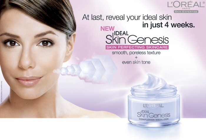
A. Piggy-back on the successful anti-aging franchises of Skin Genesis, Age Perfect and Revitalift with regimen-enhancing formulas and distinctive packaging.
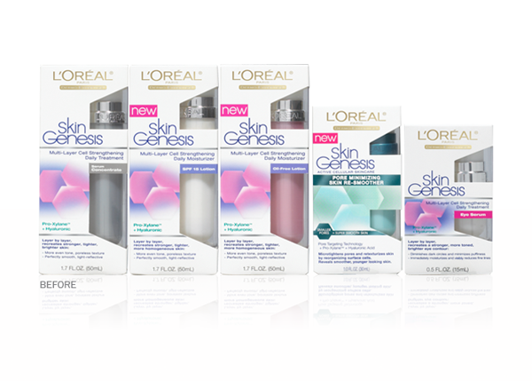
The L'Oréal Paris brand is based on a perfect marriage of science and beauty. In this case, Skin Genesis was characterized by cell-inspired hexagon shapes, along with harmonious pink and blue color codes.
I loved exploring masculine and feminine in the color palette. Special care was taken to select colors that were sophisticated, not saccharin. A fresh treatment was given to the cleansers with hologram foil stamping, metallic accents and transparent components.
This new, compelling creative was subsequently carried over to a redesign of the anti-aging products.
As the lead creative for skincare, I was responsible for concept development, primary and secondary packaging design, retail displays and marketing collateral.