
Convention 2012 Collateral Pieces - The pieces I worked on here were: 1) 18x12 envelope, 2) Folder, 3) Tri-fold planner, 4) Convention Program, 5) Tribute Book, 6) OPI Goody Bag Card. Original overall design concept was done by Kristen Merry who designed the invitation, notebook and t-shirt. I took the elements she created to layout and design the rest of these pieces mentioned above.

Merle Norman Convention 2012 Tribute Book - The tribute book had to look slightly different than the rest of the convention pieces so as not to confuse it with the convention program. I gave the tribute book a more conservative look that still matched the look of this year's convention theme, without the whimsical aspect of it.

Merle Norman Convention 2012 Tribute Book

Merle Norman Convention 2012 Tribute Book

Merle Norman Convention 2012 Tribute Book

Merle Norman Convention 2012 Tribute Book - This is the inside front cover and intro page to the Service Pin Recipients section. The tribute book is divided into 3 sections.
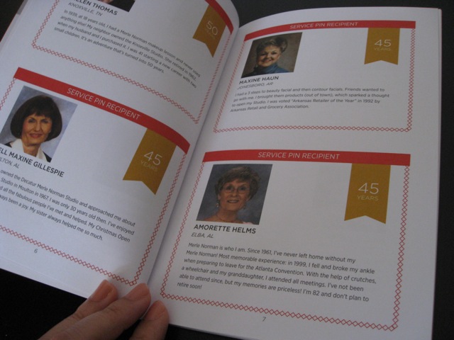
Merle Norman Convention 2012 Tribute Book - A peek into on of the spread for the Service Pin Recipients. The yellow ribbon denotes the number of years of service.

Merle Norman Convention 2012 Tribute Book - This is the intro to Excellence In Sales Award Winners section based on category.

Merle Norman Convention 2012 Tribute Book - This is the last page of the Sales Achievement section along with the inside back cover.

Convention Program Book - This is the inside front cover of the Convention 2012 Program Book, which is different from the Tribute Book.

Convention Sign 32x20 - An example of the many 32x20 Convention Signs.

32x20 Convention Sign - An example of the many 32x20 Convention Signs.

Winter 2012 Gift Carton "Cat Eye" - There are 3 of these gift cartons for Winter 2012. Each has to look like they belong together, yet separate. The direction given was to create something with gems. This is what I came up with.

Winter 2012 Gift Carton "Brush Gift Set" - There are 3 of these gift cartons for Winter 2012. Each has to look like they belong together, yet separate. The direction given was to create something with gems. This is what I came up with.

Winter 2012 Gift Carton "Lip Polish" - There are 3 of these gift cartons for Winter 2012. Each has to look like they belong together, yet separate. The direction given was to create something with gems. This is what I came up with.

24"x40" Stackable Box Graphics - These were graphics for 24"x40" wooden boxes that were stacked on top of each other at the Merle Norman 2012 Convention.

22ft x 15ft Convention Wall Layout - This was a 22ft x 15 ft display wall at the Merle Norman 2012 Convention. The wall displays available pieces for purchase by studio owners. There are hanging shopping bags, a bridal poster, newsletters, gift certificates, letterhead & business cards, retail plastic & paper bags, along with black framed Silent Salesmen and colorfully framed postcards.

Framed Postcards for 22ft x 15ft Wall - This is a section of the postcards on the 22ft x 15ft wall. Each color represents 6 categories and are noted in white below each postcard. I chose colors that match the lipstick colors on the bag.

8.5x11 Silent Salesmen Framed in Black - This is a sample section of the framed silent salesmen on the 22ft x 15ft wall. Ones that are also available in poster size are noted below the image.

64 3/4"x32 7/8" Convention 2012 Counter Graphics

8.5x11 Silent Salesman
View PDF
View PDF

Studio Teen Birthday Party Silent Salesman - I was given copy to create an 8.5x11 Silent Salesman to promote a service of throwing your teenage daughter a studio birthday party. The direction given was to create something girly and fun that was about makeup and not just about the cake.
View PDF
View PDF

Postcard version of Studio Teen Birthday Party - The direction given was to create something girly and fun that was about makeup and not just about the cake.
View PDF
View PDF

Work I Did At Merle Norman - The client wanted the Merle Norman logo on the latte mug in red and I came up with 2 versions for them to select from. It was a quick last minute project.

The Nethercutt Collection Business Cards Exploration - The client wanted to update their existing business cards. The direction given was to do something simple without photos or images, which was already explored. I decided to play with a few key colors since I was told the owners liked color. "The Nethercutt Collection" had to remain in the same original font and style. I came up with 9 versions of the fronts and 7 versions of the backs.

The Nethercutt Collection Business Card Exploration - With this page of business card explorations, I decided to keep it simple, but try utilizing a classic back pattern and also nostalgic image for some variation.

The Nethercutt Collection Business Card Exploration - These are the 7 back versions for the business cards.
gLike
Merle Norman
Rachel Hsu
Senior Designer/Production Designer, Visual Designer, User Experience & User-Centered Designer
Santa Monica, CA