
Ideal Spine and Rehab Office Brochure (Outside)
When I started working for the company they had a brochure similar to this. However, the cover design had the picture flush on one side and the Logo off-center in the opposite direction, and it did not make for an appealing brochure. I cleaned up the front fold to look more clean, updated all the info, even wrote some of the copy myself.

Ideal Spine and Rehab Tri-Fold Brochure (Inside)
The old Brochure had out-dated and poor quality photos on the inside. I took all of these pictures myself. I completely re-designed the inside of the brochure to talk about our doctors and their services.

8 Weeks to Wellness Tri-Fold Brochure (Inside)
This tri-fold brochure comes from the original 8 Weeks to Wellness Brochure. The program founders in Philadelphia originated the designs and we had the option of using their brochure (with our own address) or creating our own. I made our own brochure so we could customize it to what was specifically in our office and for our different procedures or prices.

8 Weeks to Wellness Tri-Fold Brochure (Outside)
We customized the inside fold of the brochure to include a personal story from one of our patient's who had amazing results after completing the 8WW Program.

ISR Physical Therapy Tri-Fold Brochure (Outside)
The old brochure for physical therapy included no pictures of the actual physical therapist, and all the photos were poor quality. For this brochure I took all the pictures and updated all of the info. This brochure was intended to be given to potential patients and referring physicians. The old brochure didn't say much about the compassion or caring nature of our staff, made our gym look out-dated and dirty, and had too many pictures of patients with medicine balls. I wanted this brochure to reflect everything right about or facility and staff and I feel I have accomplished that.

ISR Physical Therapy Tri-Fold Brochure (Inside)

Massage Gift Certificate (front)
I found this image while searching the internet for free images. The font I found on DaFont.com and felt that it complimented the bamboo in the picture.

Massage Gift Certificate (back) - half hour
We had a lot of patients that wanted to buy gift certificates. For the longest time we did not have any to offer, and before that we had simple paper ones that someone designed on power point with clip art. I wanted to give the business a gift certificate that looked official and clean.

Massage Gift Certificate (back) - 1 hour
Same design with a change in color to distinguish the 30 minute from the hour gift certificates.

Shopping Center Neighbor Special Offers Postcard
One day the office manager asked me to create a simple post card that could be periodically handed out to our shopping center neighbors to try and attract some business. They told me to advertise our services and special offers for discounted prices on chiropractic, physical therapy, and x-rays. I used the logo colors on this side but decided to use a black background for a change. I feel the bright blues and greens stand out better in this instance against the black background. I outlined some of the type with white to make the contrast greater so the text could be read easily.

Shopping Center Neighbor Special Offers Postcard (back)
On this side I included our logo with address, contact phone number, and a full list of other services we offered.

Business Card- This design already existed, I just wanted to show as a reference to why I designed the back of the card the way I did.

Business Card Back
The doctor had a list of services that he wanted displayed on the back of his card, and this is the design that I came up with

Business Card Front
Same as the previous card- this design already existed, I am just showing it here as a reference to my design for the back of the card

The physical therapist also had a list of services that he wanted on the back of his card. I decided to tier by size them so the shape would end up accenting the shape of the logo and address. But I didn't want it to look 100% in-line so I switched up a couple lines to give the eye a little contrast.

This doctor was recently added to our staff and needed a business card of her own. I made it to match the style of the other doctors on the front of the card.

on the back of her card she only wanted her website and services she would be offering at Ideal Spine and Rehab. I decided to center this information and to make it more simple than the other doctors' cards.

Appointment Card Front
This is their logo, I spread it across the front of the card to create appointment cards.

Appointment Card Back
I created a appointment card to hand out to patients who need the reminder

8WW Wellness Score Special Offer
The original 8 Weeks to Wellness office has a card like this. Because we buy into the program they allow us to use any of their designs. This one I based on their design but created it entirely myself (with the exception of the 2 logos).

Since the card was created to hand out to doctors and patients who may know nothing about a Wellness Score, we added information on the back that detailed the procedures and reasons why everyone should know their Wellness Score.

I wanted to learn a new technique in Illustrator so I used this flyer as my opportunity. I found a tutorial online for how to create flowers and used it to add a pretty element to a flyer about Mother's Day.

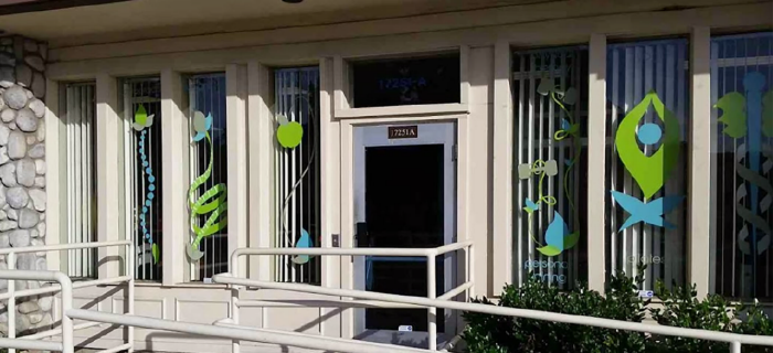
When I started working at my current job they wanted to utilize my graphic design skills. The first project they had me do was design decals they could put in their front windows. I took their current logo and used it as a theme for the different services they offer: medical, physical therapy/personal training, chiropractic, and medical weight loss. These are currently in their front windows.
View PDF
View PDF

These are my designs in the actual office windows
My artwork in side window of the office

I created this design for the medical office I work for. They decided to add Yoga classes to the business and needed a logo. I created this to reflect their current logo but still say "Yoga".
View PDF
View PDF
gLike
Ideal Spine and Rehab
Over the past 2 1/2 years of my employment with Ideal Spine and Rehab they have assigned me several design projects. These include re-designing some business cards, creating new brochures, producing weekly newsletters and various other projects. The Ideal Spine and Rehab Logo was already theirs to begin with. In all of my designs I tried to keep a consistent theme with the logo.