


This was a semester long project in which we chose a specific company created a branding identity for it.
This included redesigning the logo, creating uses, and misuses for such, and created applications, promotions, and advertisements for said company.
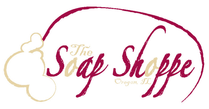
I chose a small shop the created handmade soap. The logo I ultimately came up with was one that had a bar with bubbles on the side, with the company name centered inside it.
The font I used for this logo was an elegant, readable script, with a decorative art stroke around it, giving it a more rustic feel to it. The same b rush stroke was around the bubbles and the soap bar itself, making it look uniformed.
I used this same home-handmade feel to other products that would potentially be used and/or sold in the shop had the same feel to it.
This is specifically the Logo usage you find in the branding manual.