
Lakeshore Utility brochure - Lakeshore Utility Trailer needed an affordable brochure that showed off all their capabilities. This is a lot of information to fit into four pages, but the use of a graphic framework and tables keep it from being overwhelming.
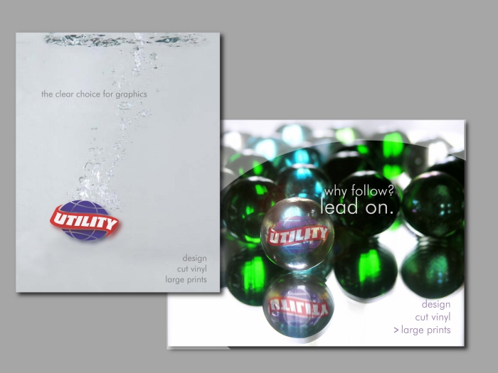
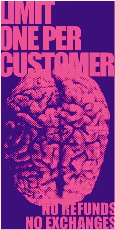
Utility Graphics posters - The use of the Utility logo and consistent typography create unified elements even through a change of theme.

Handgrenades CD set - This project was purely personal indulgence. I'd been looking at a lot of Japanese woodblocks and wanted to do something with an oriental bent to it. It was fun to have the guys break out of their stamps on the inside of the booklet.

The Handgrenades TShirts - These shirts were part of a series using a common font and artwork size to unify different themes.

Handgrenades posters and stickers - The playful font used for this band logo can be used in any number of ways while maintaining the recognition factor.
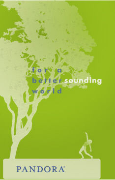
Pandora Poster - I firmly believe that music has the ability to make the world a better place. It can unify, inspire, and educate. Pandora takes the basic elements of a song or artist "seed", and branches out to other music you may enjoy, but wouldn't have heard otherwise. The shadows of musical notes growing on the tree embody Pandora's approach to building a music library.
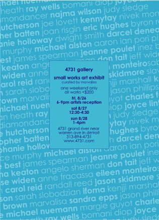
4731 poster - This poster for an exhibit of small works illustrates the show in a simple but effective manner.
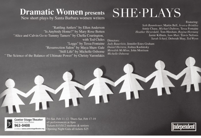
She Plays poster - Dolls cut from play scripts and organized text blocks create a playful poster that catches your attention while it communicates the information.
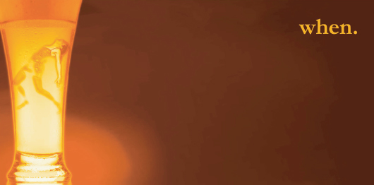
"When" - More of a personal statement than a problem-solving exercise, this is a rather overt solution to making people think about their alcohol consumption.

gLike
print design