
ground control logo - I used healthy greens and a blue to denote a healthy landscape.


A&I expedite logo - The trucking industry is full of typographically uninteresting signage that's intended to do nothing more than keep the authorities happy. I had the opportunity to create a memorable mark when A&I expedite came around wanting a unique logo for their new transportation company. The blending of the letters is professional while remaining playful.

Backyard BBQ logo - A small catering company wanted a logo that could heighten their presence and put their one location and two mobile trucks on par with more established eateries. This logo fits well within the restaurant industry and gives a nice punch to his signage and the stickers he uses to wrap his sandwiches.
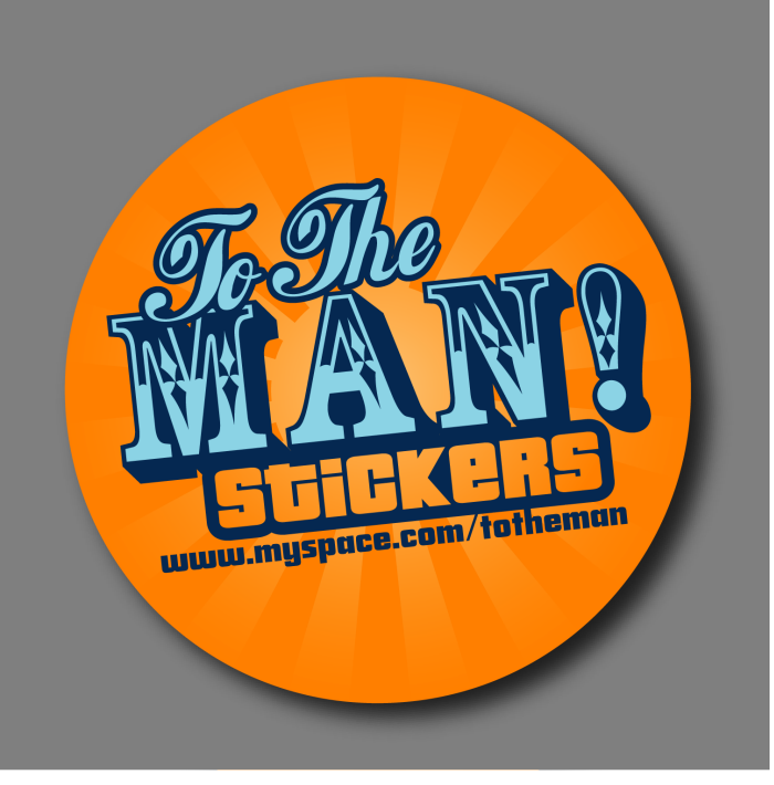
The To The Man brand was created to promote an offshoot of a fleet graphics company to promote their ability to enter the bulk sticker market. Brightly colored with a mix of type styles, it's just a fun mark to catch your attention and demonstrate the vibrancy of the company's printing process.


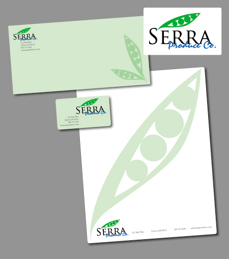
Serra Produce stationary - Serra Produce Co. was looking for a change in their logo. They'd been working for some time with a red logo with deep blue and black accents. I took a fresh approach with green and a lighter blue that would reflect the freshness found in their products.


gLike
identity