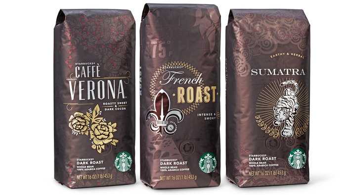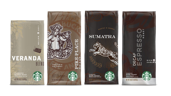
The redesign highlighted roast (blonde, medium, dark) through color, and celebrated the unique history of each coffee through symbolic icons and patterns.

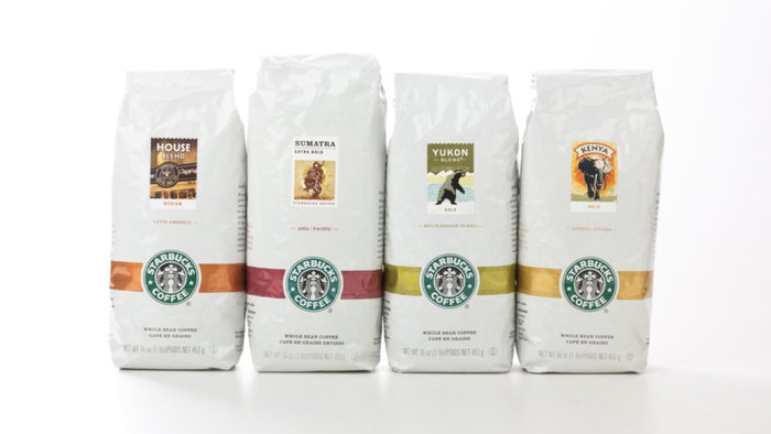
Above, packaging prior to the redesign. This design system was used in both Starbucks cafés and grocery channels.


Above, select bags from the redesigned blonde, medium, and dark roast core lineups.

Initial concepts leaned on iconography and typography unique to each coffee and explored various ways to communicate coffee roast: dark, medium, and blonde.

Concept refinement moved away from a centered design towards a more unique composition per coffee, and utilized an overall bag color to communicate roast.

The redesign included new copy for each coffee and design representation of the roast scale and tasting notes. At right, paper comps were created for each coffee and as the design for each coffee evolved, prior concepts were placed below.

A comprehensive press test was executed in order to achieve the highly layered design, with subtle shifts in color and reflectivity.

The redesign celebrated Starbucks heritage of coffee artwork, including the "stamps" used on legacy packaging.

Each bag included "Easter eggs", hidden references to the coffee's history including stories about the flavor and roast development, the coffee name and heritage, and previous artwork. New icons were created for some coffees, such as the "sun face" for Breakfast Blend.

Pike Place Roast artwork includes a pattern derived from the Pike Place store floor, the year 1977, and a reference to the key to the first store, which Howard Schultz was rumored to still possess.

A comparison of the existing packaging at left, and redesign at right.

Response to the packaging design was overwhelmingly positive, especially from Starbucks partners (employees) who appreciated a return to coffee artistry.

The full lineup, demonstrating visual system designed specifically for the Starbucks retail café environment.

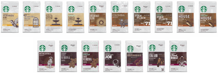
Following the redesign of retail coffees, a visual system was developed to optimize shoppability on grocery shelves.

The redesign was eventually applied to all coffee formats, including product brands VIA, K-Cup, and Origami.
gLike