


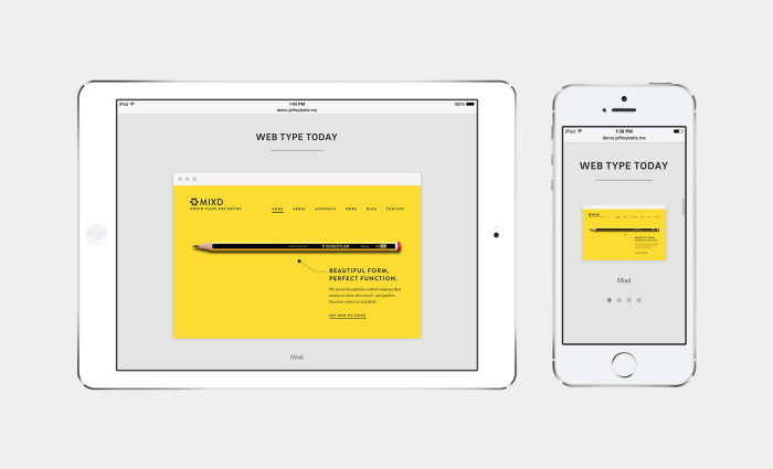
@font-face was built around a series of blocks and sections that work together to form a single cohesive layout across different devices. The design is informational and is focused on the typography. Each section is rendered with HTML5, CSS3, and web fonts. These blocks include text blocks, galleries, lists, slideshows, previews, and more.

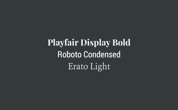
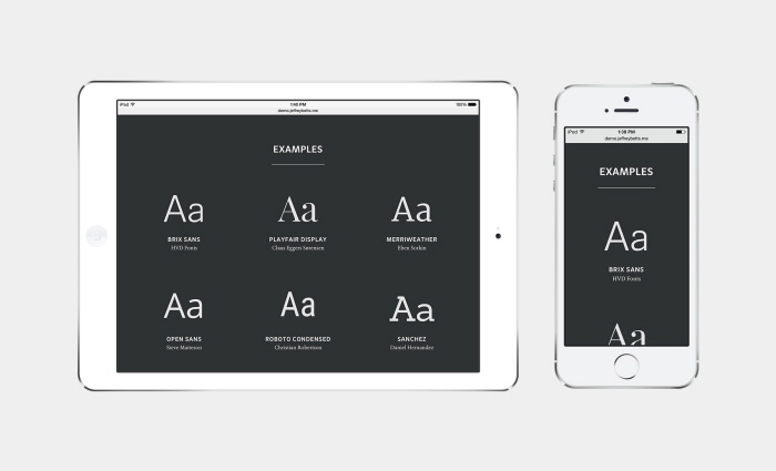
All live type on @font-face is rendered with web fonts. The primary typeface used in @font-face is Brix Sans, a clean and readable sans-serif typeface- used in headings and body coy. Throughout @font-face, other fonts are used is well, including Source Code Pro, Erato, and Playfair Display.
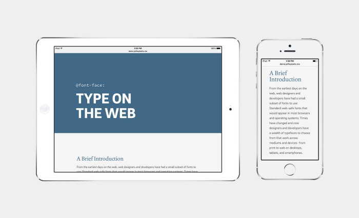
@font-face is responsive and works across different platforms– from desktops, laptops, tablets, and mobile devices.
gLike
@font-face: Type on the Web
@font-face: Type on the Web is a single page, responsive, experimental website that showcases web typography in use today in a series of sections centered around the topic of web typography. @font-face was named from the CSS3 tag used to define a web font.
View Website