Example of a product category: LED Lightbulb Product was dismantled in the manufacturing shops at UC Berkeley and weighted in order to establish its Bill of Materials.
Initial Arduino Hack to test the first IoT Lighting System scenario. Two small LED lights represent ambient and work light each with their own gradual lumens control buttons. Both lights would supposedly communicate with each other through the Internet. As the work light button is pressed successively (up to 4 times) it reaches its maximum light intensity and that would result in a simultaneous drop of the ambient light intensity. Balancing work and ambient light is a sustainable design strategy that would result in a decrease of both the cost and energy usage coming from lighting.
Example of Product Category: Computer Monitor Display. Results of Life Cycle Analysis conducted on the Dell ST2421L Display. Top: Environmental Impacts by parts (mpts). Bottom: Environmental Impacts for each life stage (mpts).
Journey Map of a designer using the website guide.
Design thinking stage: uncategorized post-its that present the user needs and insights gathered from the interviews conducted.
Design thinking stage: User needs post-its organized into themes and categories.
Wireframe for the green design guide featuring: - Home page which includes news about recent trends in sustainable design to keep the user up to date. - Menu with links to relevant pages of the website such as " About Us" and "Contact Us" which introduces the user to the website owners and provides customer support if needed. - Search bar to help the user navigate the website easier and find the information he requires faster. - User account which allows the user to personalize the website by bookmarking his favorite strategies and saving relevant products, building up his design library. This also allows the user to pause his work, come back later to the website, and immediately pick up where he left of.
Wireframe for the green design guide showing how the "Product Categories" page would look like: - Small paragraph that explain to the user how we got our results which will increase our credibility and the user's trust. - Product categories appear as medium sized icons with digital illustrations of the products and product titles under. The purpose is to help the user find what he is looking for faster and easier.
Wireframe for the green design guide showing an example of what a quick summary page with all the essential information would look like: - Layout of the information follows the "one page" design of start-up websites. - User has the relevant information in each sub-category (product overview, life cycle analysis and design strategies) directly visible. - If the user seeks more in depth information in any particular category, he has the option of clicking on the "details" button which will expand the drop down menu. - The design strategies that are first shown in the "Main" section of the "Design Strategies" are the most effective ones since they are directly induced from the LCA data analysis. - If the designer seeks further advice for a particular life cycle stage he has the choice to click on the desired stages ("materials", "manufacturing", etc.) that feature under the "design strategy" section and go into detail by clicking on the "details" button.
Demo Day Poster.
The LCA data is provided to us from the Sustainable Minds software as an SBOM excel sheet (see above figure) showing the various environmental impacts in mPts units per life stage as well as per impact category such as carcinogenic, global warming potential, fossil fuel depletion, etc. My role is to take this data and represent it in numbers that would be easy to comprehend even for users who had no familiarity with LCA. In fact, the mPts unit is not common knowledge for some as I had discovered from my interviews and is not intuitive to compare the relative environmental impacts of one life stage vs. another or of one product vs another. Percentages however are widely understood.
I reorganized the data and calculated the total mPts per Life Stage. Then I calculated the percentage of mPts each Life stage had as compared to the product’s total mPts. Representing the data as such gives the user a more sensible understanding of the various environmental impact a category/life stage might have and helps to highlight which stages are most concerning.
With regards to representing the data in graphs. I decided to use horizontal stacked bars. The reason for this particular choice of visualization is the following. First, it has been proven that people are not so good at area comparison (which figures in 2D charts such as pie charts and rectangular area charts); therefore bar graphs was the best option. Second, seeing that the design of the website page lends itself to scrolling down, I felt that a horizontal bar would be favorable to allow relevant information about the graph be positioned above and below. Finally, when considering horizontal bars, I had the option between a stacked bar and a multiple bar graph. I choose, the stacked bar over the multiple bar chart because the former is simpler, takes less visual space and give an immediate impression of the relative importance of one life stage vs another.
I carried on with the user centered design process by working on a medium fidelity prototype on PowerPoint that looks exactly like the final HTML version of the website. This page shown above is the Home page.
The “Product Study” tab on the Home page will open this page showing icons of the products that were analyzed. If clicked, each icon would take the user to the particular product study case, such as the one shown below for wearables.
Shown above is an example of what a product case study page would look like using the medium fidelity powerpoint prototype. The page starts off with small descriptions of the product and an illustrative figure. We didn't want to include pictures of real products to avoid having the user think that the analysis is a case study of a single product. The LCA results are then displayed highlighting the main causes of environmental impact in that product category. Following that are solution strategies color coded to match their respective problems. Finally, the user is given example of how these strategies can be applied and links to which he/she can refer.
The “General Strategies” tab will take the user to a page where he can find sustainable design strategies organized by life stage and strategy category such as design for ease of disassembly (which would be listed under End of Life strategies). This is to account for the need of designers who do not have a particular product in mind or for those who were unable to find their specific product in our library of product studies.
gLike
Design of a Sustainable Design Guide & a Green IoT System

Sustainable Design Guide and Green IoT is my Capstone project for the Master of Engineering Leadership I pursued at UC Berkeley.
In this project, I am learned to:
- Execute Project Management strategies.
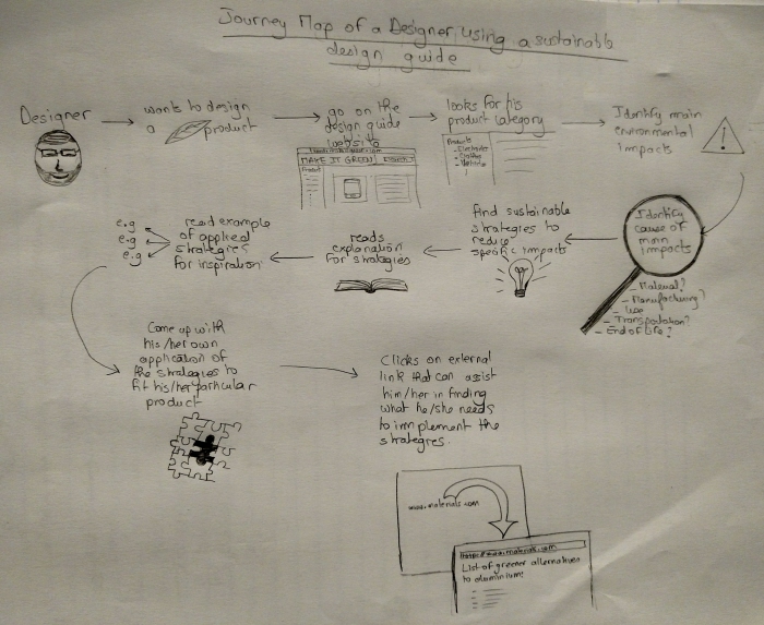
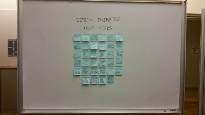
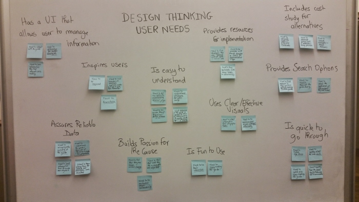
- Apply design-thinking principles to develop a sustainable design website for green designers. Processes involves identifying user groups, conducting observations and interviews, uncovering needs and insights, developing design principles, brainstorming on solutions and iterating on prototypes. Journey map, wireframes and post-its were part of my contribution to the project.
- Evaluate Life Cycle Assessment (LCA) of home ecosystem products to identify major environmental impacts and suggest sustainable design strategies.
- Cooperate in the development of an “Internet of Things” (IoT) product consisting of a system of smart home devices connected together through a hub and controlled to improve performance, usability and energy saving functionality.

View Website
Dayana Hijaz
ME Product Design Graduate at UC Berkeley Berkeley, CA