Staff Picks of the Week: May 19, 2017
 Enter a caption (optional)
This week we were caught off guard by the sheer amount of creativity on display in the projects uploaded by the Coroflot community. Each one of the five projects that stood out for us is completely different, but all of them capture an artistic and design vision that is totally unique. We can say with certainty that you will thoroughly enjoy viewing each of these projects.
 Enter a caption (optional)
Paper collage illustrations by Zachary Opaskar
Paper collage is more than just something you did in elementary school, which is abundantly clear in this huge collection of work. Using construction paper, glue and an X-acto knife, Zachary delves into some darkly humorous subject matter with these colorful illustrations.
 Enter a caption (optional)
DICHTER 3. by Anne van den Berg
It's always refreshing to see books and magazines aimed at children that also have quality design work. For this project Anne built a dreamy and colorful miniature world out of paper, spices and rocks. The result is both adorable and fascinating in the way she uses different materials to create this tiny landscape that looks straight out of a Wes Anderson movie.
 Enter a caption (optional)
KRUPS 'COFFEE CUBE' by Sam Cho
As far as a countertop home coffee maker goes, this design may appear clunky, but damn if it doesn't look cool. Sam's design is purposely modern, geometrical and modular. At first glance it may look like it takes up a lot of counter space, but when you realize that it is loaded with storage for all of your coffee accessories, the design starts to make perfect sense. It also looks like no coffee maker we've seen before and we can say we would definitely order one for the Coroflot office if it ever went to production.
 Enter a caption (optional)
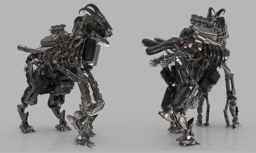
Have you ever seen a high-octane mountain goat? This 3D modeling work is hyperrealistic to the point of being terrifying in a sort of dark sci-fi kind of way. The attention to detail here is remarkable and it's easy to imagine this goat as part of some dystopian future where robotic animals rule over us feeble humans.
 Enter a caption (optional)
FASTCO MAGAZINE by Michael Spitz
Completed for the always awesome Fast Company Magazine, Michael's spot illustrations are simple and quirky, and are eye-catching without distracting from the editorial content. He seems to have a lot of fun coming up with a fresh and funny way to illustrate sports team logos.


