
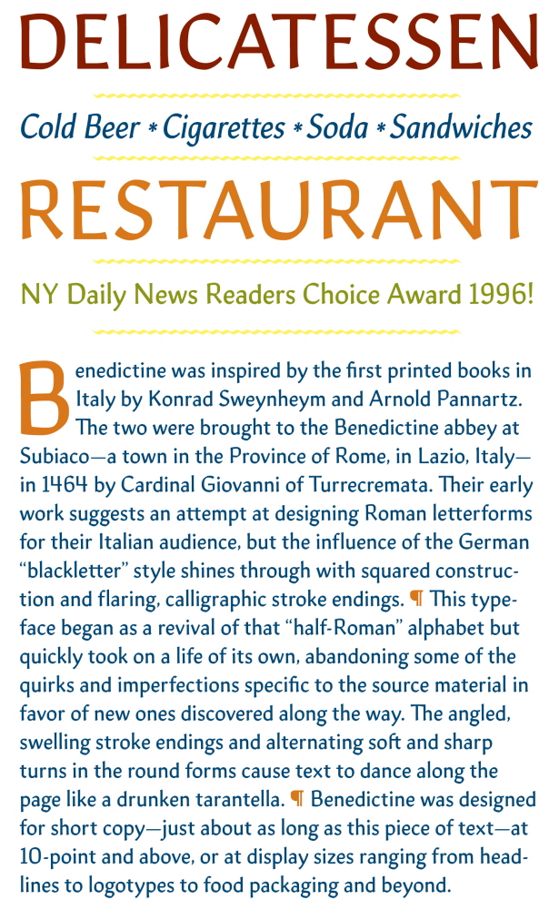

Benedictine was designed during my time in the 2014-2015 Type@Cooper Extended Program. It was inspired by the first printed books in Italy by Konrad Sweynheym and Arnold Pannartz. The two were summoned to the Benedictine abbey at Subiaco—a town in the Province of Rome, in Lazio, Italy—in 1464 by Cardinal Giovanni of Turrecremata.
Their early work shows a clear attempt at using Roman letterforms for their Italian audience, but the influence of the German-style blackletter shines through with calligraphic strokes and a rather angular alphabet, making for a rather interesting design.
This typeface began as a revival of that “half-Roman” alphabet but quickly took on a life of its own, abandoning some of the quirks and imperfections specific to the source material in favor of new ones discovered along the way. The angled, swelling stroke endings and alternating soft and sharp turns in the round forms let text dance along the page like a well-practiced (or maybe intoxicated) Tarantella.