Preliminary wireframe for discussion including notes
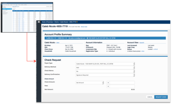
Example of client check request from in context
High Fidelity Mockup of CM First Step
High Fidelity Mockup of CM Second Step - After much user testing it was decided to only allow searches on account number. Many metrics were taken into account, 85% of all requests were made contextually and one off requests were 90% were entered as the account number, by removing the name option this considerably simplified the work flow and reduced the number of steps by half.
High Fidelity Mockup of CM Third Step- Completely dynamic page controls, in this case as check is the request type the action trigger labeled similarly, if the request type was ACH then the trigger would be "Request ACH", etc.,
WIP Screen of Requests
gLike
Cash Management

This project is to replace a decades old legacy app comprised of one 20,000 line page of code that combines .NET, JavaScript, HTML, CSS and business logic with an up to date 3rd party out of the box application. As the sole designer on this project it was my responsibility to work within the known bounds and turn the unresponsive 3rd party app into a clean easy user experience for our Advisors through creation of wireframes and journey maps, testing with advisors and working closely with the 3rd party vendor as well as LPL business units and teams. I was able to not only create a clean app based on a progressive disclosure model, but we were able to go pilot a full quarter sooner than anticipated and with a system that was fully baked into our advisory platform with contextual processing of requests. As a side note the 3rd party vendor I worked with rolled many of my design changes and progressive disclosure updates into their next release.

Available
Freelance, Full-time
Adam Landau
Senior UX Designer | Information Architect Rockledge, FL