
gLike
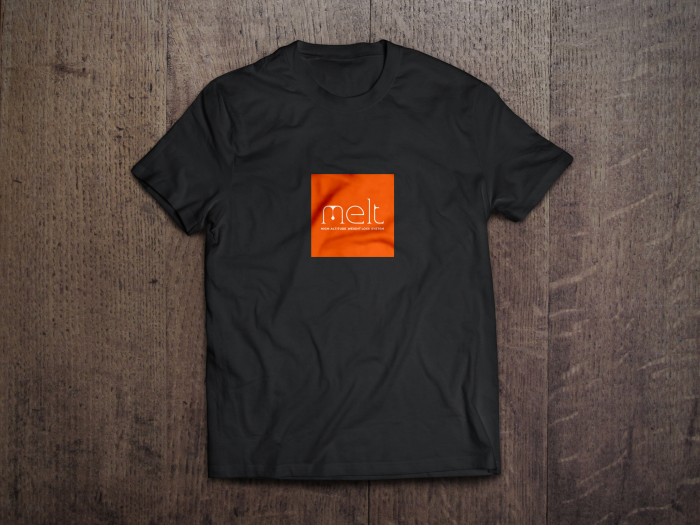
MELT - Weight loss done right.
The visual identity projects two key thoughts – the idea of shedding weight along with the concept of working hard to do it right. The bead of sweat that is released through the letter M is significant of exercise in a high-altitude chamber which promotes quicker weight-loss.
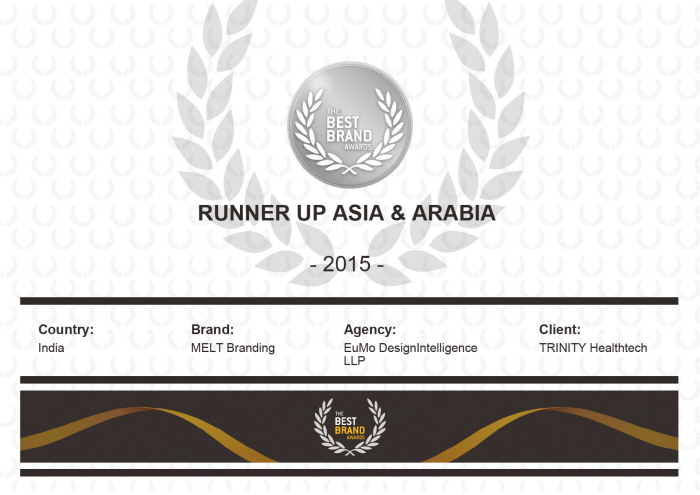
Won "Runners up" ASIA & ARABIA 2015 at The Best Brand Award for Melt Branding.


