His Name Was Jason Packaging - The image that was originally sent was of a brand new mask...considering this was 30 years of Jason, I had to make it look old. So I used quite a few filters and then digitally hand-made scratches on certain parts of the mask, to give it a very used and dirty look.
Ocard Cover, 2 discs, flat cover - front and back view. Quotes about packaging:
"...striking cover art." ~ DVDTOWN.com
"The cover art is great and says everything necessary about this film." ~ Cinegeek.com

Bruce Campbell 2 Pack sleeve - sleeve for DVD.

Hellraiser 20th Anniversary Packaging - This is the New Ocard for the DVD. It was printed on foil and has a UV spot on the title and puzzle box.

Final Packaging - flat - This is the front and back of the ocard.

Phantasm IV - Anchor Bay Entertainment - This was another fun, yet challenging cover. Again faced with little art to use, a replica of the ball was borrowed and I was able to shoot it. Some fire and textures were added and voila!

Jack Brooks Monster Slayer - new release by Anchor Bay Entertainment - I manipulated a poster, moved some things around. This was printed on holographic foil. This packaging won a Saturn Award.

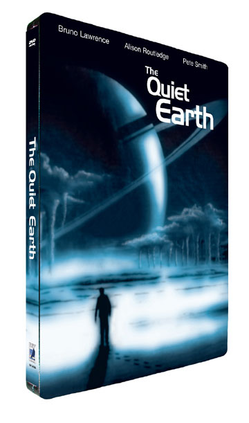
Quiet Earth Steel DVD Case - Printed on steel...has a bit of shine to it. I basically took the origianl poster art desaturated and added cyan for the monochromatic look. Looks awesome on the shelf!


Tenebre

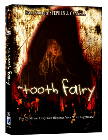
Toothfairy Packaging - This is an Ocard that was printed on textured paper. This one was a challenge due to lack of art but I ended up using some textures and used some photograph that I shot. It turned out nicely.

Nevermore Packaging - This is a DVD sleeve/slipsheet for an indie film that has not been released yet. This one had very limited and lowres art...but I managed.

gLike