
Gladiator GarageWorks Floor/Wall Solutions TearPad - The Gladiator GarageWorks National Tearpads were one of my favorite projects because of how deeply I influenced the branding moving forward. Seeing this project through as a one-man team on the design side offered me opportunities to explore their brand and stretch myself with extensive Art Direction and Copywriting. I feel that this piece stands as one of my best to this date.
My responsibilities included:
- Ideation
- Design
- Copywriting
- Art Direction
- Account Management
- Print Specs (Assisted)
Above the cover is shown as well as an inside spread. A full version is available in my physical portfolio.
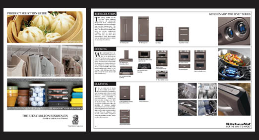
Ritz Carlton Concept Pitch Materials - 2004 - This was a piece of custom collateral produced for the pitch for Whirlpool Corporation to be the principal appliance supplier for the new Ritz Carlton Residences. Asking for a "high end" look with a "high level" product overview, this 20 page layout was completed and custom bound in 3 days.
My responsibilities included:
- Design Concept
- Some Copywriting
- Photo Selection
- Production
- Account Management
Cover and Internal Product Spread Shown. A full version is available in my physical portfolio.
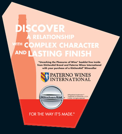
KitchenAid Brand and Paterno Wines International Co-POP - After a strategic partnership was formed between KitchenAid Brand and Paterno Wines International, they had decided to place a free booklet on the joy of wine tasting inside every KitchenAid Winecellar sold. This POP was created in a short run for distributors who would display the product. This project was fun because I was able to stretch the stringent brand standards of KitchenAid because of the partner status with Paterno. While retaining much of the same feel of their literature and POP, it's funky shape and composition were something different and eye-catching for the brand.
My responsibilities:
- Ideation
- Design Concept
- Die-Line Design
- Copywriting
- Account Management
Please note that the light green line on the piece denotes the die-line.
Printed 4 color on X-Static with a low-tac adhesive backing.
This piece is viewable in my physical portfolio.
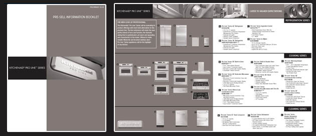
KitchenAid Pro Line Brochure - This was a great piece as it serves as a great example of the impact of metallic inks in a 2-color application. The images of the stainless appliaces were converted to duotones and the piece only utilizes a black plate and a metallic plate (of a custom color created by Mossberg Printing to resemble the KitchenAid Pro Line Meteorite Finish). This piece served as a great opportunity for myself as it was one of the first major pieces not to be outsourced for the KitchenAid Pro Line. It was also the first piece that showed the product line-up in this sort of configuration.
My Responsibilities:
- Ideation
- Design
- Photography Selection
- Photo Editing/Color Correction
- Account Management
A full version of this piece is available in my physical portfolio.
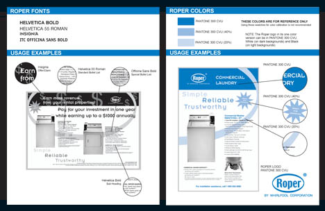
Roper Brand Agency Guide - When Roper Brand was going to switch their agencies they requested our department to analyze prior pieces of POP and Literature and create brand standards. This piece had to be clear and concise in providing direction for their new agency so that they understood typography and their 2-color standard (logo usage was covered in other documentation). I enjoyed this project because it gave me the freedom to design a "teaching" tool for the brand and helped to solidify their messaging to the consumer/trade partner moving forward.
I have also designed templates and guidelines for the tray-packs for Whirlpool Water products on display at Lowe's much in this informative style.
My responsibilities:
- Interpretation
- Design
- Copywriting
This piece is mostly distributed via PDF format.
gLike
Whirlpool Corporaton 2002-2005
Available
Freelance, Full-time
Benjamin Wojcikiewicz, AKBD
Specializing in Product Management, Product Design & Development and Design...
Marietta, GA