
INTRODUCTION
This is a case study to look at improving the UX of a major brand’s mobile site. Old Navy was selected on a ‘random’ basis and doesn’t know about this project.
It turns out there are some things Old Navy can do to reach a more ‘Frictionless’ user experience and better support the desires of a mobile user. I’ll take a brief look at all stages of UX.
INPUTS
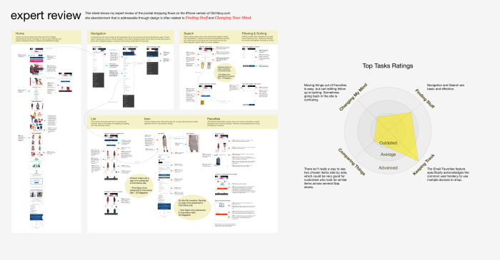
My Expert Review and Top Tasks Ratings
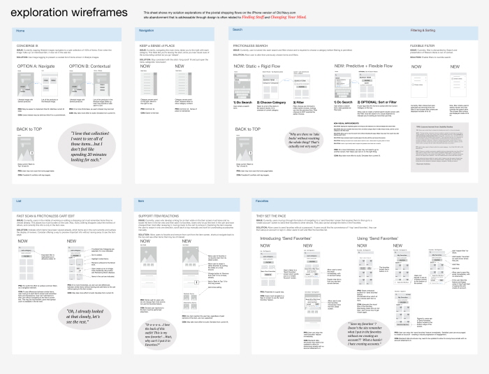
EXPLORATIONS
I (mostly) limited this to one exploration as an example of a first pass iteration.
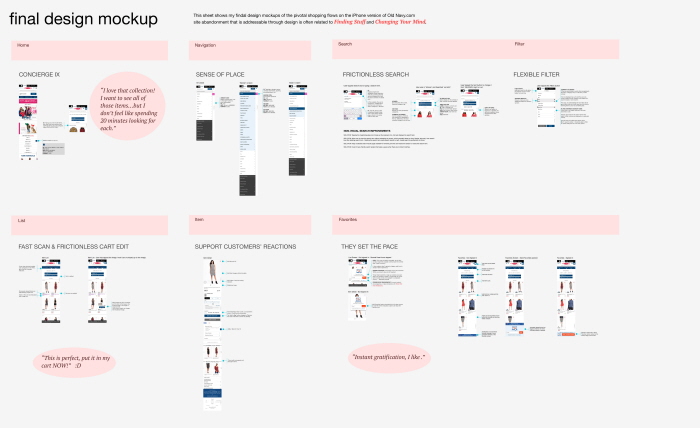
FINAL DESIGN MOCKUPS
Includes specifications for new UI elements. I stuck to the current design style to keep this case study focused on usability.
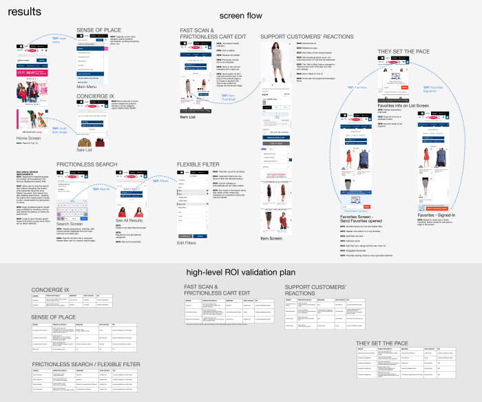
RESULTS
This a closeup of a typical user flow through the new design and a High Level ROI Validation Plan.
gLike
mCommerce Case Study
This is a case study to look at improving the UX of a major brand’s mobile site. Old Navy was selected on a ‘random’ basis and doesn’t know about this project.
It turns out there are some things Old Navy can do to reach a more ‘Frictionless’ user experience and better support the desires of a mobile user. I’ll take a brief look at all stages of UX design.