
Austin Entrepreneurship Program - Art 325: Collaborative Processes
In this project we worked in groups of five, to learn how to design as a team and work with many different design styles.
The Austin Entrepreneurship Program is a unique learning environment for undergraduates offering entrepreneurship courses, hands-on experience, and the opportunity to explore business ideas.
AEP came to our class looking for a redesign of their brand. This was my groups first shot at the re design of their identity.
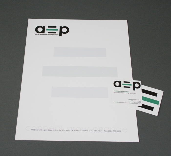
Stationary - Our first logo design broke down Austin Entrepreneurship Program into three parts. We abstracted the E for Entrepreneurship
because it is the focus of the program. We designed this logo so that someday the abstracted E in the middle would be pulled out and used by itself while keeping the brand recognizable.
The abstracted E was also connecting the other letters by reaching out to them which corresponds to what the program does for students.

Business Cards - Closer shot of the business cards.

Second Logo - The director of AEP didn't necessarily think their brand would expand to just using the abstracted E we had created. He told us to go back to the drawing board and think of something more versatile and long lasting.
This was our second version of the Austin Entrepreneurship Program logo. We took the iconic building Weatherford, which is where AEP is housed and used that as the focus of the logo.

Enterprise Challenge - Each group was given a program by AEP. My group was given the Enterprise Challenge, which is an opportunity for students to present their new business ideas to experts including successful entrepreneurs, senior executives, venture advisers, and investors. The first place prize is $10,000.
This is our identity for the Enterprise Challenge. It stays consistent with the AEP logo but focuses on business plans in the top portion of the logo.
gLike
AEP Visual Identity