Oakley Self-Promo: Cover - Brave the Elements, Conquer the Elements, Tame the Elements with Oakley, Braver than the Elements... I went with "Battle the Elements". I guess you can't ever tame or conquer them. From ice to desert and everything in between Oakley is the gear to combat every element Earth can muster! This is the cover of my self-promo piece targeting Oakley.

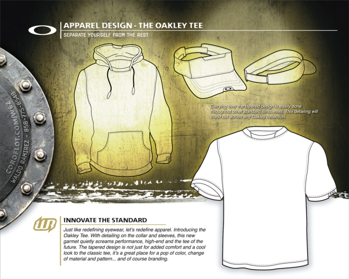
Oakley Self-Promo: Apparel - Oakley is known for it's innovation, so why not in apparel as well. Make a classic better. Redefine the classic silhouette and set yourself apart from the same old same old. With that, I created the Oakley Tee. The detailing is great for a pop of color, material or logo placement. Oh yeah, it's a great spot to can hang you Oaks too!

Oakley Self-Promo: Core Line - Here's an example of how a redesigned silhouette can turn a basic tee into high-end apparel. The detailing in the collar and the sleeves not only compliment the graphics but now it screams "Oakley!".

Oakley Self-Promo: High End Imagery - These graphic tees and boardshorts show how I can create original art and fresh looks for a world renowned brand. I also wanted to show an example of the Oakley Tee (white) without a pop in color to illustrate how it still makes a statement.

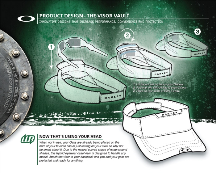
Oakley Self-Promo: The Visor Vault - Everyone has wrap-around sunglasses. But the cases for them are too damn big and bulky... I never use mine, too much trouble. When we don't use them some guys place them on their neck, forehead, brim of their hat or even wear it backwards! Eventually you lose track of them. Somebody should of thought of this a long time ago because I lose 3 pairs a year.

Oakley Self-Promo: The Resume - The last page of the promo. "Don't call me, we'll call you"... yeah, yeah, yeah.
gLike