The idea of the cover is that Housekeepers in hotel industries are known to keep everything sanitary, clean and white. So I incorporated products against a white curtain, white marble table with a simple white vase on the left.—arrangement of products against the background made it stand out more. It was an "homage" to the targeted audience.

Holiday Appreciation For Staff Catalog
Ideate, designed, photo shoot of model and stills, strip and retouch products, designed entire 56-page catalog.

2008 Breast Cancer Awareness Month
Positive Promotions, Inc.
Cast and directed both live and still products, NYC studio. Designed entire catalog from concept through production. Cover was designed and retouched in Adobe Photoshop.
Concept was to show emotion—a closeup of how walkers interact with vendors.

Client asked for a red T-shirt on model image originally wearing a blue long-sleeved T-shirt...no retouching problem there

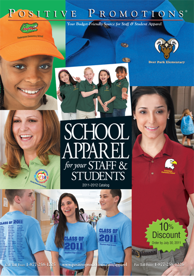
School Apparel Catalog
Casts and directed all models, and worked with modeling agencies. Created and designed entire 60 page catalog from concept through production.

Targeted to High School Students throughout the US Market. By showing happy, accomplished and confident kids from different backgrounds, customers are convinced products inside will help students of YOUR SCHOOL get the same result.

Red Ribbon Week 2012 Product Catalog.
All kids cast locally. Cover is Crazy Socks Theme, a popular Red Ribbon Week theme celebrated in elementary schools. So I emphasized how much fun to celebrate red ribbon week and that that it's so much better to with the use of our products,
Created from concept through completion, this cover alone generated new revenue for Positive Promotions, Schools Division

Student Awarda & Incentives Catalog
Positive Promotions, Inc.
Cast models and directed NYC photoshoot.
Shooting kids at the same time is a lot of work, a lot of patience and damn good support group of photographers and their assistants!

Red Ribbon Week 2010
All casting and photoshoot done in-house. Models were local and some from agencies. This catalog cover brought in 25% more in profit sales! I wanted to show real activities school kids do during red ribbon week.
gLike