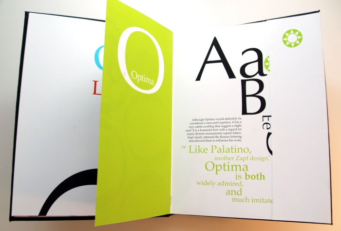
Type Graphic w/section Inro - Here we find another "Type Graphic" or "filler page" using "Optima." You can see here how, despite being different in size, these fonts can align together and create a dynamic presence because of the Zapf's frequent but careful use of uniformity between the letters with their weight, angles, and contrast.

Type Insert w/foldout - Here is another insert page. On all of the inserts, I used only letters from the specific types' title, so for example, in this design you will only find letters from the title "Medici Script." Also of note, is the specific symbol I used for each insert page on the top right corner. Each of these is color coded and is a means of reference to the index page. Each of these belong to the Type family of Zapf Dingbats (another font I will show illustrated later)

Opened foldout - Here is the inside of the insert from the previous slide. (Medici Script) Here you find another illustration with information on this font, an illustrated quote, again the corresponding symbol on the top right and a show of every character in the "Medici Script" typeface. (not shown here because the flap is closed)

Type Graphic w/section Intro - If I were to re-design the insert pages again I would make them all create a full spread such as this one. It flows much better not being "cut off" in the middle--between pages...oh well.

Type Insert w/foldout - Unfortunately the other copy of this book, which I turned in and was kept by the school, is better aligned between the pages. Here the design is slightly off which I adjusted for in version two. Hopefully the dynamic is still there and you get the idea. This is my favorite insert because "Zapfino" characters are just amazing to show off.

Opened foldout - I thought the opened with and explosion and really demonstrated the uniqueness of Zapf's "Zapfino." Again, my favorite insert....

Body Text Page - Ok, so here is the first demonstration of the history pages. There is actually one per section like everything else but this is the first slide of one. Each has a character "holding" the body of text and bleeding nicely off the page. In the middle you will find a running timeline and list of all his typefaces.

Type Analysis

Opened foldout

Body Text Page

Opened foldout

Type Graphic w/credits
gLike


