OVERVIEW: With our calculations, putting our plan into action, (which includes a $330 million budget,) would raise Lenovo's total tablet market share from 1.4% in the world to 10% market share and earning them over $10 Billion in 3 years, and create a growing customer base to role out another product after 3 years to continue their customer loyalty.

Here is a walk though some of the design process: We started with problem identification, lots of research and idea brainstorming. Brainstorming, concept generation and idea analysis, Our concepts were rated and compared against the found customer needs. The best concepts were mocked-up and further design decisions were made.

Currently the tablet market is flooded with ideas of all varieties, mostly novel or interesting. We needed to create something beyond novel, more toward long lasting. We compiled the user feedback and created the customer needs list.

Our team took the problem back to the drawing board and had multiple Brainstorming sessions. We detailed what features were required and which were added benefits.

Initial Concepts were generated to play out in further detail

We used the list of customer needs as the criterion to compare our concepts. Our product needed to satisfy the customer needs not yet fulfilled by current tablets / computing ecosystems. We then voted on the six concepts based on its applicability to the consumer's stated needs. //
Concept explained : The slide out extra display is made out of flexible screen material. The screen would have the natural shape of a silicone QWERTY keyboard. In keyboard mode the extra screen will display an image of a keyboard with visual feedback when buttons are pressed. When not in keyboard mode, the screen could be used to display extra information, other images, or act as icons or assignable buttons. The extended screen would be primarily flat with ever so slightly either dimpled or raised squares to allow the user to feel the distinction between individual keys

Study Models:
Over the course of our tablet form exploration we built a number of tablet mock ups and study models. Consumers quickly expressed a great deal more comfort with a more "traditional" rectangular tablet experience. We used wood to stand in the place of the real thing, to see if doing particular tasks would work better with different form factors. Our team built tablet study models both small and large with different end dimensions. This helped out team find the most versatile size range for holding, working on, and transporting. //
Several informal observations were used to view how users handled our mockups in an attempt to better understand how people went about using their tablets and potentially uncover needs users may not be able to articulate.

Prototyping: The Prototypes captured the physical form of the tablets, thinness, length, width, and proportion size. This allowed users to handle the tablet to better understand what would “feel good” in their hands. They valued having something that is easy to maneuver, carry with them, and hold or use for an extended time. We found that people expected and wanted a rectangular screen. // The less wide versions allowed people with larger hands to hold them on the sides and not only with a front-to-back pinching fashion. // This shape would allow an Ergonomic single handed grip as well as an more equal weight balance in the users hand.

Early Design Decisions:
We decided to go with no larger than a 5.3-inch wide screen, which allowed the total width to only be 5.5 inches. This slimmer size increases portability and provides a more human-hand-friendly proportion without relying on a surface to set the device on. Even for people with smaller hands, the smaller width allows them to get their fingers further behind and under the device which decreases the torque of gravity on the device.

To utilize and augment the Lenovo Thinkpad brand of having strong and reliable professional computers, we maintained the Lenovo branding language, including colors, font, logos, and advertising slogans.

We then went on the hunt for the preferred screen aspect ratio. Research showed that there was no standard for screen aspect ratio. Motion pictures are shot and presented in many different sizes. TV and online videos such as YouTube are often presented in a 4:3 ratio, which is why Apple picked this ratio for their iPads. This ratio means for every 4 inches wide, it is 3 inches tall. Most film is 1.5:1.

The Golden ratio, more commonly known as 16:10, appears in nature in things like the nautilus. In design, it is deemed efficient and beautiful, recognizable to the eye, which is why credit cards and business cards are in this ratio. (Beyond that, getting wider is 16:9 which incorporates most movies, standard aspect ratio of HDTV, and the iPhone 4. Finally there is 2.35:1 called super widescreen used for big widescreen movies and the iPhone 5. ) The Golden ratio offers a longer display to add productivity for the business professionals using the device. The Nimbus screen is for the business professional, not entertainment. This is demonstrated by not being tailored to TV or Wide screen movies. The Golden Ratio, in design and nature, renowned for being aesthetically pleasing due to the way in which it can be cut into a square and a smaller rectangle with the same aspect ratio.

The back of the tablet is removable, allowing the body to be taken apart so components can be replaced or upgraded. This also allows the camera to be removed for business security reasons if needed. The center of the back is a Lenovo Logo charging contact to quickly connect the tablet upon contact with the dock without plugging it in.
// Back top-right corner : HD camera and LED Flash. The inset oversized camera lens will prevent fuzz from collecting over the camera or touch surfaces when laid down flat.
// On the Bottom: Internal speaker, standard earphone jack, and micro USB female connection for plugging in accessories with a wired connection. // Right side: Volume Controls located out of the "accidental bumping zone" // Left side: micro SD Card for storage or for non-wireless direct data transfer.

Front Facing Camera // Lenovo Thumb Reader - for secure and fast log in // 3.5 Auxiliary Jack - for headphones with mic // Mini USB3 Port // Rear Facing Camera and Flash- with non scratch lens that does not collect lint // Lenovo Emblem Charging Contact on back for quick-connect and not having to plug it in.

In order to meet the various needs of the ecosystem, we would have to expand our view beyond a single product and begin to ask ourselves what the full office, car, home ecosystem for a tablet might look like based on the stated and latent needs of our consumers.

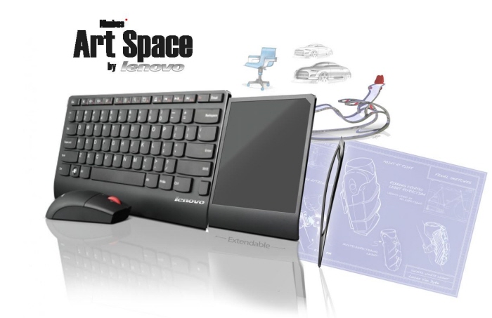
The art space is the 'work station' set up for work or at home which provides greater productivity associated with a full keyboard and mouse. This was also the precursor of the portable workstation tablet-folio "Transit" (next slide) ---- The Art Space Features: Larger Desktop wireless Keyboard with a pull out track-pad and writing pad. Offers mouse, stylus, and all function keys.
View PDF
View PDF

Features: Full size keyboard, Multi-function trackpad --
Explanation:
The Transit incorporates a multi-touch track pad allowing, signatures, sketching, and track pad functions with the ability to assign different areas as different functions, for example the hash marks on the right allow use as a numerical keypad . // The keyboard overlay attachment is just a plastic insert, so there is no redundant batteries, electronics, or hardware needed. The keyboard simply provides tactile feedback to the user and transfers the force of the buttons to the track pad in keyboard mode. The track pad identifies which area is being pressed and assigns that character to show up typed.

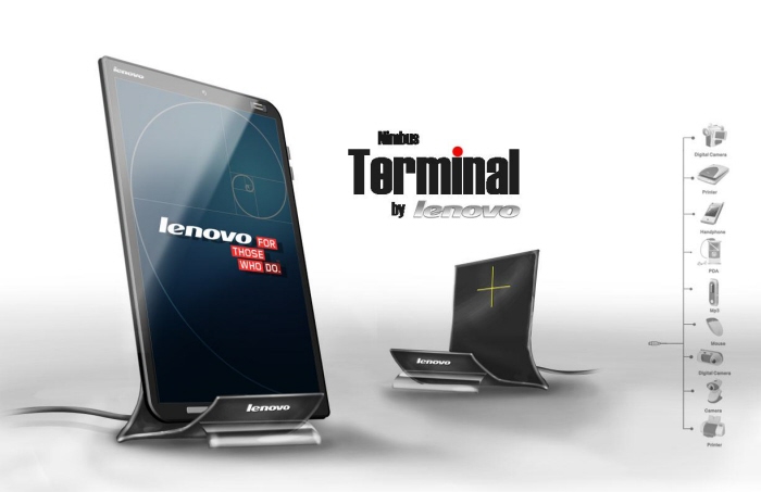
Features: Cordless Charging (no need to plug in the tablet), Connection to existing peripherals, Automatic Stand-By Mode, Passive Cooling
View PDF
View PDF

Features: Modular versions allow for credit card acceptors, extra storage or additional battery life | Ergonomic grip lessens the chance of dropping the device
gLike