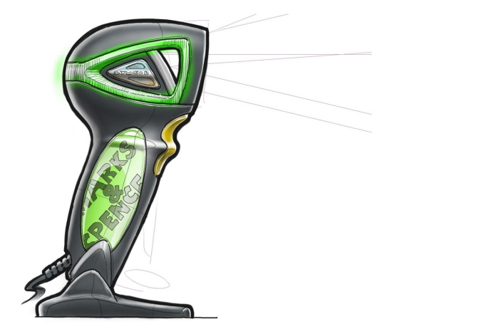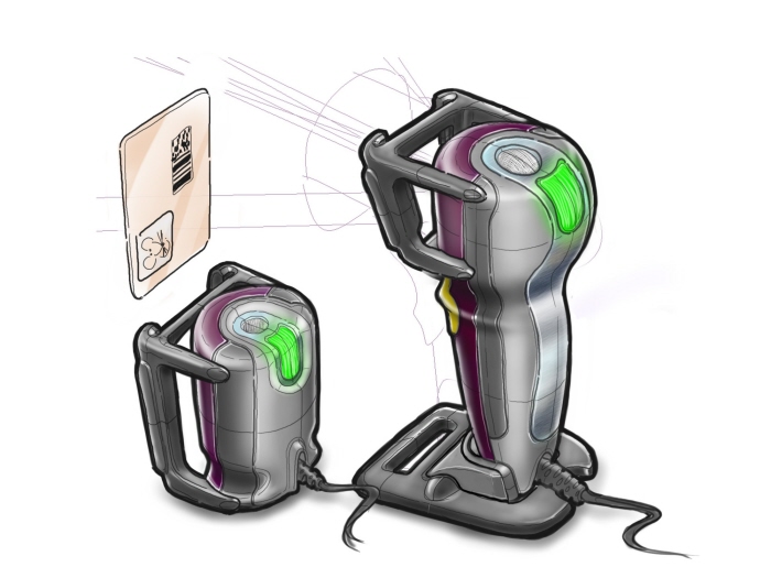
The final 3 concept appearance models.
Photography by Bill Albrecht

This concept had a particularly striking profile and a bold LED lighting design. The handle included a clear gel-like material that allowed light to illuminate through, but still provide comfortable ergonomics.

This concept had a particularly bold moulded light pipe built into the canopy, lit from edge mounted LEDs and providing a patterned and higly visible feedback illumination.

The horseshoe design was quite a departure from existing form factors whilst still retaining the all-important ergonomics. The unusual design came about as an exploration into removing as much volume as possible and asking whether scanning has become accepted enough in the social consciousness to push the comfort zone.

Despite the drastic volume reduction, it still remained important to retain visual clues for the user to instinctively understand the scan direction. Here the U-shape and multiple leading lines are designed to subtly suggest a correct angle of orientation before the trigger is even pulled.

From sketch, to render, to reality. It's quite a treat in our industry to have ideas brought to life and able to held and used.
Render in Autodesk Imagestudio
Photography by Bill Albrecht

The ability to co-brand products is normally a welcome addition to every design.

High end details are always important to the perception of the design and are made all the better those parts can be functional as well as aesthetically pleasing. The metal parts look like a natural function of the styling, but in fact hide a more functional role; they are carefully shaped and placed at key hit points in the design for when the product is dropped on the floor.

One of the difficulties with product families is creating a design that works in multiple form factors and from the high-end to low-end of the range. Additonally many designs are often released years apart without consideration to followup or cohabiting products.
Here, the concept was designed to work across multiple form factors.


The design that led to one of the final appearance models - here, the concept of a clear gel-like material that can be illuminated through was proposed.

The DNA of this design survived into one of Motorola Solutions existing products, the DS9808.

A bold design, but at the cost of a comfortable handle...


Sometimes concepts are defeated by the simplest and smallest of problems. Dust. The angled & exposed scan window would be particularly vulnerable to collecting dust and grime. When in an environment where users are not particularly caring to the devices, the end result is often a degredation in scan performance and a perception that the device is faulty.

A technological limitation of many scan engines is a minimum read distance. Often this limitation is carefully hidden by a combination of placing the engine far into the housing and preventing any user from scanning an item too close with the housing size/shape. Here, the limitation is a approached from a different point of view. A loyalty/ID card is placed within a preset slide-in housing which is in turn incoprorated into the design as more of an impact-resistant exo-skeleton. A functional element and an aesthetic rolled into one.


Despite the cool deconstructed look of this Orb concept, it would have been a tempting target for trapped fingers and would likely have been a less than robust housing during drop testing.


The more complicated clear mouldings have the ability to bring a more premium look to a device when done right. This concept aimed to use LEDs to side-light the clear face and illuminate the edges. Sadly, the clear plastic is a huge hit point during drop and would not live up to Motorola Solutions customers high standards for robust design.
gLike