
The flagship piece in the line, the ATLAS robot shelf. This is my first prototype, unpainted. All the Atomic Playroom series pieces flat-pack and ship easily anywhere; they are easy to build.
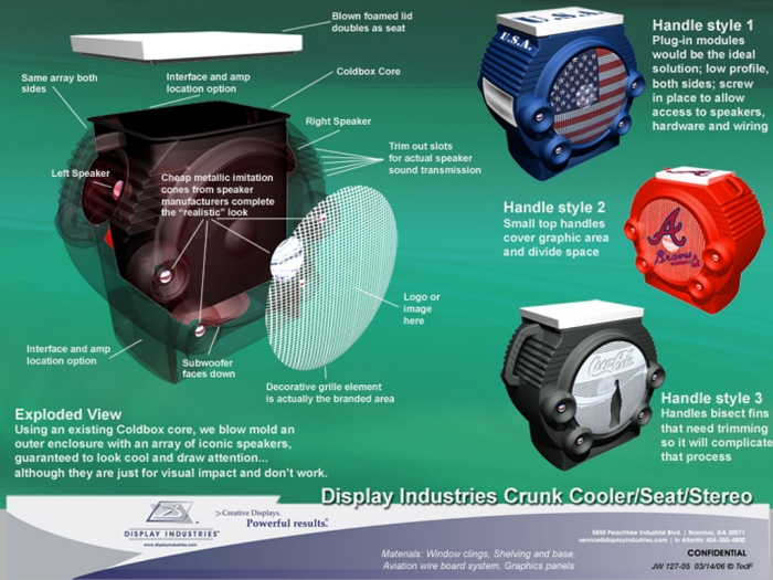
Crunkster Cooler - it uses deceptive appearance to look like a massive speaker, when in fact the volume of the unit holds chilled beverages in a cooler, and the actual speakers are relatively small.
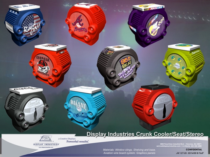
Various graphic treatments for the fake front boom box effect speaker. Crunkster Cooler - it uses deceptive appearance to look like a massive speaker, when in fact the volume of the unit holds chilled beverages in a cooler, and the actual speakers are relatively small.
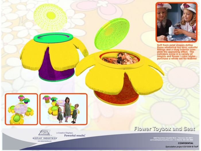
Molds and processes were already in place to make coolers with lids at a former employee. This was my concept of what do do with seconds or damaged 36" tall coolers; convert them into sit-worthy toy chests, with soft sculpture foam flower petals.
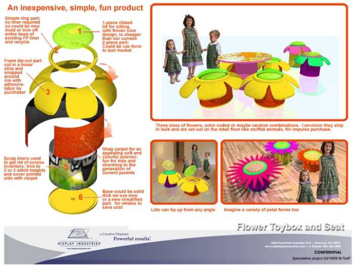
More options for the concept. Molds and processes were already in place to make coolers with lids at a former employee. This was my concept of what do do with seconds or damaged 36" tall coolers; convert them into sit-worthy toy chests, with soft sculpture foam flower petals.

Youth-oriented look for co-branded display
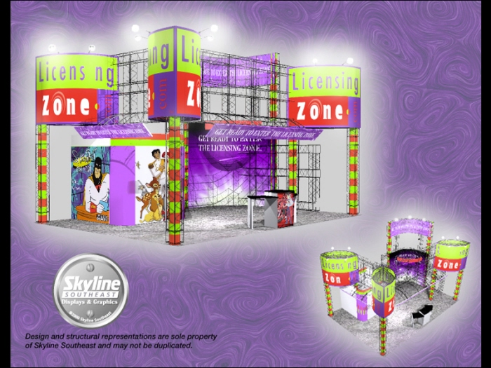
Licensing Zone was one of my trade show clients; they dealt in licensing youth properties. Together we designed a structure to convey their importance on a budget, and provide architecture for the functional presentations and client meetings they would need.
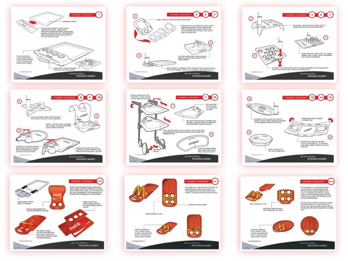
This design was in response to a design challenge from a sales team with small children who spilled their drinks at McDonald's. This series of concepts was an attempt to better the management, branding and experience of handling McDonald's food and beverages from counter to table.
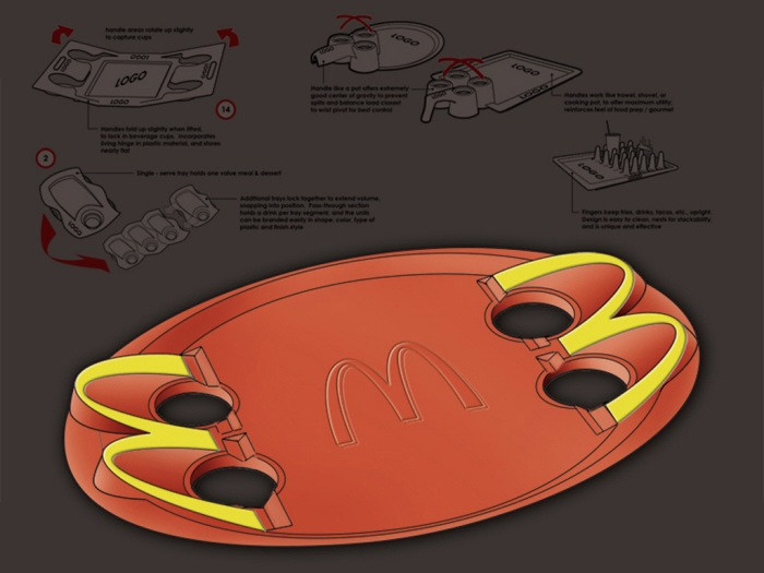
Final concept, new food-friendly McDonald's try design. Featured are the M-Rim and socket for positive drink management, the FryGuide trough to hold the base of fries at an upward angle, and softer elegant forms. This design was in response to a design challenge from a sales team with small children who spilled their drinks at McDonald's. This series of concepts was an attempt to better the management, branding and experience of handling McDonald's food and beverages from counter to table.
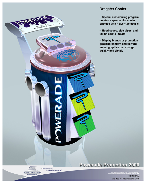
Molds and processes were already in place to make coolers with lids at a former employer. Here is another answer to what we could have done with processes and molds already in place - this was the "boy" oriented answer to the flower toy chest; the race car toy chest. This one is branded for a beverage tie-in. I came up with many concepts to try to capitalize on things the company already counted as capabilities, for easy additional products to add to the line.
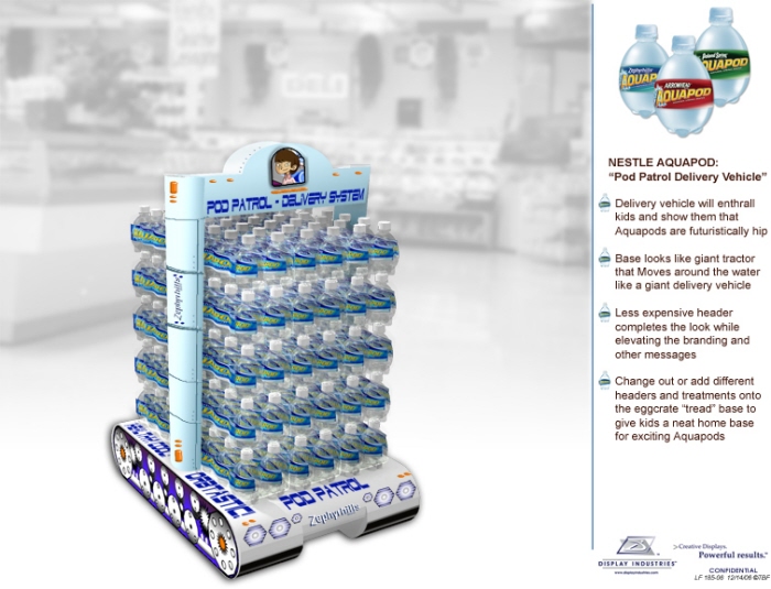
"Kids Water" Corrugated bulk stack glorifier - this concept was an interplanetary water crawler tank.

"Kids Water" Corrugated bulk stack glorifier - this concept was a surfing water bottle.
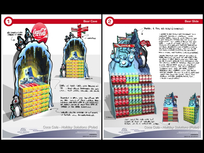
More recent conceptual work for Coca-Cola, using unique corrugated environments to glamorize a bulk stack installation.
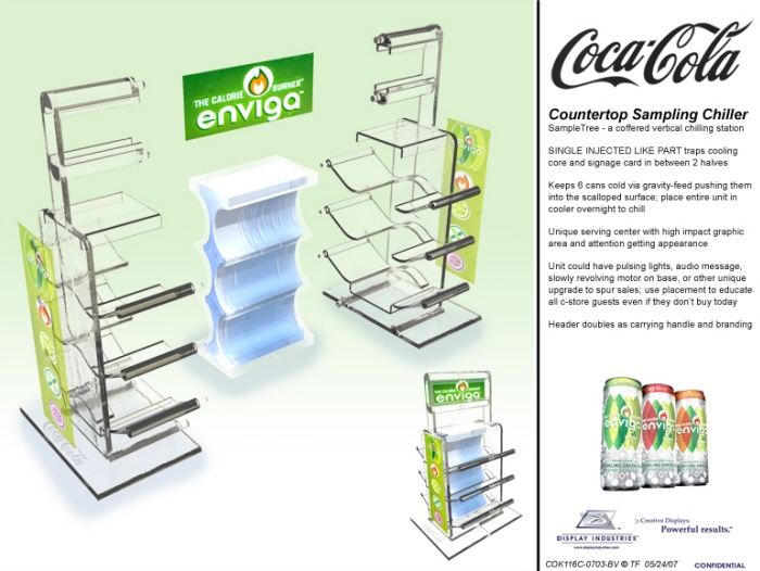
A really great little design, clear injection molded, with one single tool creating a universal half-part, two of which form a unit, capturing a blu-ice cooling core. This was to function as a chilled incremental unit growth countertop promotion at the register.
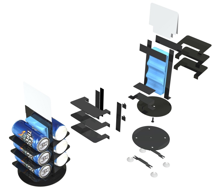
The company decided to go with sheet metal fabrication for the display, and this was the followup solution in an exploded view of the weldments and assembly. This one was award-winning.
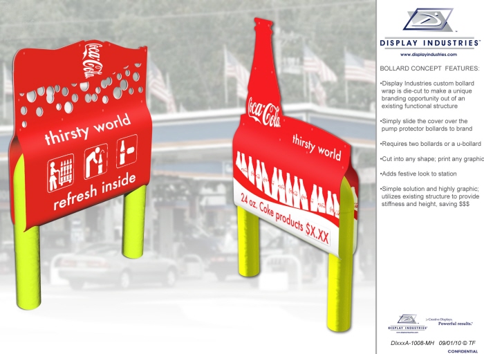
Concepts using the structure of the actual architecture of a convenience store at the pump area, to increase bang for buck of graphic advertising by cannibalizing their hardscape for support.
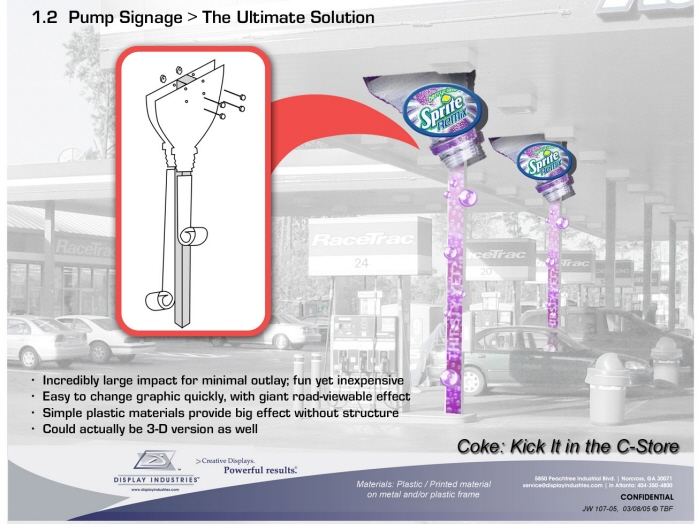
Concepts using the structure of the actual architecture of a convenience store at the pump area, to increase bang for buck of graphic advertising by cannibalizing their hardscape for support. I really liked both of these.
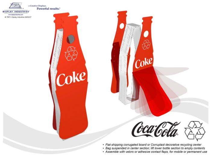
A coke recycling bin that was post-consumer, easy to place, easy to empty; large, iconic, effective. Better for the environment. My employer opted not to present this because it was not plastic injection or blow molded, their most profitable services.
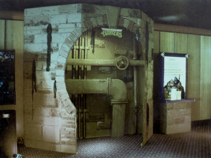
Award winning display for General Cinemas, for Teenage Mutant Ninja Turtles movie. Another "sewer entrance" was built into the wall at the entrance to the theater showing the movie.
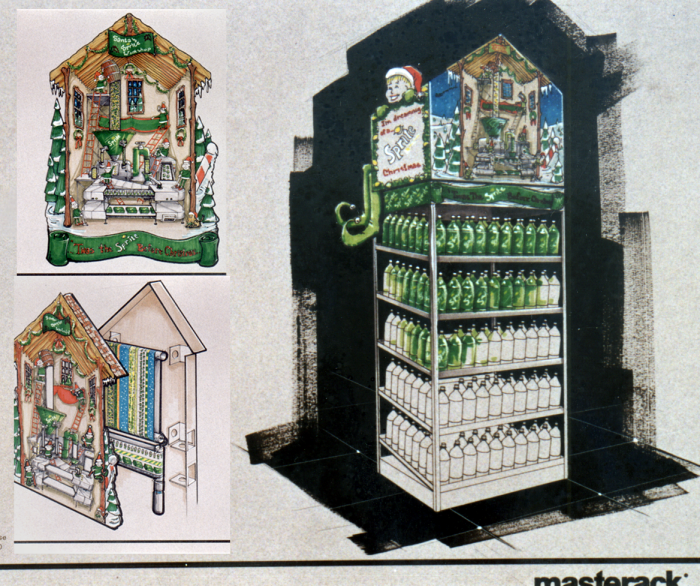
Here's a very old concept but I always thought it would have been a hit. McCauly Culkin was the Sprite Elf this year, and I wanted a continuous loop scroll showing the elves in their factory in the North Pole, making the sprite with conveyor belts and chutes with juice, etc.

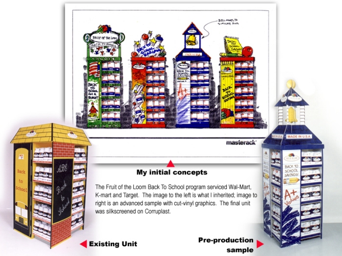
A huge uptick in business resulted from my redesign of this retail unit. Existing design left, 4 concepts center, final solution right.
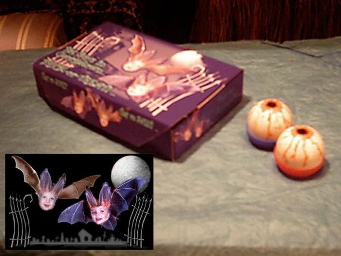
Projects for nieces and nephews - showing my love of fun solutions for little ones. I started making special boxes for the older ones, and soon everyone wanted them.

The whole flat pattern for the boy's halloween box; boys as bats.

Other panels from the "special box"

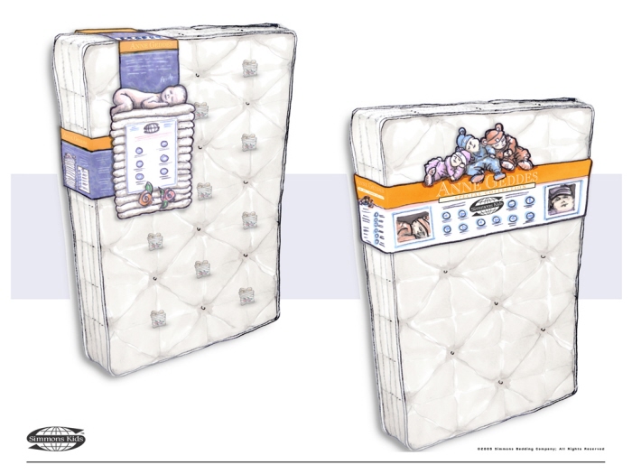
Concepts for Simmons Mattress co-branded mattress with Ann Geddes - final two directions for labeling the new line of mattresses.

Simmons "Dream Baby" development of an iconic image - initial 6 best directions, thumbnail sketches

Simmons "Dream Baby" development

Simmons "Dream Baby" development

Catalog line art, to be used in Pencils PLUS! sales catalog

Graphic Design for a chocolate milk product multi-pack package, done for MeadWestvaco


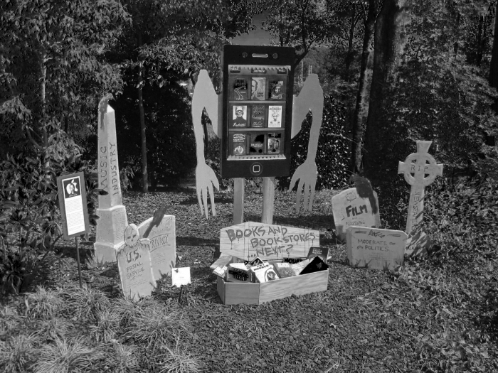
The iCrow, a scarecrow installation (for halloween) in Atlanta Botanical Gardens. Got crows? There's an app for that.... The iCrow is attending to the burial of printed books, standing in the midst of headstones for a number of industries it has essentially caused the demise of.
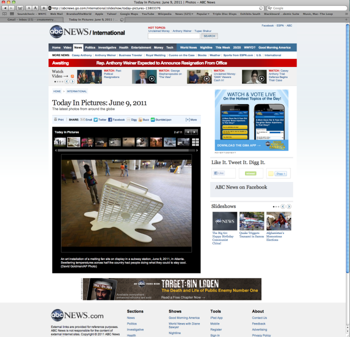
A sculptural concept called "Hotlanta Fan" which was placed in the busiest station in the Atlanta MARTA system, was photographed by the A.P. and went viral, appearing in the printed N.Y. Times among 20,000 other postings online including ABC News, NPR, the Daily Mail, and the MoMA.
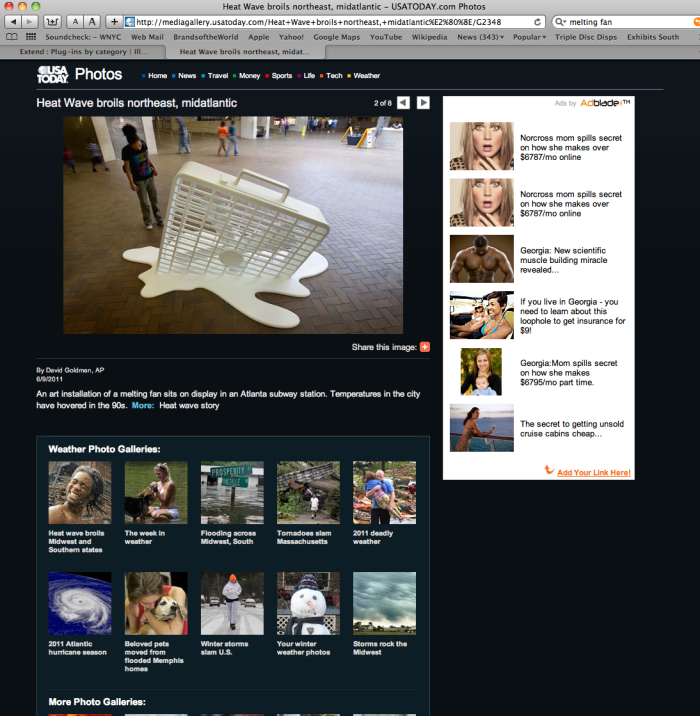
A sculptural concept called "Hotlanta Fan" which was placed in the busiest station in the Atlanta MARTA system, was photographed by the A.P. and went viral, appearing in the printed N.Y. Times among 20,000 other postings online including ABC News, NPR, the Daily Mail, and the MoMA.


My furniture designs as Atomic Playrooms - this item is the CornerBot
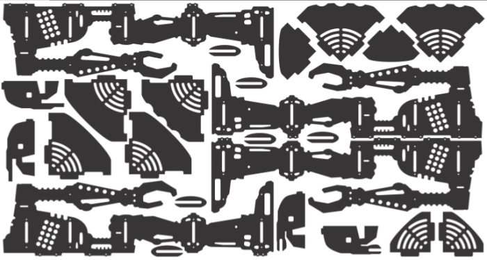
CornerBot production layout per sheet,- engineering design for advantageous manufacture - scale, shape and features of parts optimized for yield of 2 per sheet

My furniture designs as Atomic Playrooms - Rocket Rack - conceptual rendering with color options

Rocket Rack - first and second run manufactured units
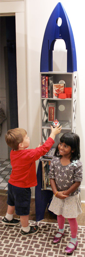
Kids playing with the Rocket Rack - it is: A book shelf, a curio and collectible display, a play environment for action figures, a sculpture, or a media holder.

Small shelves, 14" to 16" wide - additional Atomic Playrooms furniture

ATLAS in Little Shop of Stories, a childrens bookstore 's Decatur, GA.

ATLAS in CAmp LEGO, a kids day camp where you build your own programmable functioning LEGO robot.
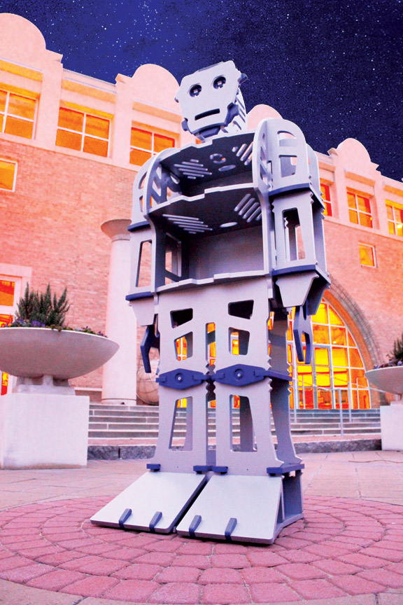
ATLAS at Fernbank Museum in Atlanta, GA. He also resides in the Museum of Design, a Smithsonian affiliate.

And ATLAS, 3rd generation, in a custom orange finish for BIG BANG THEORY, where he now resides on the set of Stewart's Comic Book Store, and is a veteran of multiple episodes.

A fun self-promotion piece from several years ago, showing a variety of portable modular trade show exhibit solutions where candy might be expected.
gLike