
Western Art Academy Cartoon- WAA workshop attendees in Gel Ink Line Art.
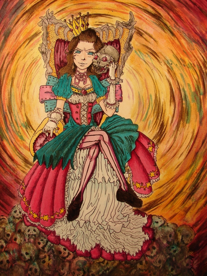
Queen of the Dead- Queen on the throne with skulls in India Ink.

Yellow Submarine- Illustration in Colored Pencil. This was a recreation of the popular Beatles album as requested by a high school friend for his father.
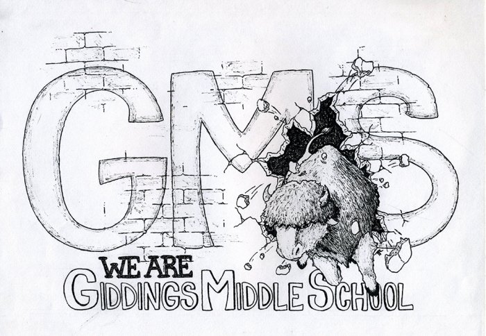
GMS T-shirt- Buffalo bursting through wall in Ink. This is a t-shirt design for my hometown middle school with the school mascot.
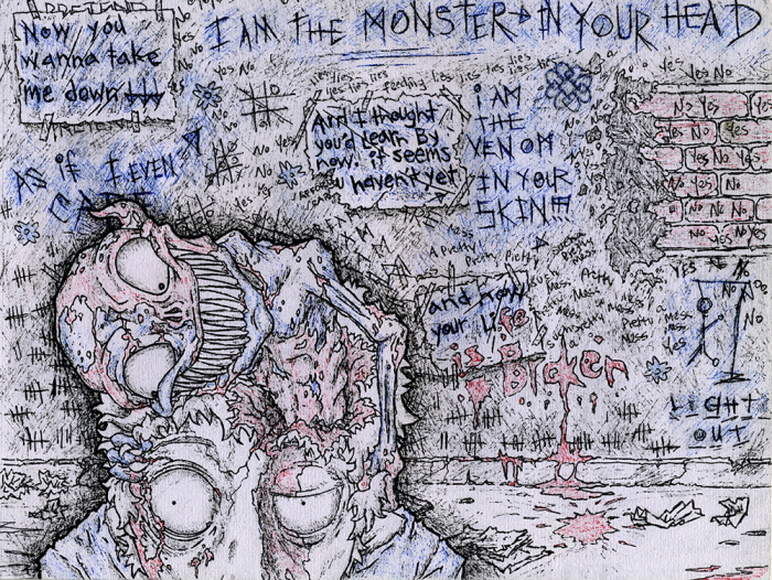
Lights Out Tribute- Insane man with monster in Gel Ink Limited Colors. This illustration is a tribute to the band Breaking Benjamin and a literal play on their song Lights Out.
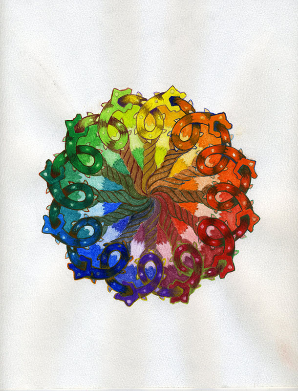
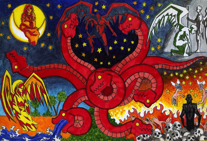
Ouroboros Mandala- Design in Guache Full Color. This illustration is meant to be a circular design in which the patterns are organized around a unifying center. With the actual patterning being a matter of personal taste, I chose to incorporate the Ouroboros symbol, which represents immortality and nature.
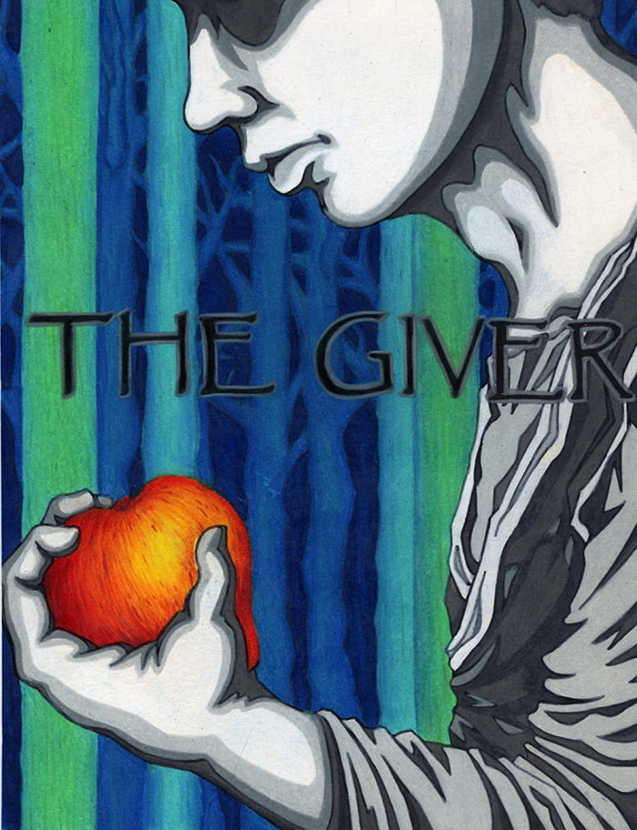
The Giver- Boy gripping apple in Colored Pencil. This is a redesign of the cover for the book The Giver. I wanted to express the stoic and flat, everyday lifestyle of the characters and the difference in comparison to the real apple. Also the blue and green trees in the back become more natural as the recede further and further back.
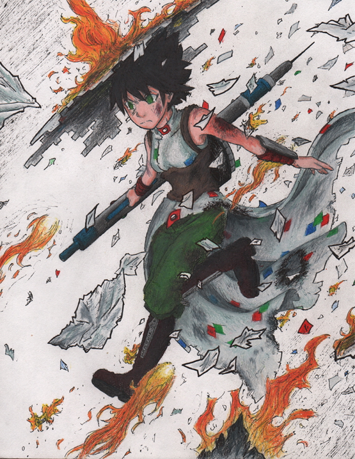
Crippled Defense- Fantasy action scene in Colored Pencil. This illustration displays one of my original character concepts engaged in combat. Made on my own time, this piece is my first application of learned art techniques outside of class near the end of my first semester.
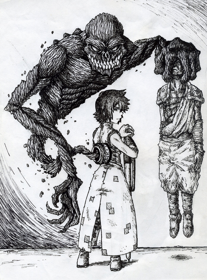
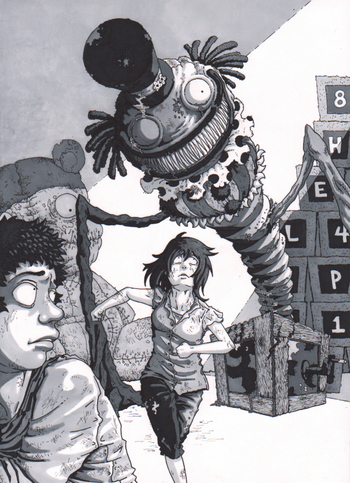
Negotiation- Two figures and a monster in Ink.

Icons of Japan- Illustration in Graphite Pencil. The idea for this assignment was to create 8 icon images relating to one subject with cropped images. I chose do shift between traditional and pop art aspects of Japanese culture. Maneki Neko to Hello Kitty, Koi fish to sushi, calligraphy to anime, and dragon to Godzilla.
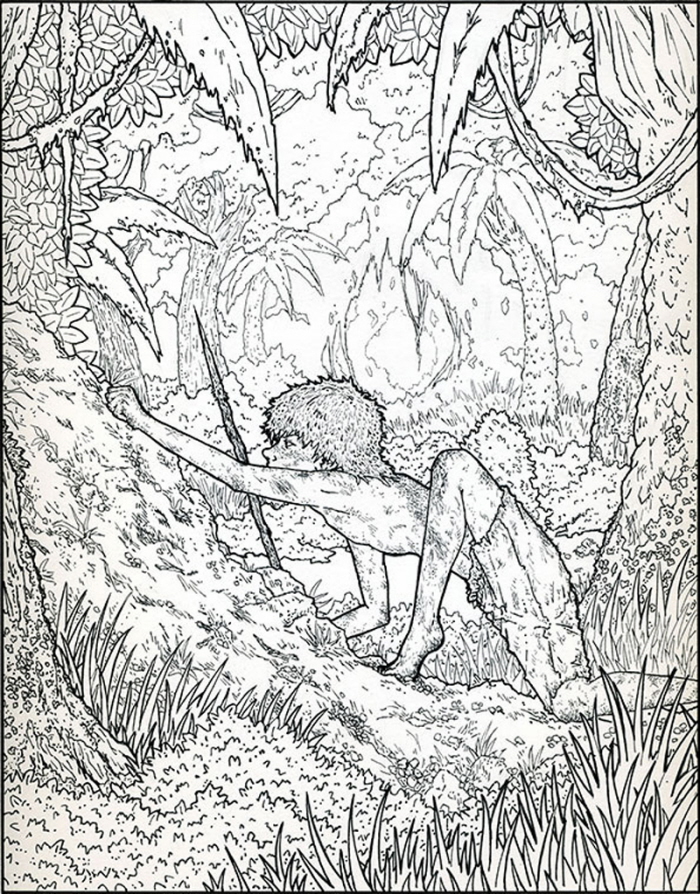
Jack- Boy hunting in forest in Ink Line Art. This piece was illustrated with the book Lord of the Flies in mind. I wanted to delve into Jack's first hunt on the island and highlight the forest as an oppressive being. I also wanted to exaggerate Jack's more animal instincts as he hunts as foreshadowing.
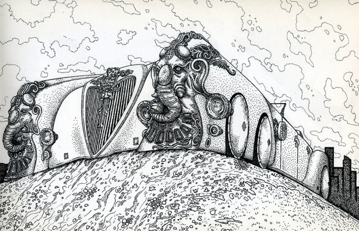
The Automobile- Fictional car in Ink. This illustration is a fisheye view of Nemo's automobile seen in the film "The League of Extraordinary Gentlemen". The angle chosen is mean to both provide foreshortening and exaggerate the car's length as well as bring focus to the front design.

The Chase- One figure chasing other figure in Prismacolor ink. This illustration depicts two of my original characters running through the forest, one chasing the other. This piece was an exploration of the different kinds of linear tones such as stippling and cross hatching.
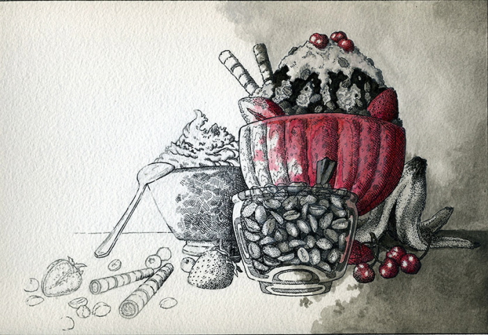
Sundae Emporium- Sundae with ingredients in Graphite Pencil, Ink and Guache. This piece was designed as advertisement for an fictional ice cream parlor. The transition from basic pencil to a complete painting is meant to mirror the idea of customers being able to assemble their personal sundaes from scratch.
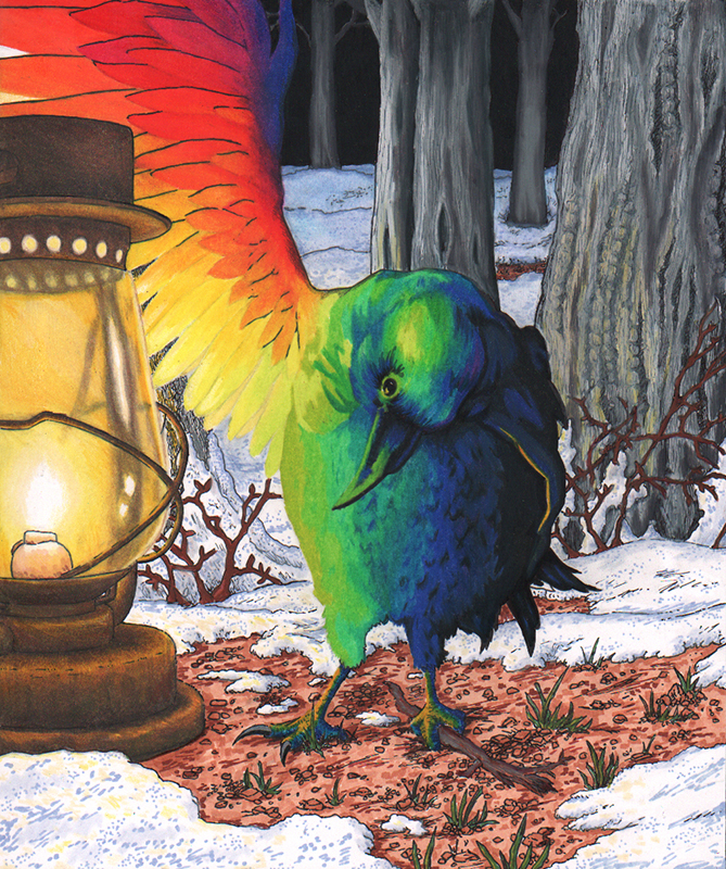
Rainbow Crow- Crow lifting it's wing to lantern light in Colored Pencil and Marker. This piece was created for the Rainbow Crow folklore that tells how the Crow lost it's beautiful rainbow feathers and sing-song voice to save the other animals.
Ma, Don't Look- Jack-in-the-box nightmare in Ink and Marker. This was a redo of an older illustration that I used to measure my progress. I created this with the intention of drawing the eye forward, down and back, exuding depth.
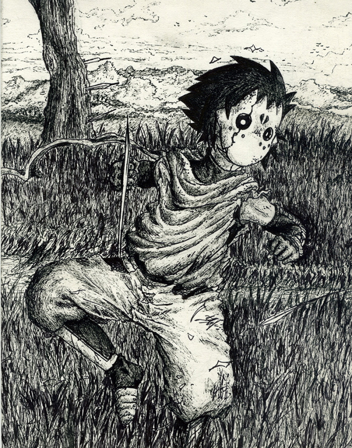
Kirabi- Masked boy midair in Gel Ink.
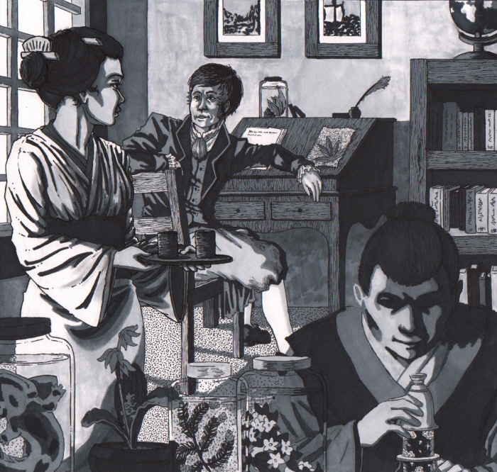
Sakoku- Three figures in Ink and Marker. Depiction of Dr. Philipp Franz von Siebold, his wife and his assistant working in Japan during the country's 200 years of isolation.
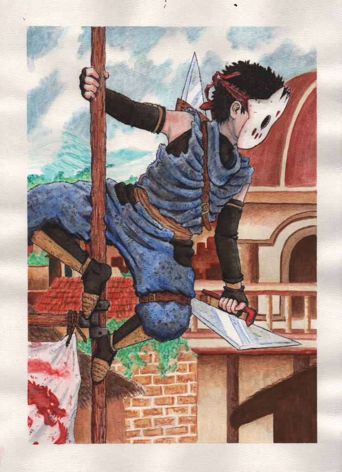
Kirabi Lookout- Masked boy overlooking village in Guache paint. This painting was a display of basic figure understanding with no real narrative or color technique in mind. The character concept and design is an original I created beforehand.
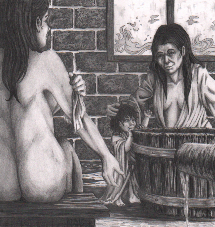
Chinese Bathhouse- Mother and daughters taking a bath in Graphite Pencil. This piece is my interpretation of another's former work on 1600s bathhouses in Asia.

Abuse- Couple in tense embrace in Marker and Colored pencil. This piece was meant to reflect a specific aspect of domestic abuse. Its the morning after a fight and the abused partner returns the other's displays of affection with reluctance. I tried to show an awkward embrace as the boyfriend surprises his girlfriend from behind. He seems to have almost lunged forward to hug her and the crooked smile she gives him is greatly downplayed by the fear in her eyes and the tense placement of her arms. The fresh flowers on the table and drawing on the fridge paint an even bigger picture for us.
The Morgan Beatus- An illuminated manuscript in Marker. This illustration is my own version of the Morgan Beatus' "Woman Clothed in the Sun". My choice to use marker with simple illustrations is meant to reflect the flat figures and symbolism that the Mozarabic style was known for.


Cool Catz- Two cats with musical instruments in Marker. This piece was a redesign of a catalog cover, in this case The Jazz Store. I chose to depict two "cool cats" with wardrobes reminiscent of the Blues Brothers, with sharp lines and mostly flat tones to create a more lively feel than what the original design portrayed.

Snakes and Ladders- A board game cover design in Marker and Photoshop. This assignment was meant to have us design a game cover and text with specified dimensions in a way that drew the eye and appealed to the right target audience.

Working Mom- Article illustration in Ink and Marker. This piece was designed to be a full page illustration for an article that explained the overwhelming task of raising and affording daycare for children with a low income job and demanding hours.

Essential Personnel- an article illustration in Marker and Photoshop. This piece was an illustration for an article geared towards big businesses. The image, while endearing on its own, is meant to elaborate on the dangers of not having contingency plans when a key position in suddenly unfilled. This was an exercise in making points with unconventional comparisons.


Beelzebub- book illustration in Marker and Ink. This piece was a cover design for the book Lord of the Flies. I wanted to illustrate the scene where we are finally introduced to the beast that's been plaguing the boys on the island. I used warm, vibrant colors on the boar and leaves because I wanted to press on the hallucination factor of the actual scene.

Pain Killers- Spot Illustration for online article in Ink wash, watercolor and Photoshop. This illustration was created for a written piece about pharmaceutical drugs that are stolen and replaced with fakes and resold to the public after being watered down or otherwise compromised. The idea was that taking your pills could just as likely harm you as they could help you, and buyers would have no way of knowing which way it would go.


gLike
Illustration
This is a collection of Illustrations from 2011 to the present. The mediums used vary from ink and pen, watercolor, colored pencil, marker, graphite pencil, guache and mixed media.