
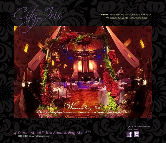
City Iris Splash page design-1 - For this splash/landing page, the second image will rotate using javascript and then will proceed with 2 other images. The purpose of doing this is to create a better brand awareness of floral designs for weddings as well as for the events. The primary navigation buttons appear along the top right. Also, the client requested to place the social media logos along the bottom as he will be using social media to further promote awareness of his brand. Please go to: www.cityiris.net
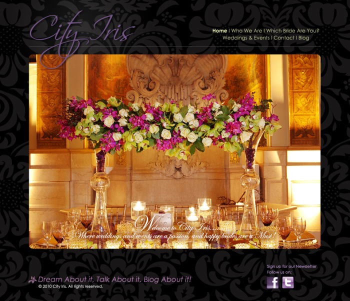
City Iris website: Splash page javascript & jquery, series 2 0f 3 images - For this splash/landing page, the second image will rotate using javascript and then will proceed with 1 other image. The purpose of doing this is to create a better brand awareness of floral designs for weddings as well as for the events. The primary navigation buttons appear along the top right. Also, the client requested to place the social media logos as he will be using social media to further promote his brand. Please go to: www.cityiris.net
City Iris Website: Splash page 3rd javascript image - For this splash/landing page, the second image will rotate using javascript and then will loop back to the first image. The purpose of doing this is to create a better brand awareness of floral designs for weddings as well as for the events. The primary navigation buttons appear along the top right. Also, the client requested to put the social media logos along the bottom as he will be using social media to further promote awareness of his brand. Please go to: www.cityiris.net
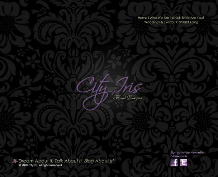
City Iris Splash page design-2 - This is a splash landing page. The purpose of designing this splash page is that the owner wanted to have a series of web images for his events to promote his brand to potential customers. The idea behind using the pattern background is to create the feeling of lavishness and high style for a website catered to weddings and events.
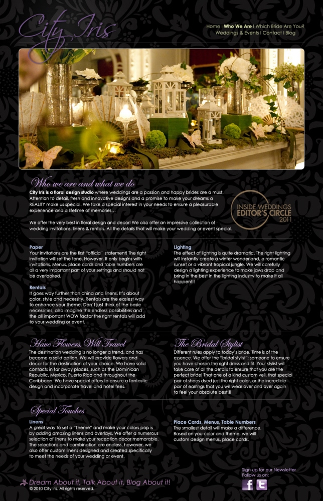
Who We Are, What We Do page design - For the Who we are and what we do page, I wanted to keep to a wide rounded edge photo and to break up the text so that the content was not too long to read. 2 columns of text read better than 1. Also, for the h1 tags, the client also requested that a script type like edwardian be used instead of the standard fonts that come with MAC and PC's. Hairline rules also breaks up the division nicely for better legibility. Visit: www.cityiris.net
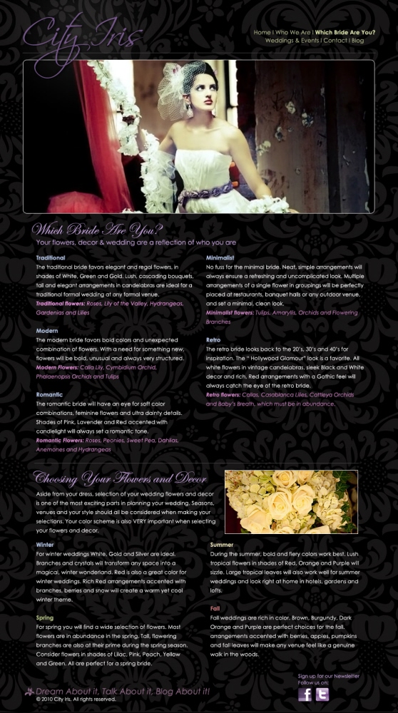
City Iris website: Which Bride Are You? page layout - Keeping to a consistent system will allow for the user of the site to have a better user experience. I made sure to follow a pattern from the previous who we are page. White type on a black field is hard to read but increasing the leading helps for better legibility. Visit: www.cityiris.net
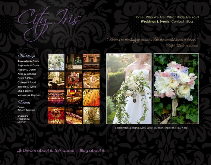
City Iris Gallery page re design 1 - The previous cityiris gallery page was difficult to see the thumbnails and so we decided to go with a larger gallery size. Also, we decided to show 2 photos on one page instead of one and this way, we have the option to show more photos. A secondary navigation was needed so that the user can click on the wedding/event photo gallery of their choice. A quote was added as a reminder to the happy couple, special events that further promotes the cityiris floral designer brand. Visit: www.cityiris.net
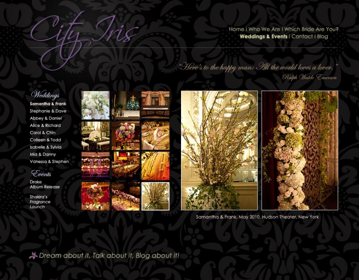
City Iris Gallery page re design 2 - The previous cityiris gallery page was difficult to see the thumbnails and so we decided to go with a larger gallery size. Also, we decided to show 2 photos on one page instead of one and this way, we have the option to show more photos. A secondary navigation was needed so that the user can click on the wedding/event photo gallery of their choice. A quote was added to remind the happy couple or the event locale of the joys of living beautifully & happily. Visit: www.cityiris.net
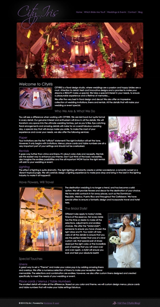
City Iris current website - This is a screen capture of the previous website: www.cityiris.net.

City Iris accordion fold postcard front and back

City Iris accordion fold postcard front and back
gLike