NRC Door Hanging

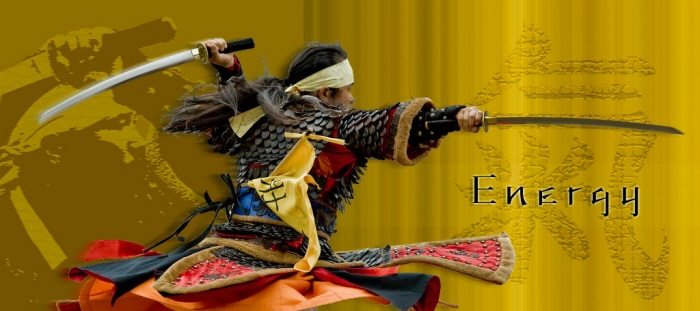
Energy Poster - the idea was to base the design around a sport and a theme of creating the illusion of movement.

Tazo Tea Concepts - Several different concepts I came up with based around constraints. The project was to come up with multiple ideas for a new tazo teabox design that had to include specific fonts and information.

Gyro Horizon (Cover Art) - Made an artistic cover for my friend's music project, Gyro Horizon. I balanced the imagry and colors around the themes of his music.

Xbox360 Gears of War Bundle Design - I've taken a look at what I thought could be an improved design on the box cover of an Xbox360 bundle.
This is my recreation of the front cover of the package design for the bundle.
I took a bunch of images sourced from google searches to collect the majority of the resources in this design. The background was created from concrete/metal textures with a red solid blended in. The Xbox font was downloaded from http://www.dafont.com/x360.font

GoW360 Design Comparsion - This is a reduced size image of my redesign of the 360 Gears of War bundle compared to the actual design of the bundle in retail stores.

Hancock building - In a future without man... - Image I put together from pictures I found off the net. This project is based off of a contest theme from the website www.worth1000.com.
In this theme it was making buildings of the now look what they would look like 100s of years in the future if man were to just disappear... In this case, it's the John Hancock building.

The Real Donkey Kong Country - Remember playing DK Country in the early 90s? This is what one of those mine cart levels would look like.

The American Gothic Restoration - I started with a copy of the famous American Gothic Painting gone wrong. The ruined photo looks like it went to hell and back. Of course, when life gets your photo down... Photoshop it.

Small World - Took myself from a photograph walking in a Slot Canyon in one of Utah's national parks and a photo of my DSi on the coffee table.
I adjusted the hue and saturation of myself, added noise, a blur, and masked myself into the photo.

Composite Image (A Mystic's Desk) - Composite Image constructed from various images I found from the internet.
This project was made for a photoshop class.

Parking Ticket - This project I learned how to use masking.

Monster Animal - More Masking Techniques.

Energy - Had to make a design based off of a sport. In this case it's Martial Arts.
This version the noise gradient is more monochromatic.

Truth in Advertising - This was a school assignment where the intention was to portray the falseness of advertising. I suppose it could use more work as I'm not sure the message is clear. (It was supposed to point out the dramatic difference of the packaging design compared to the looks of the real deal.)
The details of the exhibition are made up.
gLike