
Linkin Park layout - This is the first page of a three page spread I did when I first started designing for my school magazine.
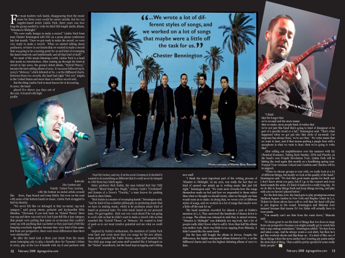
Linkin Park spread - This is the rest of the Linkin Park package that was done on a double truck.
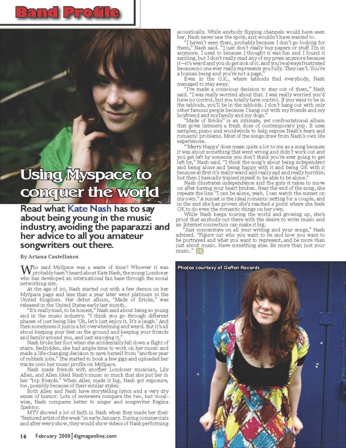
Kate Nash layout - I like this design because it is simple and clean.
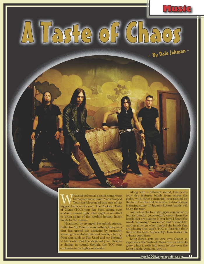
A Taste of Chaos layout
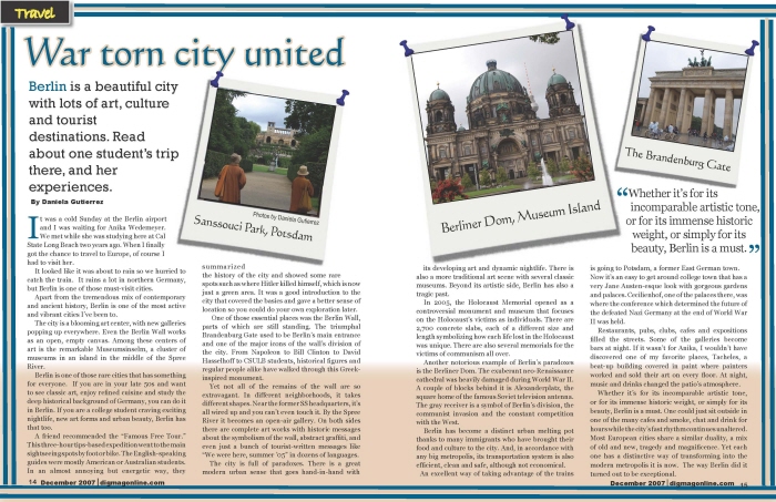
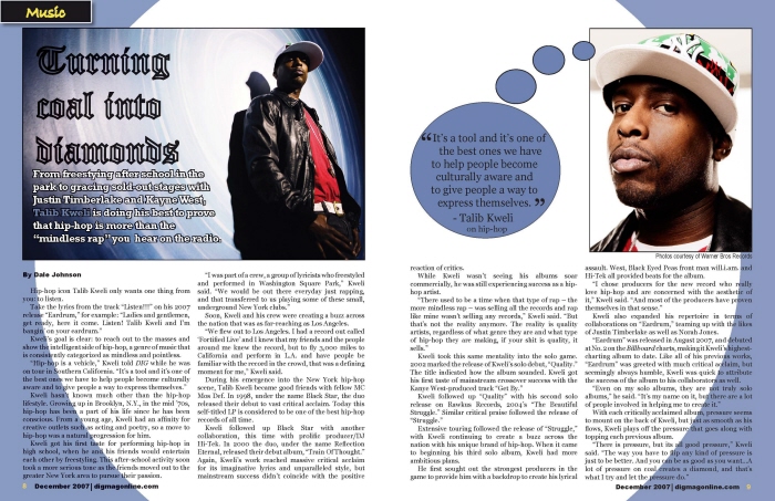
Travel spread - I like this design because I think it is something different and it definitely catches the reader's eye.
gLike