
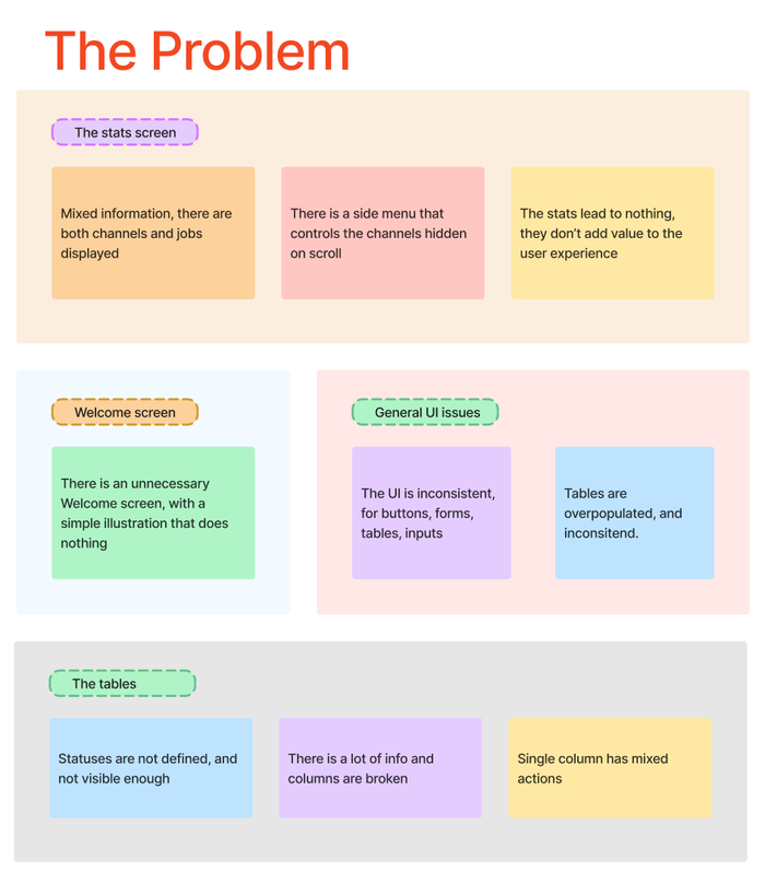
There were a lot of issues considering the UX and UI of this app, First we started with a split in the stats screens, and the obvious removing of the welcome screen.
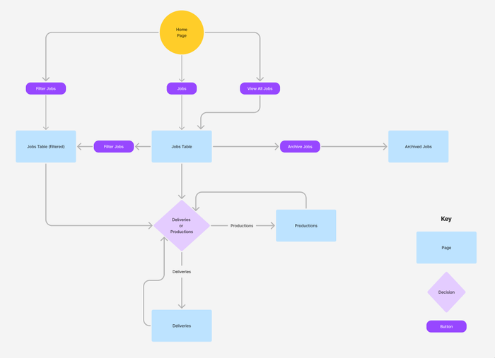
We've created a flow where the stats(Home) page is directly connected to the jobs, and allows different kinds of filtering via cards and the chart
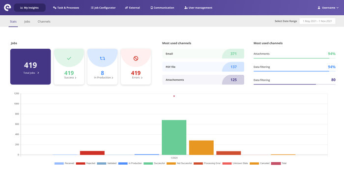
Now the stats page allows for the user to directly filter out the Successful, In Production or Error jobs - there were the most important statuses.
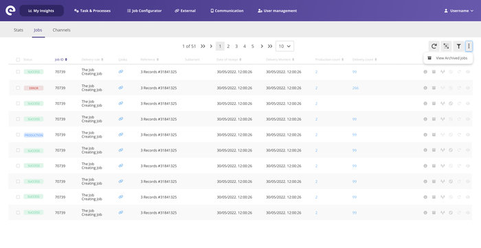
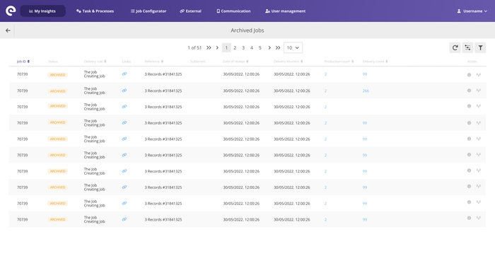
This is the jobs table, that displays jobs with various statuses. We added pagination, because of the large number of jobs, and to increase a speed of preview. There is also an option to Archive old jobs to remove them from the main table. We have included a filter and a column toggle.


The prototype is available on the "View Website" button below
gLike