
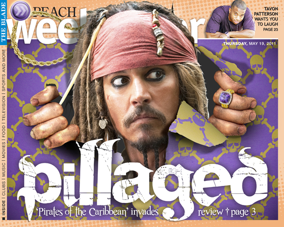
Thursday, May 19, 2011 Weekender cover - I was fairly sure this was going to be the week of the Pirate. With so much Pirate marketing, I wanted to do something to make us stand out. I decided to combine some of the press photography with a lot of PhotoShop to give the illusion that Johnny Depp was ransacking our cover. The skull and crossbones pattern was done in Illustrator to sort of resemble Louis Vuitton. A lot of shading, a lot of blending. The dirt on his hands was applied with numerous layers.


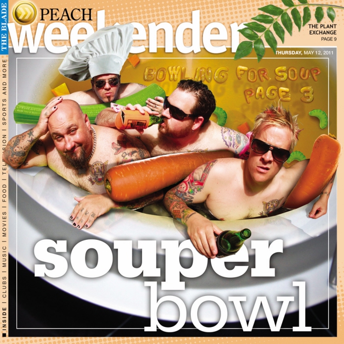
Thursday, May 12, 2011 Weekender cover - I had some press photography of the band, I clipped it, replaced the pool toys they had with vegetables and chicken broth in PhotoShop. Actually, this was rather difficult. I had a really hard time getting the angles to match. The soup noodle lettering was created from multiple photos heavily worked in PhotoShop.
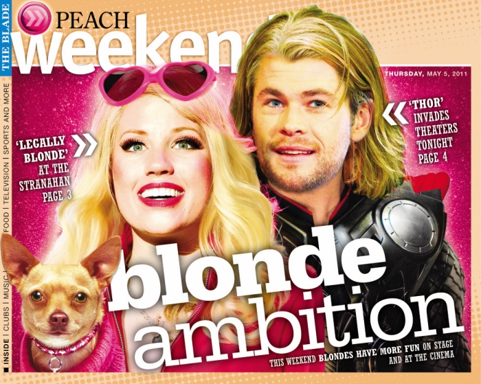
Thursday, May 5, 2011 Weekender cover - Two major entertainment options for one weekend. My idea was to sort of mock the blondness. It actually took a lot of work to make Thor look so giddy. I took the press photos and merged them with some shots of the actor to get a happier Thor. The Legally Blond actress is an amalgam of about four images. But, the chihuahua is unaltered!
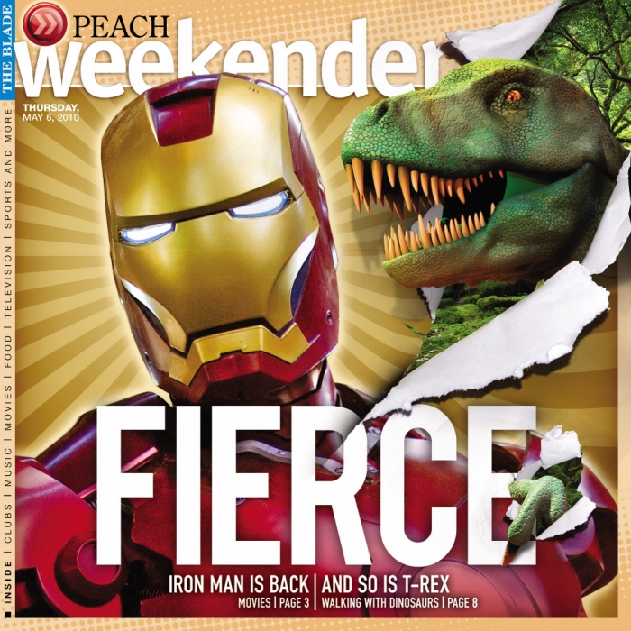
Thursday, March 6, 2010 Weekender cover - We couldn't decide if we should feature the major new movie release or the 'Walking with Dino's' show coming to town. The end result was both. I wanted to avoid a lot of clutter and keep the design clean and to the point. I did a lot of work in PhotoShop to get the piercing effect of the Dinosaur.
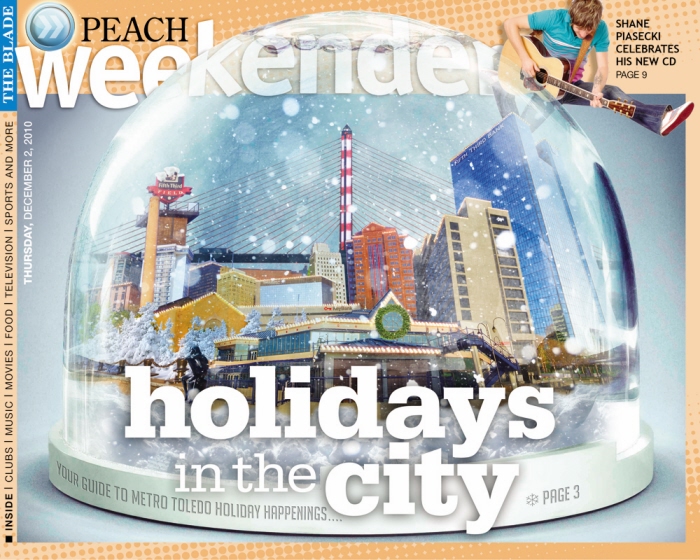
Thursday, December 2, 2010 Weekender cover - In PhotoShop, I blended about fifty separate photos of downtown Toledo along with images of holiday lights, and decor. The challenge was trying to get a distorted realism.
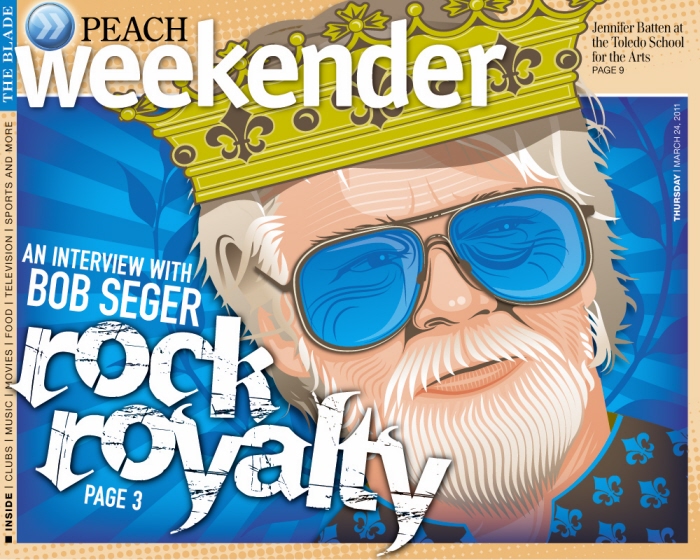
Thursday, March 24, 2011 Weekender cover - This was primarily created in Illustrator, with some effects applied in PhotoShop.
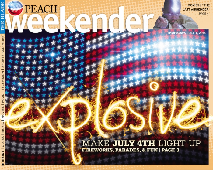
Thursday, July 10, 2010 Weekender Cover - I created a brush in Illustrator from multiple vectorized photos of fireworks to get the type effect, then I moved it into PhotoShop and blended several layers to get the color gradations.
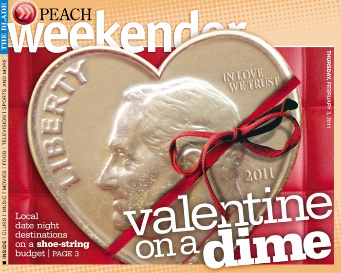
Thursday, February 3, 2011 Weekender cover - Heavy photoshopping of a few separate photos of a dime. I leaned heavily on Illustrator to get the correct lines.
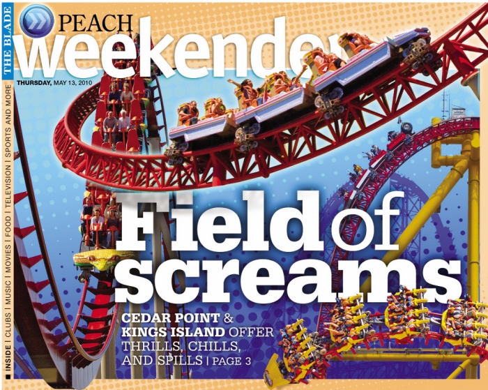
Thursday, March 13, 2010 Weekender Covers - I took a ton of press photography and painstakingly clipped it out in PhotoShop. I then bent it, twisted it, and forced it to work in the design.
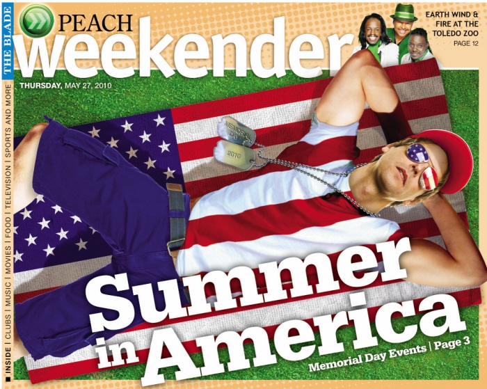
Thursday, May 27, 2010 Weekender Cover - The idea was to create a cover that represented 'Memorial Day.' But, what really represents Memorial Day, aside from marching vets... So, I came up with this idea after a lot of brainstorming. I wanted something that would feel very three dimensional and a little surreal.
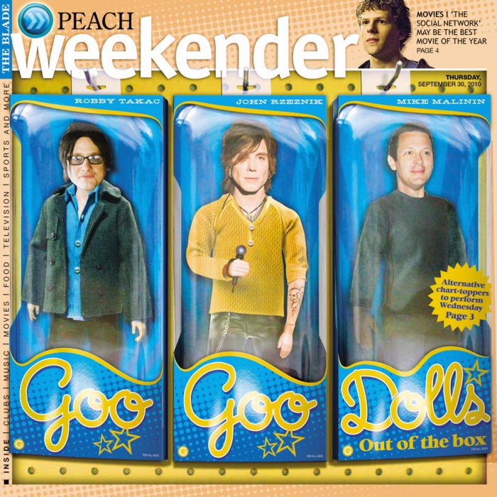
Thursday, September 30, 2010 Weekender cover - A lot of PhotoShop and Illustrator work to try to replicate the effect of action figures in glossy cardboard and cellophane boxes.
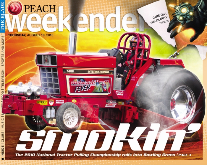
Thursday, August 19, 2010 Weekender cover - A lot of PhotoShop rework, including multiple photos applied in varying layer effects to get the smoke.
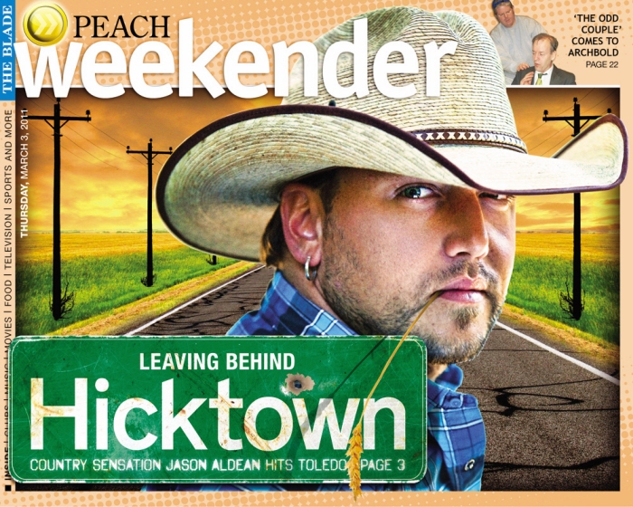
Thursday March 3, 2011 Weekender cover - Heavy photoshop illustration for the cover of our weekly weekender section. The background is totally manufactured from several photos. The sign was created by using illustrator and PhotoShop.
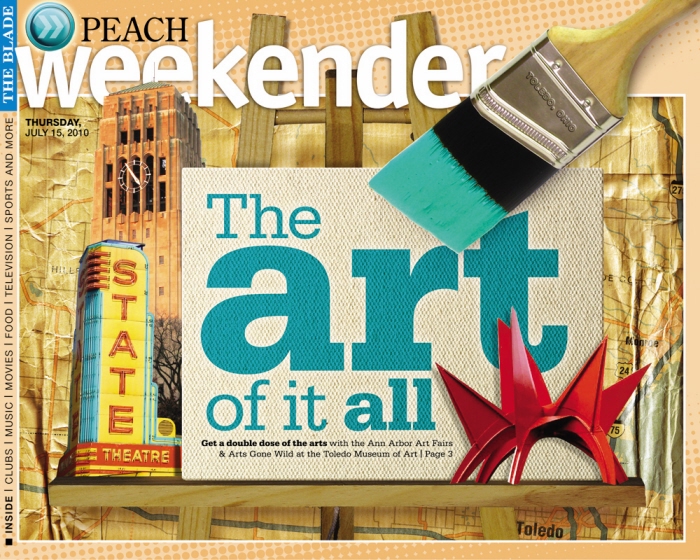
Thursday, July 15, 2010 Weekender cover - PhotoShop illustration combining multiple recognizeable local Arts elements.
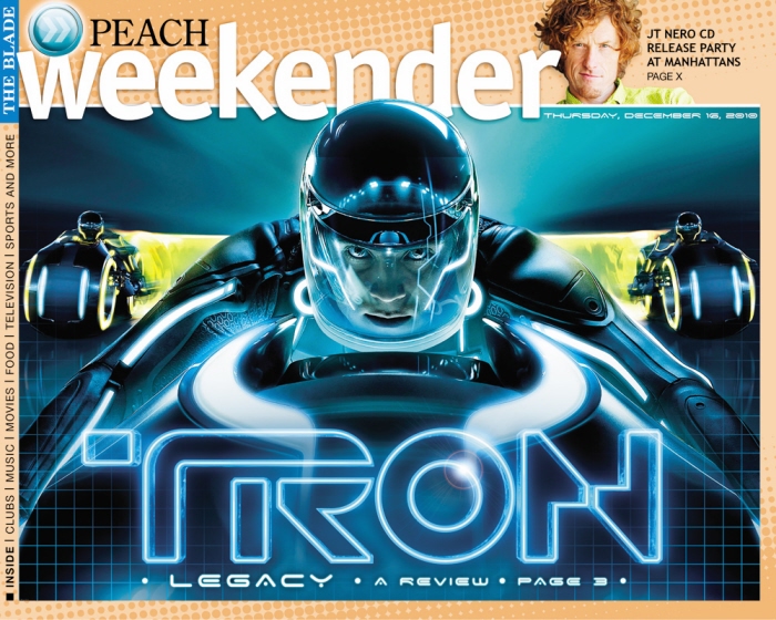
Thursday, December 12, 2010 Weekender cover - I significantly reworked the provided press photography. I really wanted it to feel symmetrical and commanding.
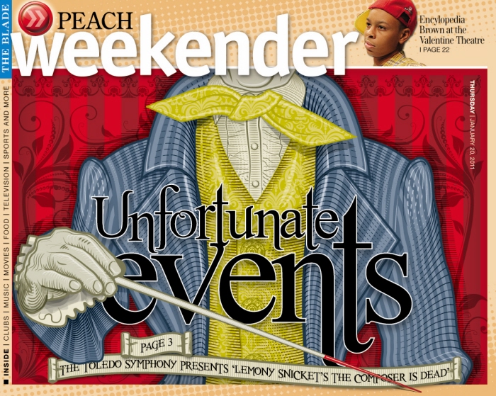
Thursday, January 20, 2011 Weekender cover - This was totally created in Illustrator. I wanted sort of a surreal version of woodcut.
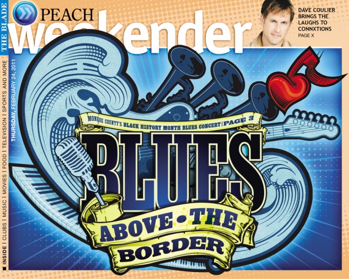
Thursday, February 24, 2011 Weekender cover - This is a real blend of Illustrator and PhotoShop. I was really influenced by tattoo design.
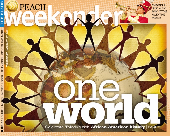
Thursday, January 27, 2011 Weekender cover - The original paper-cut figures were created in illustrator and then moved into PhotoShop to render the textures and effects.
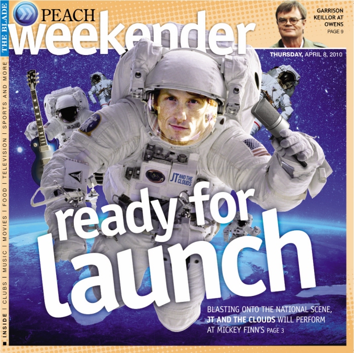
Thursday, April 8, 2010 Weekender cover - We didn't have very good photography to work with and it was impossible to get a photographer to shoot them. So, I took what I had and reworked it into a photo illustration that hopefully made the point about a band that was starting to get national attention.
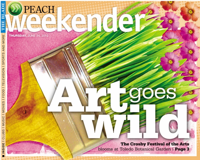
Thursday, June 24, 2010 Weekender Cover - The challenge was to create an icon that would represent a big local festival that wasn't incredibly specific. The art on display is up for auction, so anything we could use may or may not be available and wouldn't really capture the entirety of the work. I created this totally in PhotoShop. I wanted it to feel simple and clean.
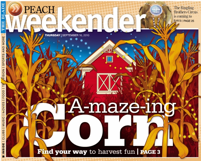
Thursday, September 16, 2010 Weekender cover - This was totally created in Illustrator, along with some hand illustration. I wanted the effect to feel immediately simple with loads of complexity upon further inspection.
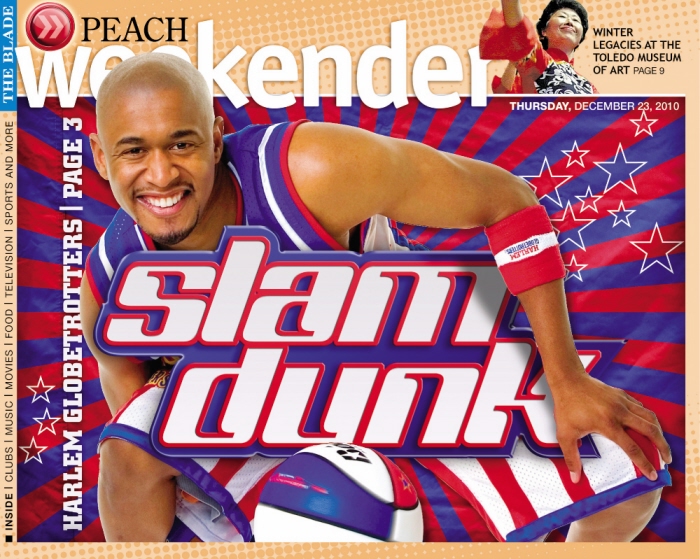
Thursday, December 23, 2010 Weekender cover - I reworked a few press photos of the Globetrotters and created the background to present something that hopefully appears really dynamic and fun.
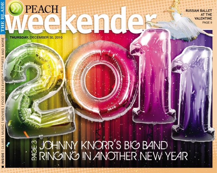
Thursday, December 30, 2010 Weekender cover - Our photos were not so great, so I created this using multiple photos reworked in PhotoShop along with some traditional hand illustration and work in Illustrator.
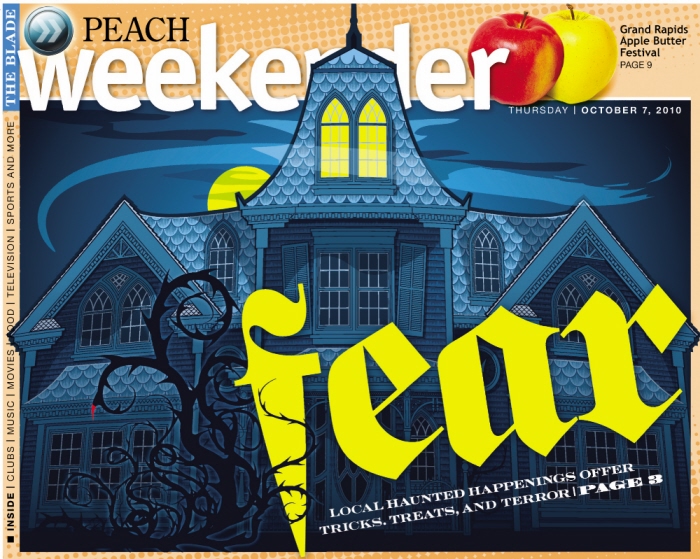
Thursday, October 7, 2010 Weekender cover - This was primarily completed in illustrator. The challenge was to achieve a color that would read as dark without reading as dull.

Thursday, August 26, 2010 Weekender cover - I created a beer label for the headline in Illustrator and then brought it into PhotoShop to smooth out the edges and apply it over the photos of beer that I merged for the layout.


Heavy duty photo illustration.


gLike