
24 Hour Fitness Presentation 01 - The client asked for a presentation that would be able to play through continuously but also allow for the user to choose what they view. The six hexagons are your primary navigation. When one is selected from the main screen they transition to the bottom of the screen to be paired with the playback controls. Designed while at 2ndNature, unfortunately I was not able to finish the development of the project.
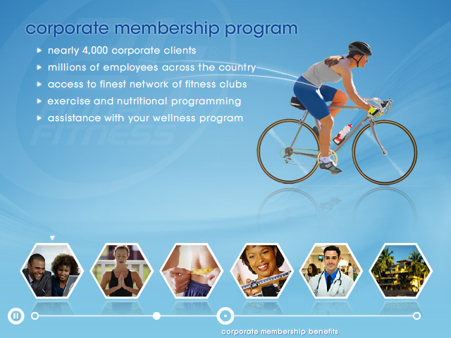
24 Hour Fitness Presentation 02 - The client asked for a presentation that would be able to play through continuously but also allow for the user to choose what they view. The six hexagons are your primary navigation. When one is selected from the main screen they transition to the bottom of the screen to be paired with the playback controls. Designed while at 2ndNature, unfortunately I was not able to finish the development of the project.
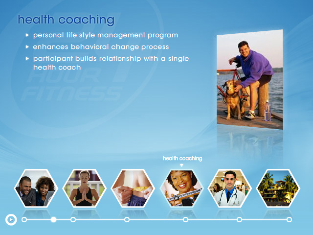
24 Hour Fitness Presentation 03 - The client asked for a presentation that would be able to play through continuously but also allow for the user to choose what they view. The six hexagons are your primary navigation. When one is selected from the main screen they transition to the bottom of the screen to be paired with the playback controls. Designed while at 2ndNature, unfortunately I was not able to finish the development of the project.
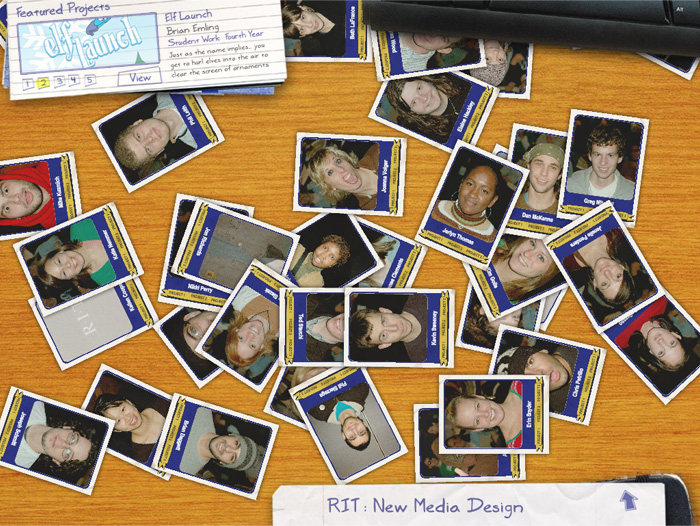
Class Project Site 01 - The goal of this project was to design an interface to be used as a portal for student projects. By clicking one of the cards, the card would rotate a scale into the center where you would be able to select a link to the one of three projects created by the student. All design work was created in Photoshop and then brought into Flash for development.
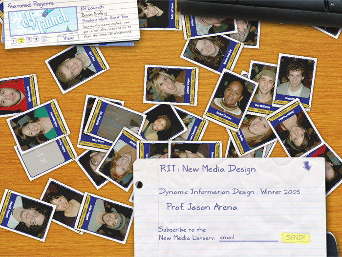
Class Project Site 02 - The goal of this project was to design an interface to be used as a portal for student projects. By clicking one of the cards, the card would rotate a scale into the center where you would be able to select a link to the one of three projects created by the student. All design work was created in Photoshop and then brought into Flash for development.
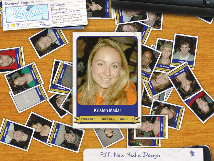
Class Project Site 03 - The goal of this project was to design an interface to be used as a portal for student projects. By clicking one of the cards, the card would rotate a scale into the center where you would be able to select a link to the one of three projects created by the student. All design work was created in Photoshop and then brought into Flash for development.
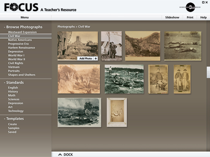
Focus 01 - Comps for an interactive teacher's resource CD-Rom created for the George Eastman House in Rochester, NY. As part of RIT's New Media Team Project, each designer developed their own comps to provide the client with alternative designs to choose from. This design was not chosen and credit goes to Jack Kalish for the final design that went into production.
Final Project:
www.kalicious.com/projects/interactive/focus/launch/
Check out Jack's work at:
www.kalicious.com
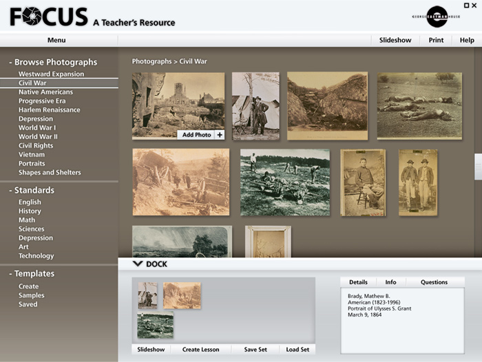
Focus 02 - Comps for an interactive teacher's resource CD-Rom created for the George Eastman House in Rochester, NY. As part of RIT's New Media Team Project, each designer developed their own comps to provide the client with alternative designs to choose from. This design was not chosen and credit goes to Jack Kalish for the final design that went into production.
Final Project:
www.kalicious.com/projects/interactive/focus/launch/
Check out Jack's work at:
www.kalicious.com
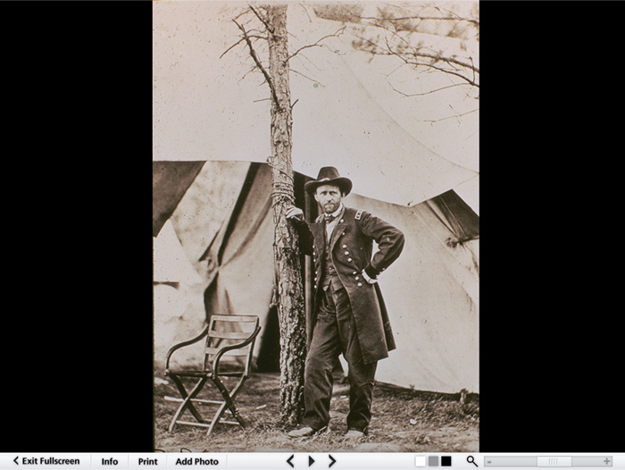
Focus 03 - Comps for an interactive teacher's resource CD-Rom created for the George Eastman House in Rochester, NY. As part of RIT's New Media Team Project, each designer developed their own comps to provide the client with alternative designs to choose from. This design was not chosen and credit goes to Jack Kalish for the final design that went into production.
Final Project:
www.kalicious.com/projects/interactive/focus/launch/
Check out Jack's work at:
www.kalicious.com
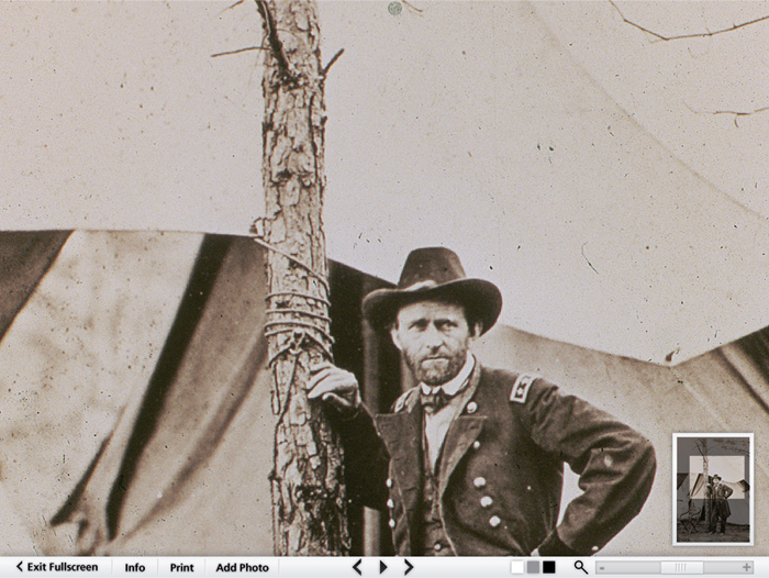
Focus 04 - Comps for an interactive teacher's resource CD-Rom created for the George Eastman House in Rochester, NY. As part of RIT's New Media Team Project, each designer developed their own comps to provide the client with alternative designs to choose from. This design was not chosen and credit goes to Jack Kalish for the final design that went into production.
Final Project:
www.kalicious.com/projects/interactive/focus/launch/
Check out Jack's work at:
www.kalicious.com
gLike