
Contrast, 2013. This photo represents contrast because it has opposite textures. On this photo i used hue and saturation.
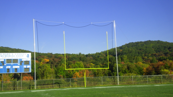
Balance, 2013. This photo represents Balance because of the same shape of each side of the field goals. I used saturation on this picture
Emphasis, 2013. This photo represents emphasis because the picture is focused on one particular object. I used hue and saturation on the picture.
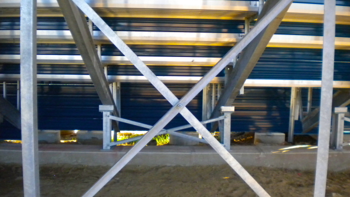
Unity, 2013. This photo represents Unity because of the way that the bars are equal on both sides. I used vibrance on this picture.
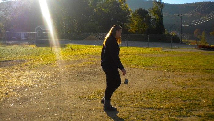
Movement, 2013. This photo represents movement because the girl is walking in one direction which is movement. I used saturation on this picture.
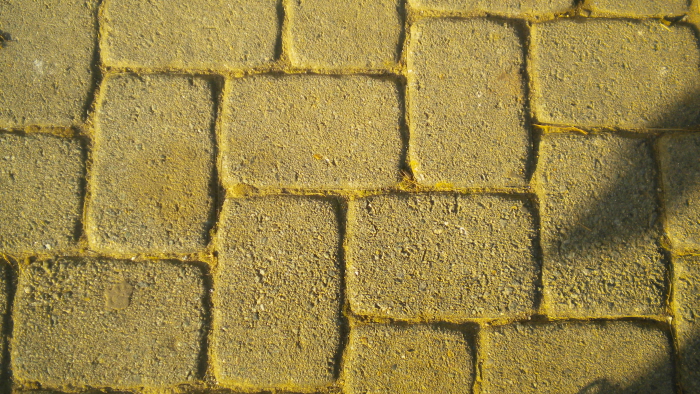
Pattern, 2013. This photo represents pattern because of the way the lines in between the blocks create a unique pattern. I used hue and saturation on this picture.
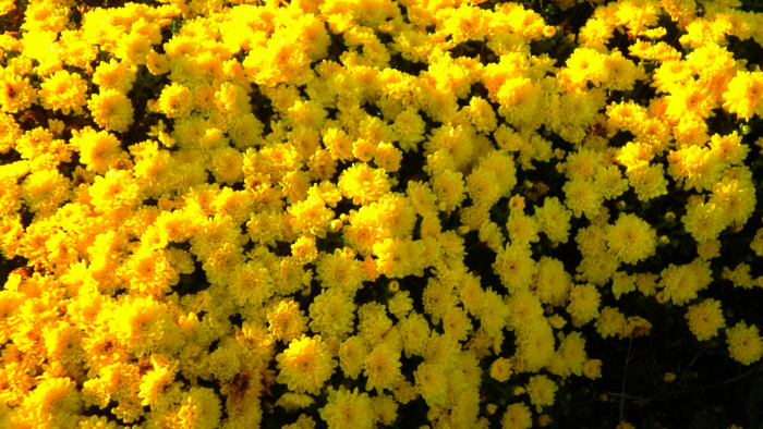
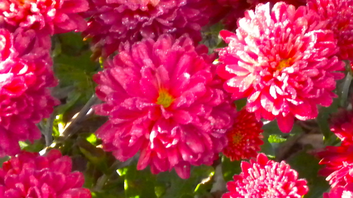
Artist choice, 2013. This photo represents emphasis because it it showing many different points of interest in the photo. It also represents unity because of the way the pedals are set up and how they are equal on all the different sides. This photo also represents texture and color because of all the different pedals and the rich color of the yellow. I used saturation and curves on this picture.
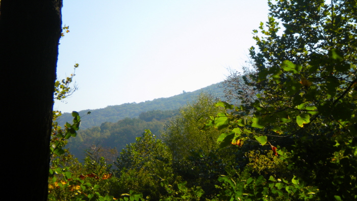
Artist Choice, 2013. This photo represents contrast because all the different shapes and textures in the picture. This photo also represents emphasis because of all the different points of interest. This photo represents space because of the depth in the picture and all the space throughout the picture. This photo represents texture because of the different shapes and textures like the tree on the side. I used hue and saturation on this picture with vibrance.
gLike
Principles of Design
1. Contrast
2. Balance
3. Emphasis
4. Unity
5. Movement
6. Pattern