
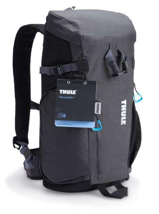
Managed team of designers to develop wide range of different types of packaging for the Thule brand soft goods. From matte plastic boxes to black core shell hang tags, there were multiple structures and materials that tie back to the core Thule heritage packaging.
View PDF
View PDF

Hinge box that swings open to allow access to the product while also allowing ease of keeping the box together at retail.
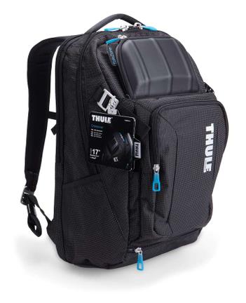
Accordion Hang Tag - image 1
This hang tag was created to allow the packaging to interact with the end consumer. Metal touch points allowed a high-end feel while increasing the strength of the attachment point. Magnets held the tag closed until the consumer went to look at the internal information. The quick and easy closure that the magnet provided helped ensure that the consumer would put it back together once they were done reading.
View PDF
View PDF
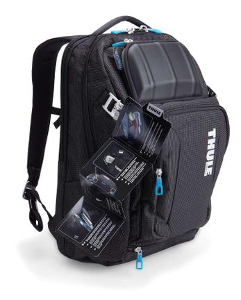
Accordion Hang Tag - image 2
This hang tag was created to allow the packaging to interact with the end consumer. Metal touch points allowed a high-end feel while increasing the strength of the attachment point. Magnets held the tag closed until the consumer went to look at the internal information. The quick and easy closure that the magnet provided helped ensure that the consumer would put it back together once they were done reading.
View PDF
View PDF
Black Core Hang Tag Booklet - image 1
This evolution of the Thule hang tag was developed to solve two problems:
1. when black packaging was printed on white paper it would often crease and leave white marks as well as white edges on the packaging and 2. goods were often on a "fast track" timeline and the packaging had to be created prior to receiving samples that could be photographed.
We continued using the metal touch points ensuring the high-end feel while increasing the strength of the attachment point. The internal pages were developed using an accordion fold as a nod back to the original packaging as well was making sure that the tags were assembled correctly (a problem that the company often faced). The content was broken up by language for ease of use by the end consumer.
View PDF
View PDF

Black Core Hang Tag Booklet - image 2
This evolution of the Thule hang tag was developed to solve two problems:
1. when black packaging was printed on white paper it would often crease and leave white marks as well as white edges on the packaging and 2. goods were often on a "fast track" timeline and the packaging had to be created prior to receiving samples that could be photographed.
We continued using the metal touch points ensuring the high-end feel while increasing the strength of the attachment point. The internal pages were developed using an accordion fold as a nod back to the original packaging as well was making sure that the tags were assembled correctly (a problem that the company often faced). The content was broken up by language for ease of use by the end consumer.
View PDF
View PDF

Basic Hang Tag - image 1
Some products did not need the room for information and explanation of features/benefits that was needed on the more technical packs and bags. A simple two sided hang tag was developed for the products to help keep costs down and margins healthy.
Keeping select metal touch points continued to allow the high-end feel while increasing the strength of the attachment point.
View PDF
View PDF


gLike
Packaging
Managed team of designers to develop wide range of different types of packaging for the Thule and Case Logic brand soft goods.