
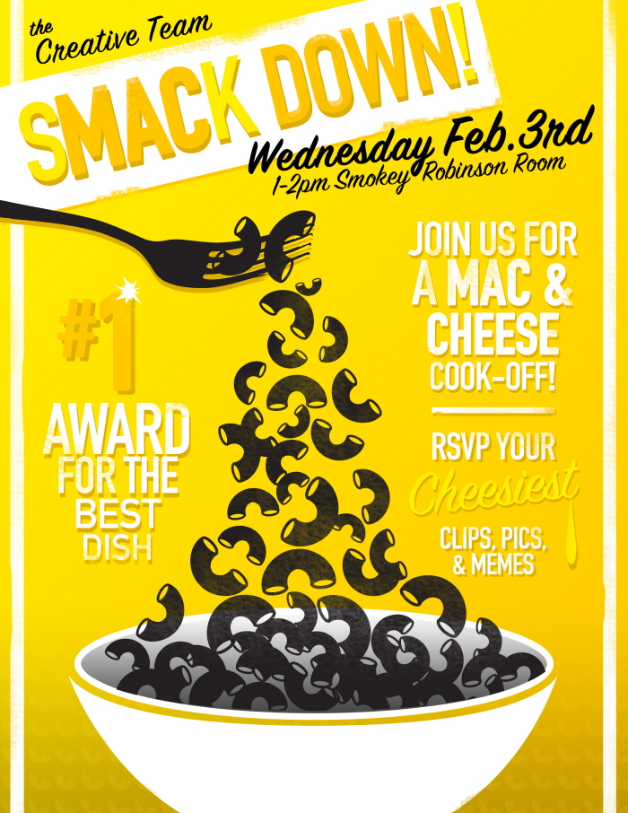
sMACk Down Poster
Poster I threw together for a work event (that I hosted) for fun recently. Wanted vibrant and cheese related colors. Went with an almost retro look inspired by a recent trip to a Detroit print shop.


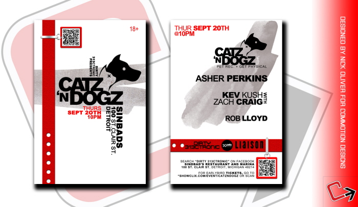
Catz N Dogz Flyer. Done for a Detroit EDM events company. I wanted the style of the headliners music to once again be my guide in creating this piece. Went for a smooth, yet bold look. Sort of minimal, which is not my normal approach. Used a strong typeface here in Arial with several variations to set each block of type off.


2nd Annual Belle Is. Disc Golf Tournament Detroit. I can not tell you how proud I am of this piece. I went a totally different route in the design than normal, using a lot of handmade graphics via Illustrator. I used a much brighter color palate than normal, with an attempt to capture the fall mood that this event will have. The layout design was another challenge. I have seen this style of design for many years and never really tried it (realistic). I feel it all came out first class. To be the designer chosen to do this is a big big deal. I also did the courses logo.


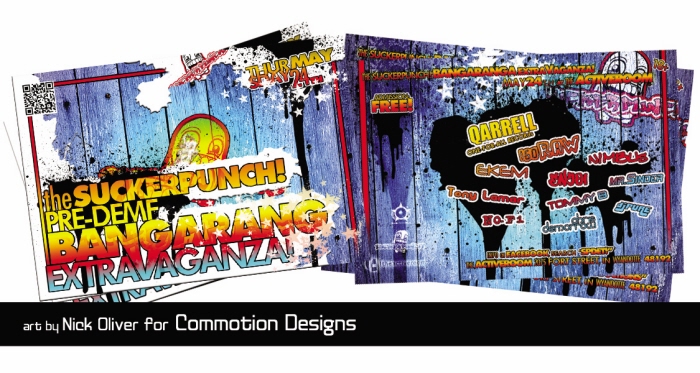
Suckerpunch! Bangarang Extravaganza Event - I spent a couple hours on the previous version of this flyer and came to the conclusion that it just did not work! I called the client, asked them for 3 words to describe their event: Hot, Grimey, Diverse. This is the color explosion filled answer to those words. One of my favorite pieces yet. Clear and legible, but fill of energy and replete with a sorta grimey backroom feel. Check out SuckerPunch! Productions on Facebook.

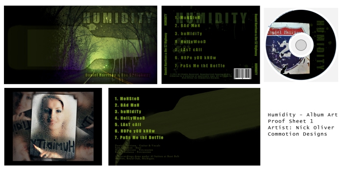
$2 Highway Album Art - Although this is not the final version ( I will update that soon) I felt that it was beautiful enough to share. A mix of moods, emotion, and easy to understand typography make this one of my favorite pieces. Plus doing album art for a band this good was a great experience.
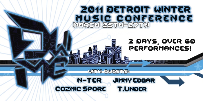
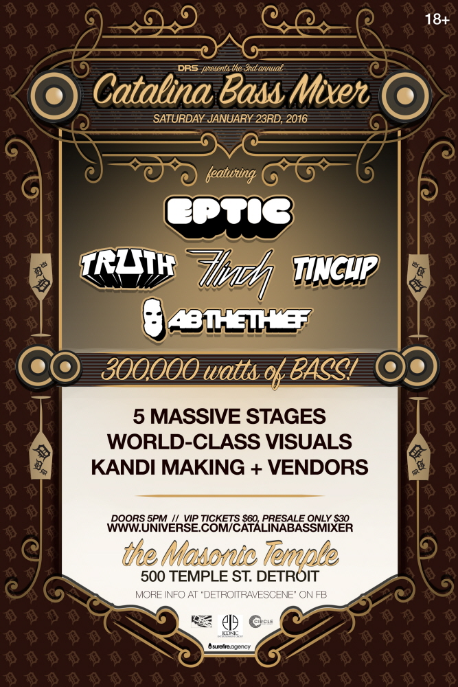
Detroit Winter Music Conference flyer front - I was commisioned to the art for the inagural DWMC this year. It is a great honor, and the event was a major hit. The idea behind the logo and the flyer was to capture a sense of winter, technology, and modern design. I think I accomplished this very well. The printerd version will be coming soon.
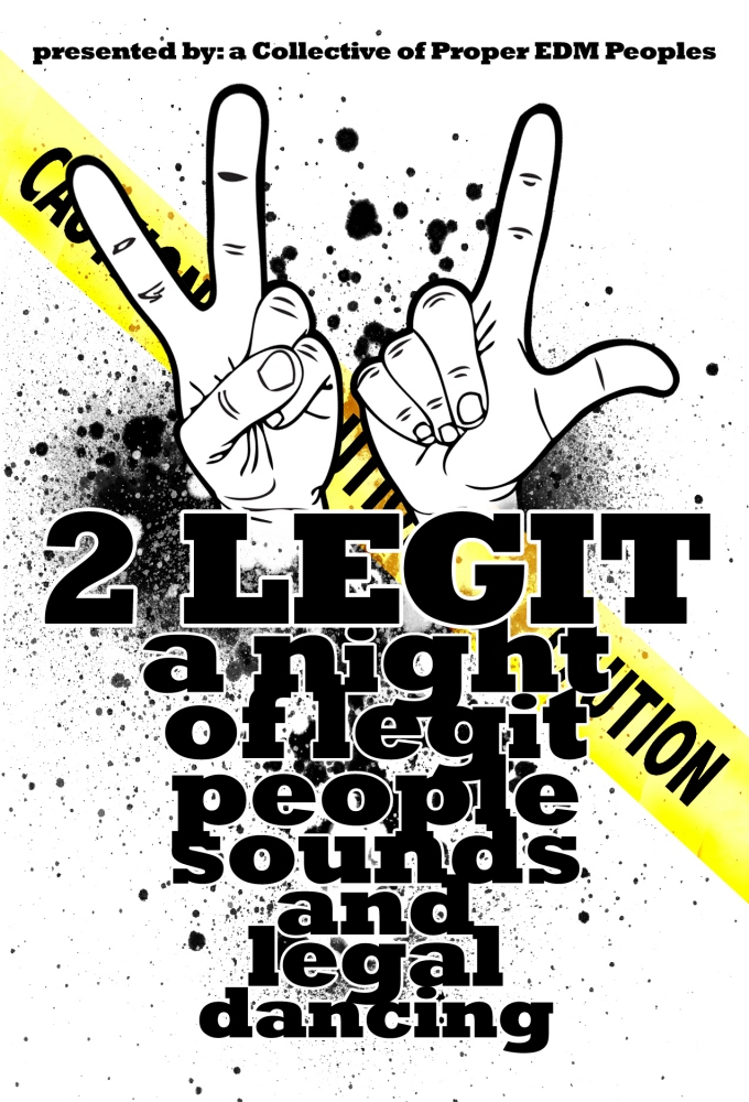
2Legit Party Flyer - One of my favorite pieces, flyer done for Detroit event company. Wanted a gritty feeling, and the notion of opposing authority conveyed. Used a strong font, minimal colors, and some painted splatters to create a fairly strong piece.
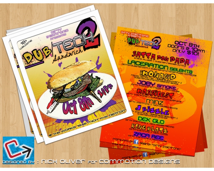
Dub/Tech Sandwiches 2 layout - Would you believe that I actually made that sandwich and snapped photos for this Dubstep show?! It is true. I did this shows first edition a year back and photoshopped the sandwich. This year I wanted to make one to save myself time. Overall the flyer is opposite of much of my stuff lately. Much more urban artsy. Still pops and that is what matters.
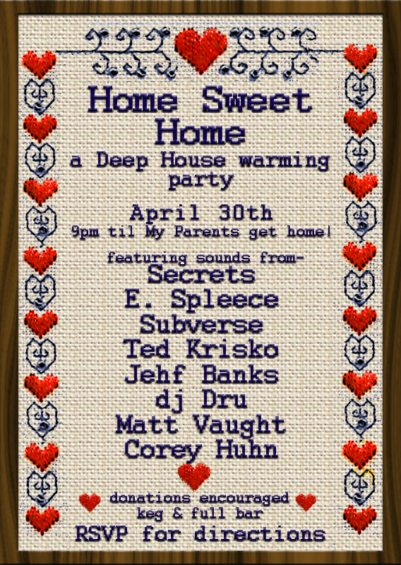
Needle Point flyer - Hilarious job given to me with specifically requested style of an old needle point piece. I think it came out pretty good, and was a fun change of pace.
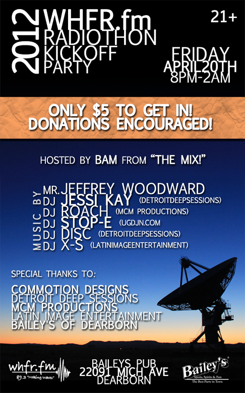
WHFR.fm 2012 Kickoff Party - Simple, classic, fundamentally sound. But still has some punch to it. I look at WHFR.fm as that sort of station, and I wanted to mimic that with the flyer art. Lacking in pizazz but oozing with style and a bold feel, this flyer was fun to do and I love working with my Alma Mater.
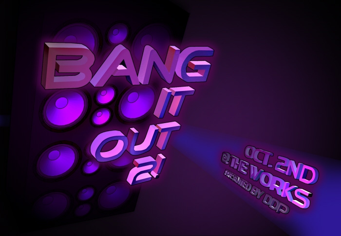
Bang It Out Flyer - Took a new direction on this flyer. Some 3D elements and some more minimal set up on it overall.

gLike
Flyer Design
When I was a youngster I went to a lot of the electronic music scene events in Detroit. The art on the flyers would always captivate me. I took note and decided one day I would be a contributor to the music scene. Today I do some of the best known events and work with a slew of clients to bring them creative enigmas on anything from 3 foot posters to 4x6 flyers.
Available
Freelance, Full-time
Nick Oliver
Designer, leader, thinker (Art Direction and Multimedia Design)
Detroit, MI