Cover design for the Polish designer magazine 2+3d. - The illustration and design correspond with the colours of the Polish flag. This issue is celebrating the anniversary of 2+3d magazine.

Fa-Art magazine.Fa-Art magazine. - Graphic, alyout and illustration design for the Fa-Art Magazine.

Fa-Art magazine.Fa-Art magazine. - Graphic, alyout and illustration design for the Fa-Art Magazine.

Fa-Art magazine.Fa-Art magazine. - Graphic, alyout and illustration design for the Fa-Art Magazine.

Fa-Art magazine. - Graphic, alyout and illustration design for the Fa-Art Magazine.

Fa-Art magazine. - Graphic, alyout and illustration design for the Fa-Art Magazine.

Fa-Art magazine. - Graphic, alyout and illustration design for the Fa-Art Magazine.

Fa-Art magazine. - Graphic, alyout and illustration design for the Fa-Art Magazine.

Green leaf - specialistic isolation board. - Design of the foil package/wrapping.
The design corresponds with the brand of the product and according to the clients demand - the design reminds of ecological trends.

Broshure for suard clenaing systems.

Book cover - book covers. Project in progress.

Annual report for Hydrobudowa 6 - Part of an annual report of a company which specializes in building highways, bridges, elements of public transport especially ones that need underground digging and work with the water systems. The graphics
and images used in the report correspond with the companies field of work.

boomboomduterre.com

chopsticks instruction and package - Instructions, graphic and package design for chopsticks. The simplicity and diagramed look of the instruction finally make it clear how to use chopsticks. The graphics correspond with the minimalist japanese style.

chopsticks instruction and package - Instructions, graphic and package design for chopsticks. The simplicity and diagramed look of the instruction finally make it clear how to use chopsticks. The graphics correspond with the minimalist japanese style.

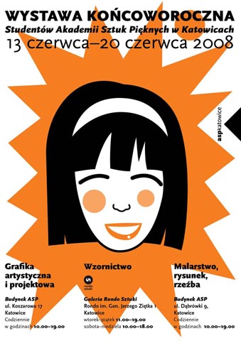
exhibition posters - Series of poster promoting the final semestral exhibition of Akademy of Fine Arts in Katowice, Poland.The posters were ment
to be put together, but also separatly. Their look is to stand out in the complicated and many times messy “poster and com-
mercial†erea in Katowice, and also to show students of Fine Arts Academy as positive energetic and modern young people.
The poster were designer for the silk screen technique.

Dvd Cover

Book cover - book covers. Project in progress.

Book cover - book covers. Project in progress.
gLike