
Pattern, 2014. Reds enhanced.
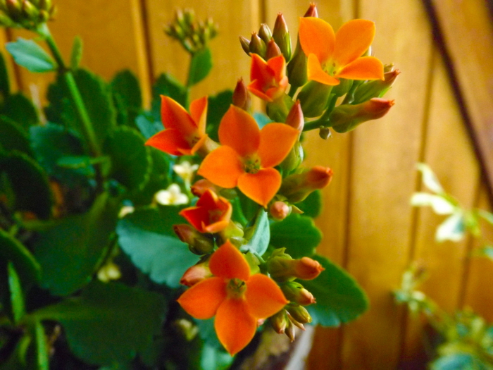
Emphasis, 2014. Enhanced the vibrance and saturation.
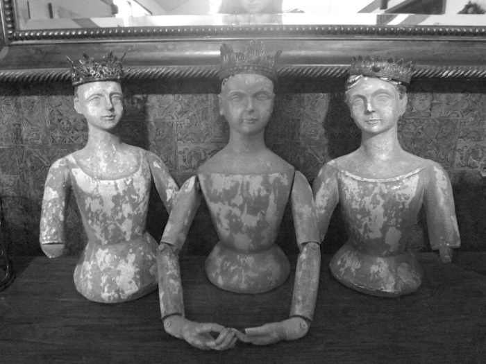
Balance, 2014. Black and white, lowered the contrast, enhanced the brightness.
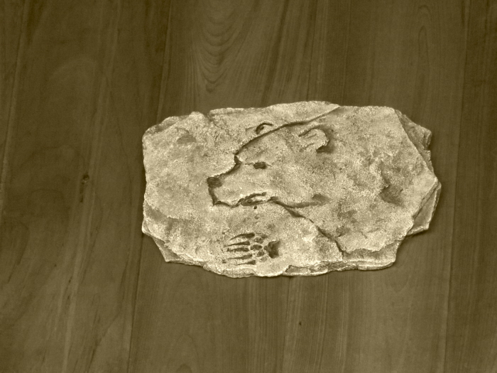
Harmony, 2014. Sepia tint, lowered saturation and more exposure.

Contrast, 2014. Black and white, lowered the blues and increased the contrast.

Movement, 2014. Saturated.
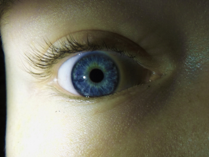
Harmony (in the eye), Emphasis (on the iris) , Hue (of the iris), Shape (around the iris and pupil), 2014. Enhanced the blues, lowered the saturation and increased the vibrance.

Scale, 2014. Lowered the brightness and contrast.
gLike
Principles of Design
Principles of Design: ideas that are used to organize/arrange the elements of design
- Pattern/Repetition
- Emphasis/Focal Point
- Balance
- Harmony/Unity
- Contrast
- Movement
- Size/Scale