Google it (it's my brother-in-law) - When Mike-in-law started his own car dealership, I wanted to give him a bit of a retro look because of the name. I had planned to do a series with different vehicles tires making the dots of the i, but the 911 kind of stuck...

Windrose Trading Company - A company in Charlottesville that deals with fair trade... oddly enough... the never paid. :(

Jody's Popcorn - treasure chest - This was a development idea for the local hotels to have a treat of some really, really yummy fudge left in the room.

Windrose Trading Company - In addition to the wax seal, developed this stamped look to more organic.

Children's Hospital - Casino Night - For several years I have done work for charities in the area and have the support of my work on the endeavors. This was one of the looks I created one year.

m&m's - For a presentation I did for my client, this was the opening shot... there were several slides where I incorporated the iconic image into typically boring slides to liven it up.

m&m's - I ended up doing this look for several meetings... this one was in LaJolla!!!

Diageo - Tanqueray - Since summer is a great time to enjoy Gin (read the majority of the sales) I created this concept of a American flag for a 4th of July promotion.

m&m's - Once I started, I couldn't stop. Ended up with lots of these in all sorts of variations.

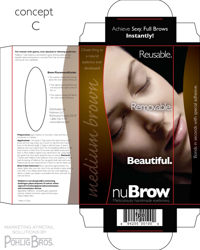
nuBrow package development - The reason for the different colors, is to show the color of the eyebrow inside.

Logo development - Client was interested in a organic option for a logo, this was created as a supplemental option.

Unilever presentation - This was a opening slide for a presentation where we had everything from samples, to mock-ups & renderings. This image tried to convey the "ideation" feel for the meeting.

Pohlig Bros. - We needed a image for a printed piece to be used for our highly anticipated "Holiday Gift" here at Pohlig Bros. This image was printed & die-cut into a custom sleeve that went around a couple of our archival rigid boxes that year.

nuBrow package development - This look seemed a little morbid to me, but hey, then again I do not need supplemental eyebrows... not that there is anything wrong with that.

nuBrow package development - This one I think shows off the eyebrow the best of the bunch, but after all this he stuck with the barbie colors & text only.

Pohlig Bros. - Tried to do a variation on a standard print mark.

Jody's Popcorn - You can see a 3-d of this in my rendering portfolio. Still trying to sell them this look! :)

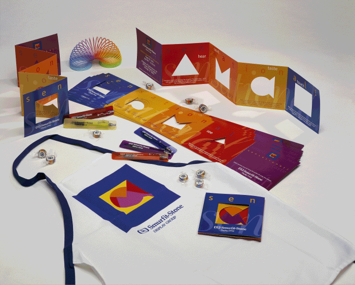
Party Favors - We rented the Museum of Modern Art in Chicago for a party, did cooking demo's, tons of schwagg.... Mike McCann did the printed piece design on this one.

Ukrops Monument Ave. 10K run - Everyone in Richmond knows about this event, tried to put a Pohlig Bros. spin on it!

Richmond's Monument 10K run - option pink - For the ladies, they did not want to be... 'green'... well, the shirt anyways.

Super Bowl XLIII - We usually throw a Super Bowl party... I have created some images for the invites over the years...

Super Bowl Party XLIII - ... usually cannot stop with just one... :)

Volleyball Team - Our new team Logo!!! ... the name is a long story... :)

moerner, pohlig, LBTYF

moerner, pohlig, graphics

moerner, pohlig, graphics

Sell Sheet

Mechanicsville Auto Sales - My Bro-in-laws place... chceck it out if you are in need of a vehicle!!!

Mechanicsville Auto Sales - Created both a black & red version as well as 2 color simple graphics for shwaagg... :)

Frosty shirt and DVD package - Created a look to show off the package using the iconic Snow Man.


Havanah Roads - Tasked with creating a 'Cuban' look for prepared meals at Whole Foods. Made several flavors and made each 'sack' have it's own personality.

Working with the Communications Team, the final logo is meant to represent grow, movement and bring a vitality to the church.


gLike


