
This is the final look of the cover photo when viewed in full. I also did the same version without the slogan, as the assignment request.
Image edit: removed brand names off the coffee cup and the plate. Change of color and added texture to the image to remind of the look of old photos.
I felt that using a picture that presents the activity that was considered relaxing through the centuries, and is still present today, was best to connect the feel assignment was looking for with the today's audience. The detail of the oriental table cloth was another element that accentuated the atmosphere of the olden times or traditional cafes you can still find around Turkey today.
The look of the profile picture when viewed in full. No fuss, no complication, just a logo of the brand.
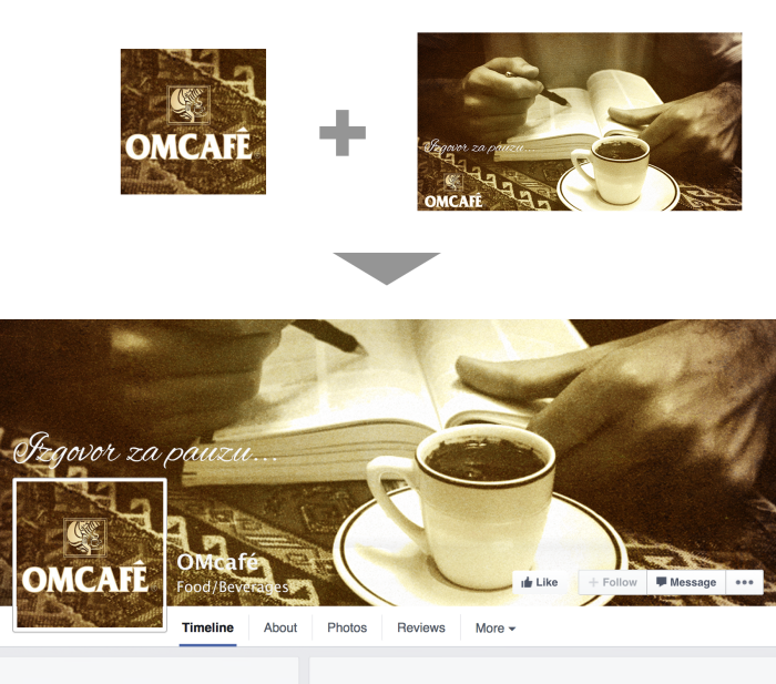
The idea of creating the effect of the seamless continuing of the cover photo and the profile picture. I felt that the overall effect that this type of combining profile photo and the cover photo is much more sophisticated and goes well with the feel which client/brief asked for.
gLike
OMCAFE Facebook page redesign
This was one of the assignments for the job application which I haven't passed in the final round.
OMCAFE is a Serbian coffee brand that specialises specifically in producing a high quality black coffee, or locally known as "turkish coffee".
The brief requested of me to come up with a cover photo and a profile photo that will have an archaic feel to it, following the theme of "taking a break" which is connected to coffee time and go with their slogan "Excuse for a break".
***IMAGE COURTESY OF FLICKR***
the photo was used only as a mockup and not for any commercial purposes
Available
Freelance, Moonlighting
Milja Zarubica
Founder & creative sorceress @ RITUAL design studio
Belgrade, Serbia