
Unity, 2013. These cones make a row of cones. If one were to be missing, the row would not be in unity. I used levels.

Emphasis, 2013. There are multiple smaller green beans, and then a larger yellow bean. The yellow bean is the important part, showing emphasis. I used vibrance and levels.
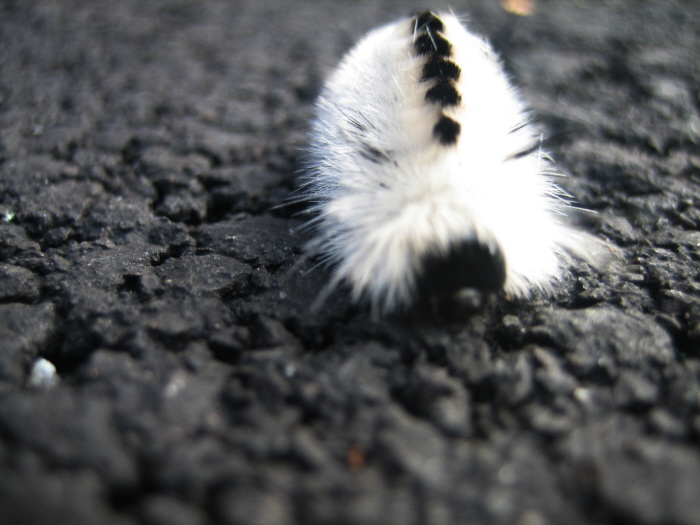
Movement, 2013. The caterpillar (which was actually pretty fast for such a bug) is partially in focus, with the front and back of its body a bit blurred, as is the surrounding background. The front and back are out of focus, making it seem as though the caterpillar is still in motion. I used curves.

Contrast, 2013. The pink rose stands out against the contrasting green background, showing contrast. I used curves and vibrance.

Balance, 2013. The three apples, when you look at it from a certain point of view, and even the one shown in the photo, show the apples in a pattern making it seem like there is an equal amount of apple in each part of the picture. I used vibrance and hue/saturation.
gLike
Principles of Design
Principles of Design:
Contrast
Balance
Emphasis
Unity
Movement
Pattern/Repetition


