
Following the success of OS1's first bond effort, they were asked to spearhead a second effort with a focus on dealing with overcrowded area schools. The primary message was that schools would be built regardless and a bond was the most cost effective way to fund them. Shown here are newspaper ads and a campaign mailer. The signature "school bus yellow" always grabs attention in a sea of subdued colors

More campaign materials and social media posts. In addition to repurposing graphics from print I designed a series of "mythbuster" Facebook posts designed to counter misinformation. Detailed rebuttals appeared with each graphic.
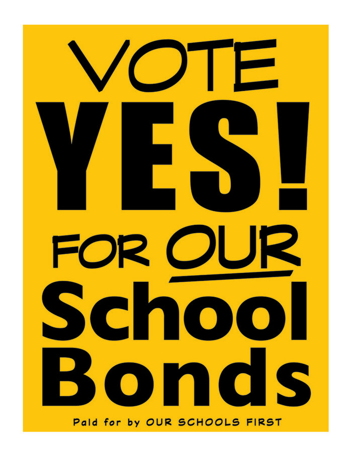
I opted for vertical yard signs. It was the best format for this messaging. They really stand out in a sea of horizontals and are inescapable when combined with the signature yellow.

"Our Schools First" is an educational advocacy group, initially formed to promote the (successful) passage of a school building bond in Iredell County and continues as an advocate for education and the county schools. Shown are letterhead, business cards, personal stickers, and automobile magnets.

Our Schools First endorsed and campaigned for pro-education candidates.

In addition to the "school bus yellow", the coffee cup was another recurring element used to illustrate the average cost of the bonds - essentially the cost of a single cup of coffee per week. The referendum was endorsed by NASCAR star (and hometown hero) Dale Earnhardt, Jr.

The bond effort had a very short timeline, less than four months from the time it was officially placed on the ballot until election day. It was essential to disseminate a great deal of information in clear and relatable terms.

Multiple Facebook spots were posted with personal statements by community leaders, concerned citizens, and some from students themselves.

This was created for a middle school who were sorting into different "houses" as a morale booster. I based the design on the students' original sketches.

I did black & white versions with each house name to use on color-coded printed tees and sweatshirts.
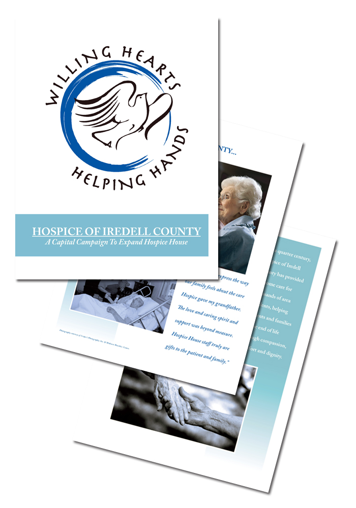
I designed the logo and case statement for the area's Hospice organization. In addition to the booklet, I created accompanying stationery and a flyer.
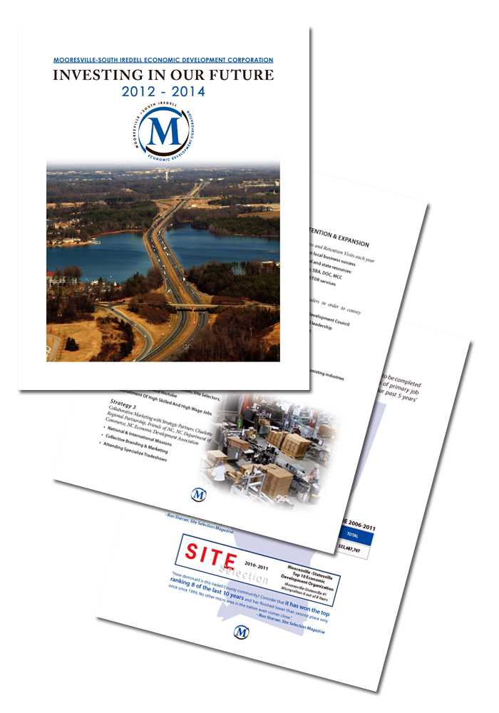
I created the Economic Development Corporation's capital campaign document as well as their new logo.
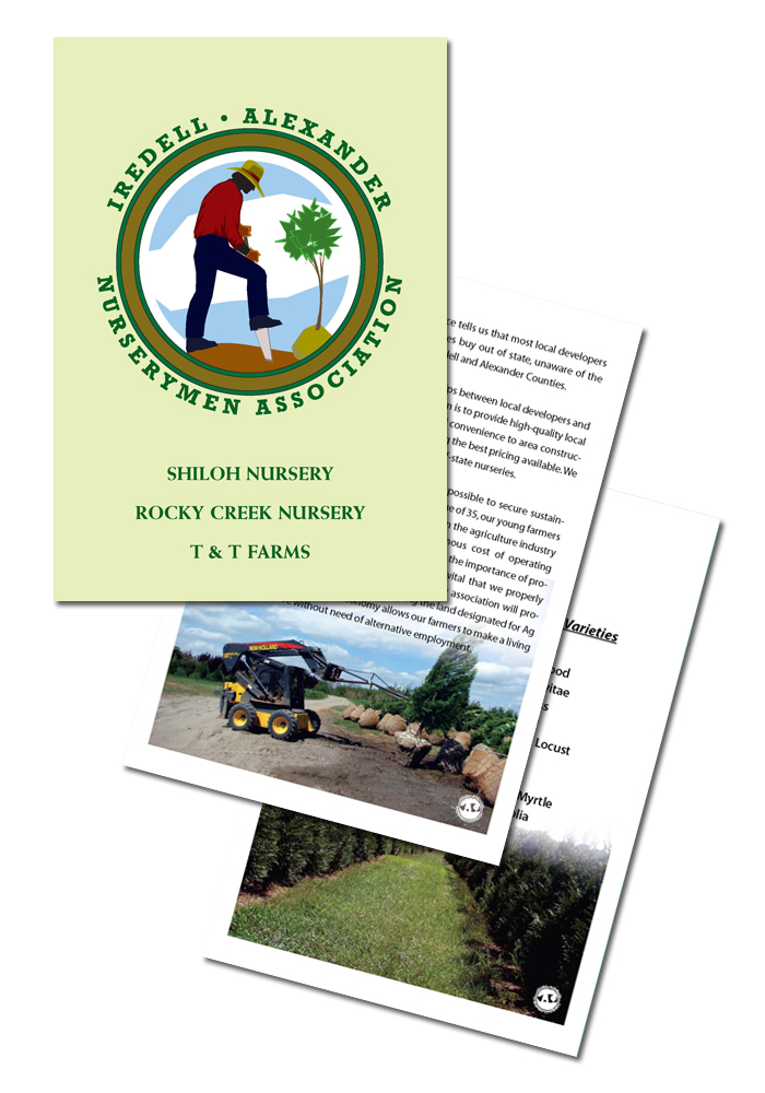
The Nurserymen Association is comprised of area farmers and growers. It's aim is to raise awareness of local landscaping sources to real estate developers and landscaping professonals.
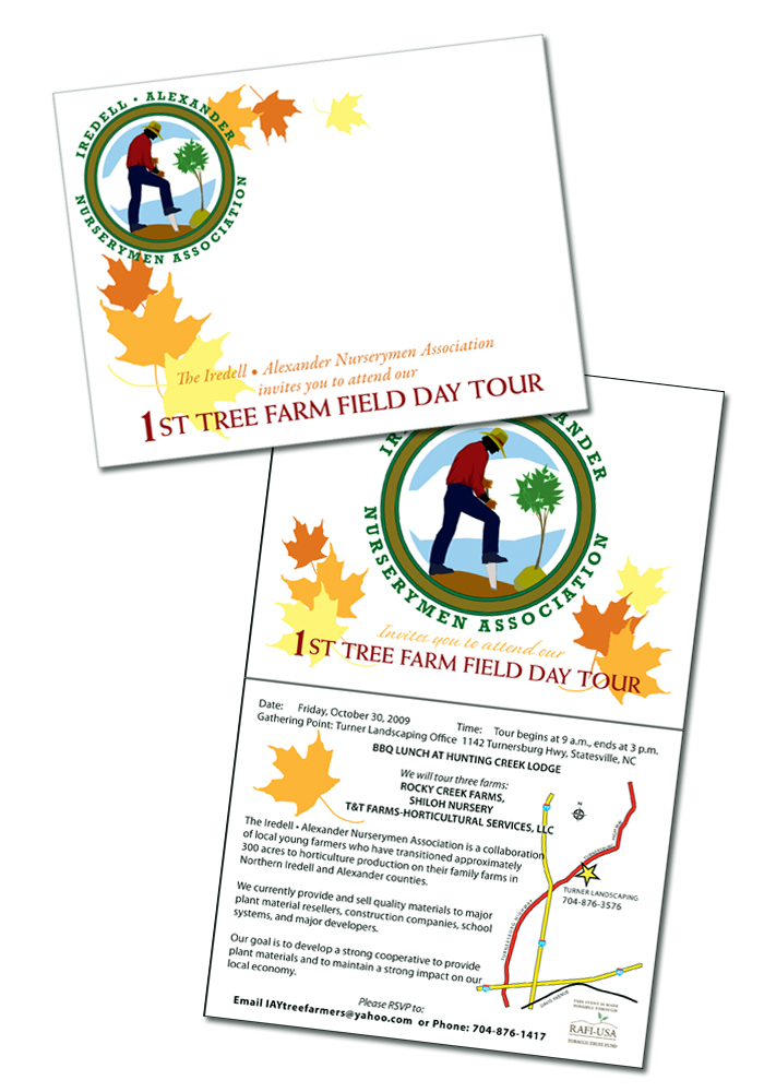
The growers discovered that they would sell to wholesalers in Texas and other points west who would then resell to developers and ship the materials back to North Carolina.
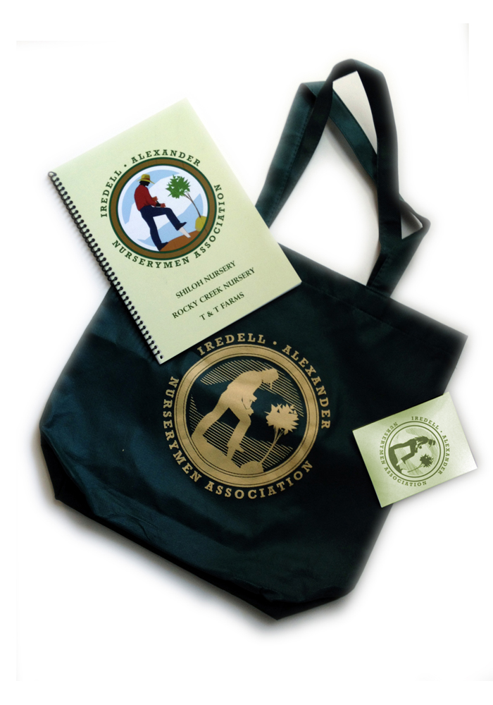
I helped the organization stage a tour/open house of the participating growers. Using the logo I designed for them, I provided them with gifts for the visiting dignitaries including a customized tote bag and seed packet. I sourced a supplier for inexpensive logo polo shirts for those working the event.
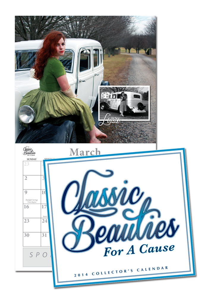
"Classic Beauties For A Cause" is a collectible calendar pairing models in period clothing with vintage cars. Profits go to benefit battered women. I created the logo and the layouts.

Thumbnails of each calendar page.

Label for the CD version of the calendar.
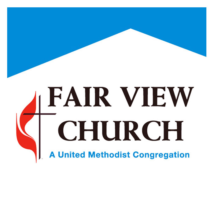
The church wanted to update its image. Using the classic gothic arch as a starting point, the final image evokes both a classic frame church against a blue sky and a roadway, stretching to the horizon.
I designed this image for the church's capital campaign.
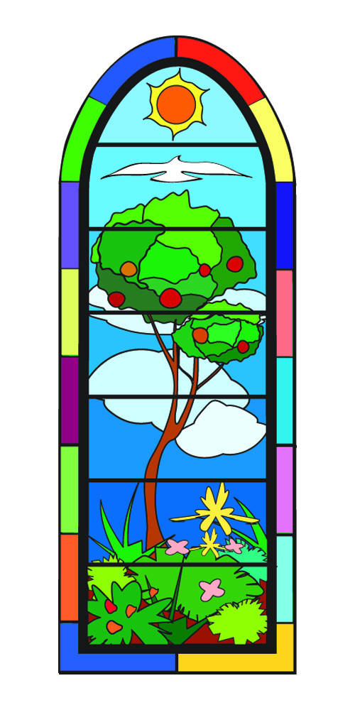
The church wanted a gauge to mark the fundraising's progress. I designed this stained glass window, with panels replacing blank panes as money came in. A 5 foot scale model was constructed from this design.
gLike
Non-Profits
Available
Freelance, Full-time, Moonlighting
Michael Haire
Owner/Artist of Michael Haire Media
Mooresville, NC