
Sid Meier's Gettysburg focused on the famous Civil War battle. The packaging combined old and new by revealing parts of the wireframe shape behind the more fully rendered cannons created by Greg Foertsch. The game released with both "North" and "South" boxes. I designed the layout and created the logo.

These illustrations were done for a computer version of the classic board game, "Battleship", with a Gilbert and Sullivan twist.

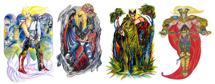
I was lead artist for the original Civilization game and for the sequel/overhaul, Civ II. I had more than twice the art team than on the first game but it was still a scramble to the end. We used 3D representatives (with motion capture) from over two dozen nationalities. I did the design and research for each character, some of which are shown here.

These are some of the final characters from the finished game. 3D modeling by Barbara Bents, Murray Taylor, and Frank Vivirito.

These are screen shots of "Diplomacy" screens, interacting with the Japanese and the Greeks. Background portraits by Jerome Atherholt.

More shots with the Spanish and the Babylonians. When you defeat a competing nation state I devised an animation where the loser's portrait appears framed inside a guillotine. As the blade falls the screen goes black and you hear a scream echoing into the distance.

CPU Bach was a really interesting Sid Meier game for the short-lived 3DO game box. The program would compose new music on the fly based on Bach's musical formulae. I designed the original cover art showing a classical harpsichord with its insides replaced by a circuit board, incorporated into the opening animation. Bach portrait by Chris Soares; 3D by Frank Vivirito. I created the interface screen in the background that allow you to customize the music created.

Sid Meier's Colonization followed the format of the first Civilization game but was confined to Colonial era America. Historical characters appear in the game and I researched and created them. When possible the portraits were drawn from historical sources.

Sword Of The Samurai was a terrific game combining roleplaying, hand-to-hand combat, and a strategic component.

The graphics were designed under considerable restrictions, the old EGA format. Image resolution was 320 x 200 at most with a palette of 16 (mostly ugly) colors. This format is making kind of a comeback with smartphone games.

I based all the images on classic Japanese art. Fortunately the graphic qualities of the source material lent itself reasonably well to the EGA format.

These full-screen images appeared at significant points in the game, including the beginning and end. The opening animation, two panels seen at the page bottom, began with a silhouetted samurai brandishing his sword, transforming into Japanese characters meaning "Sword of the Samurai". This was the final game for which I created nearly all the game graphics.

You interact with all these characters as you play the game. The women along the bottom row are your potential wives. The character at the bottom right represents you.

This is a color proof for the F-15 Strike Eagle tee shirt.

Color proof for the Silent Service tee shirt.

Color proof for the Gunship tee shirt.

This is a cover design for an early Screenplay game, also marketed under the name "Cyborg". The concept was robot gladiators. I extrapolated what life in the arena (and presumably steroids) would have done to Astro Boy, one of my childhood favorites.

Cover art for "Laser Defense".

A magazine ad for our line of fantasy games titled "Warriors of RAS".

Your character in the fantasy series progresses through the four games in a variety of environments.
The Warriors of RAS.

Another fantasy game spot.

B&W magazine ad for "Dunzhin", the first in the series. Ink and graphite on vellum.

Illustration for another installment of the "Warriors of RAS" series. Ink and graphite on vellum.

One of many black and white magazine spots.

In "The Institute" the player is a prisoner in a terrifying military complex, subjected to dangerous experiments and surreal situations.

This full image was used for the wraparound cover of the game manual.

Scary cover art for an early adventure game.

"The Paradise Threat" was a sequel to "Lucifer's Realm". Your character has died (spoiler alert!) and while traveling to Heaven you encounter great figures from history and uncover a plot by the most evil figures from the past.

Illustrations for "The Institute" and "Lucifer's Realm" double ad, Playful Professor", and "Microworld". Pen and ink.

In "Asylum" you awake in a mental facility and you have a narrow window of opportunity to escape. You have to avoid sadistic guards and deadly inmates as you plot your path to freedom.

Original ink drawings for covers for "Asylum" and its sequel, "Asylum II".

These are a few of the spot illustrations used for magazine ads and documentation for Asylum.
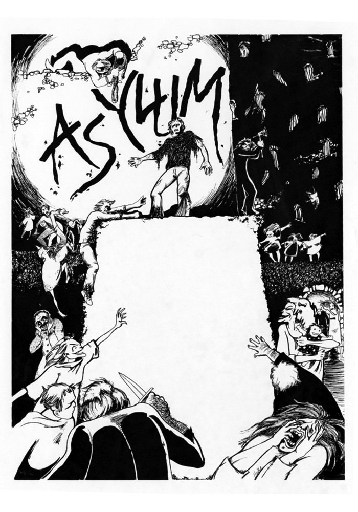
Illustration for a full-page magazine ad. The ad copy went in the blank space on the plinth.

Magazine illustration for "Asylum II". Ink and graphite on vellum.

Illustrations for "The Institute", "Asylum", "Sentinel", and "Star Trap. Pen and ink.

This black and white illustration was for "Sentinel". Ink and marker on vellum.

"Danger Ranger" was a Levels/Platform game. My first and - I think - only experiment with airbrushing.

Illustrations for [something with battling insectoids], a maze game called "Knossos", and "The Human Adventure", a takeoff on "Fantastic Voyage".

This poor, battered guy was done for "Deathmaze 5000". Ink on vellum.

Art for a double ad for "Deathmaze 5000" and "Knossos". Ink on vellum.

I can't remember the details for "Farver Legacy" but the illustration's not bad. Ink and graphite on vellum.

Illustrations for an ad pitting graphic adventures vs. text adventures, along with spot illustrations from product catalogs.

This spooky guy was created for a game called "Ghost Death". I don't remember anything beyond that. Ink on vellum.


This was a joint ad for "Invader's Revenge" and "Phantom Slayer". Ink on vellum.

"Rat's Revenge" was an early maze game where the rat turns the tables on the humans. Ink on vellum and acetate.

"Monkey Kong" was one of the earliest Med Systems/Screenplay games. Rescuing a beautiful girl from a giant ape - totally original idea. Ink on vellum.

An early ScreenPlay product offering software protection. (Floppy disks were cutting edge technology in those days.)

The original image. Ink on vellum.

And with Zipatone added. (Google it)

Who hasn't wanted to murder their printer at one time or another. Ink on vellum.

Cutting edge technology, circa 1982.

The idea was to combine the (then cutting edge) PC with an anachronistic gramophone horn. This piece and the Guardian ad were a subdued change-of-pace from dragons and cyborgs. Ink on vellum.

These vignettes were incidental art created for ads or support materials. Ink on vellum.


gLike
Computer Games
These images show some of my work as artist and art director for several computer game companies.
Available
Freelance, Full-time, Moonlighting
Michael Haire
Owner/Artist of Michael Haire Media
Mooresville, NC


