The logo was the starting point for the rebranding of a local dental practice. The "smile" logo on the card back was in contention for the primary logo and was kept as a secondary graphic.
I worked with a local sign fabricator on various applications with preexisting structural elements.
The Sawyers' lab mix, Junior, is the company mascot and ambassador so they wanted him incorporated into their new logo. I kept the font and color scheme from their old logo for continuity and because the Black, Red, White colors were clean and bold.
The original building is close to 100 years old. Before this renovation the last update was in the early 1970s. Several color schemes were considered but the town historical commission would not allow painting the brick so we went with the black paneled option. My initial comp is to the right. After some discussion we decided to rebuild the front, bringing it out flush with the facade. The architect's rendering is in blue.
Several shots in various stages of construction, including mascot Junior on the right. I chose a classic font for the 3D letters on the front and designed the shingle sign and rack that hangs off the building.
The back of the buildings on the block were generally ignored, even though they face a second busy street. We restored the windows on the ground floor and replaced the metal security door with french doors. Some basic cleanup, paint, and a lit sign made a huge difference and elevated the whole project.
The old interior is the top photo. My original AutoCAD LT drawing is on the left. That was translated pretty directly to the architect's final construction drawings. The owners and I went through many variations before the final solution.
These are some interior shots of the building. The space was gutted and I worked out the new floor plan according to the owner's specifications. The 15' tin ceiling tiles were original to the building and the plaster removed to expose the brick walls. I used a variation of the logo's black-white-red color scheme for the interior and exterior colors.
The owners specifically wanted an industrial look for their workstations. I found a local custom builder and worked with him on pieces specifically for the space and their staff. These custom pieces were not only more economical than commercial options, the designer was able to incorporate desk drawers, something none of the commercial sources offered.
The owners were very happy with the final product and have used it as a backdrop for much of their print and digital promotions.
I tweaked the logo for this cleaning franchise and oversaw interior and exterior signage for their building.
The client requested an interior mural displaying the "core values" of the company. She had a list of attributes and I came up with corresponding icons.
gLike
Commercial Spaces

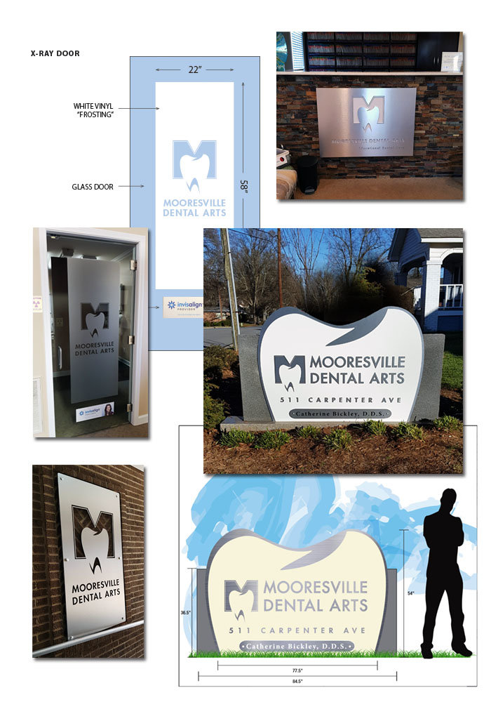
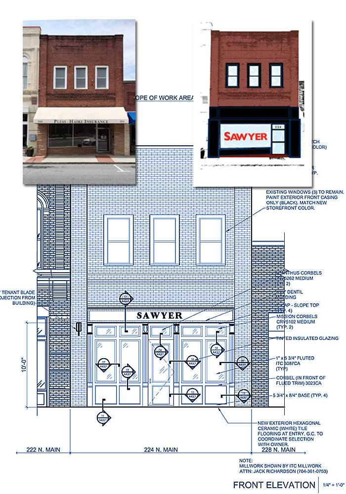
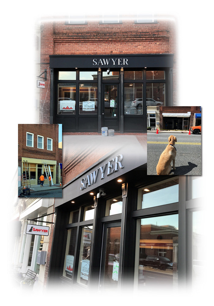
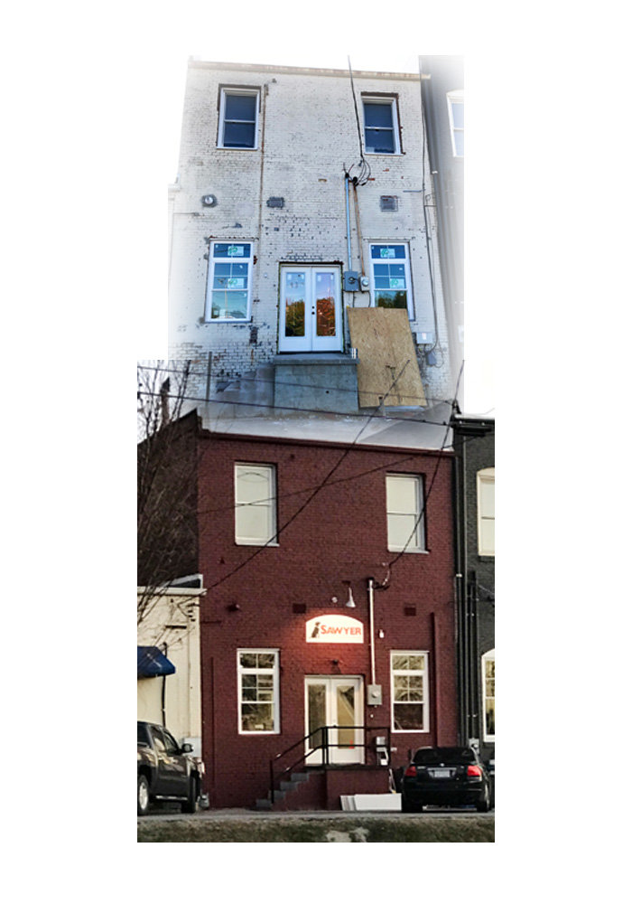
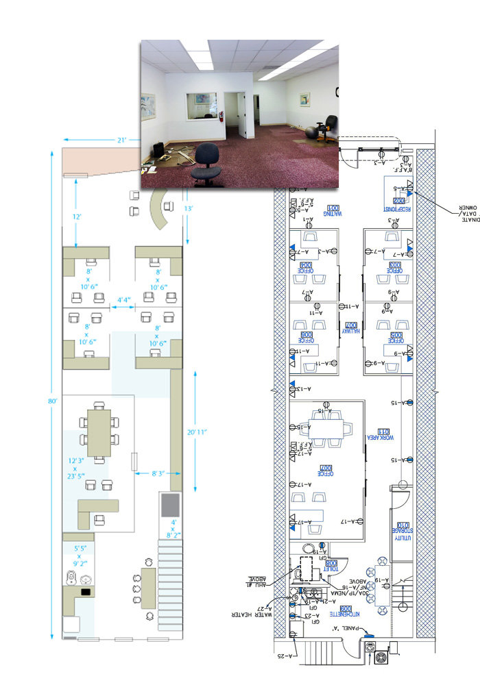
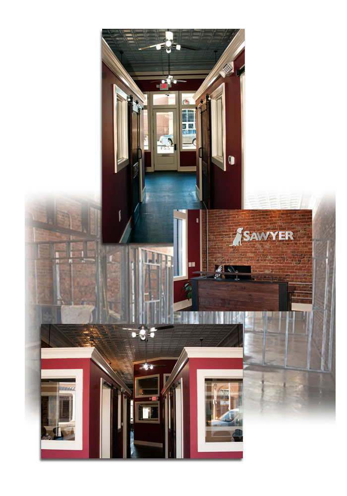
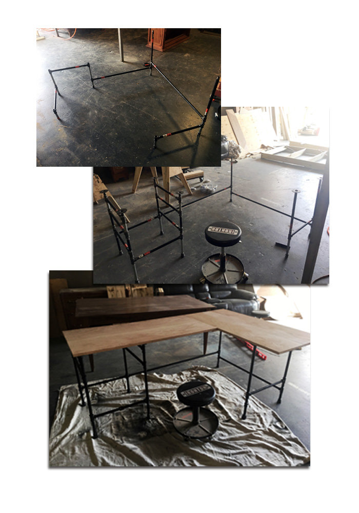
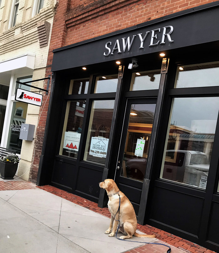
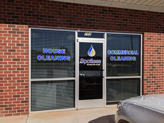
The clients wanted to renovate a historic building downtown. The building selected was completely gutted having last been renovated in the late 60s. I had designed their logo and done some marketing pieces for them and they asked me to consult on the renovation design. I tailored a preliminary floor plan to their specifications which translated pretty completely to the final architectural drawings. I worked out numerous comps for the new facade. We ended up building out the front but the color scheme for the front and back were mine. I sourced a custom furniture maker for the industrial look they wanted and worked with him on the final designs. I built the office color scheme on the company logo using shades of red, black and white. I sourced all the furniture and fixtures and designed and oversaw the building signage. This project took most of 2017.

Available
Freelance, Full-time, Moonlighting
Michael Haire
Owner/Artist of Michael Haire Media Mooresville, NC