
BOLD, CONTEMPORARY, EMPHASIS ON PHOTOGRAPHY. Images arranged in a simple square emphasize the visual appeal of the client's work samples. A human element is brought in with friendly script fonts to give the site an approachable feel.

ICONIC, MONUMENTAL, CLEAN - This graphical composite centers on a Flash slideshow uniquely incorporated into the overall layout, sliding portfolio photos in from outside the window to emphasize the total package. A furniture veneer texture doubles as a user interface and a table top on which site visitors dine on a visual feast of product shots.

GEOMETRIC, HAND-CRAFTED, SOPHISTICATED - A frenetic handwriting font works with cool green tones and a typewriter font to mimic the high energy process of building custom furniture while evoking a personalized hand-crafted product. This graphical composite revolving around a Flash slideshow is uniquely incorporated into the overall layout, as a scrolling slideshow of portfolio photos.

DYNAMIC, OFFICIAL, CANNY. A hostage negotiator wanted to distribute scripts for training officers at police departments across the country. The glimmer effect of the logo is echoed in a sleek ribbon motif bringing the user's attention to key details. The project involved real time checkout and several layers of security to ensure that the scripts did not fall into unauthorized hands.

WARM, FRIENDLY, HEALTHY - The Mychal Institute, associated with Duke University, built a web presence for an emerging substance abuse clinic around the notion of comforting the ill in a safe caring environment. The design was crafted to increase participation in the clinic by their core audience of upscale substance abusers.

TRADITIONAL, HISTORICAL, LOCAL - In order to establish their long-standing place in Asheville North Carolina as a local bike shop catering to the needs of individual consumers, motifs from the company's storefront harness the client's clout while still providing clean lines evocative of the efficiency of their product line and service.
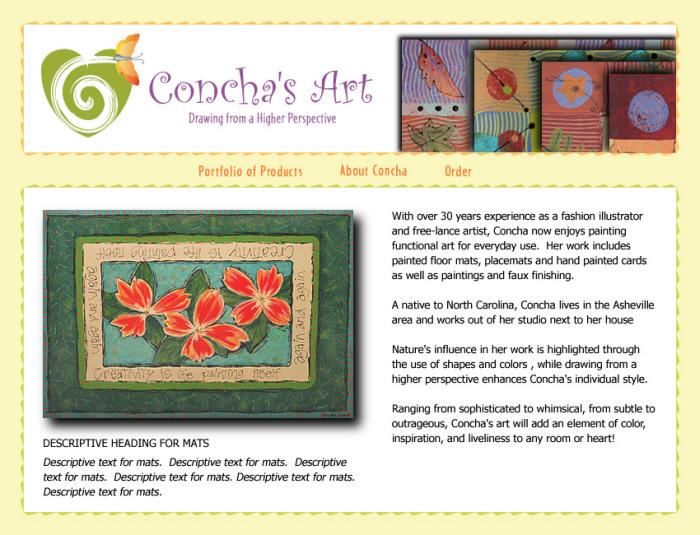
ARTISTIC, PASSIONATE, ACCESSIBLE - Marketing an artist's consumer products demanded rich visual display in a highly usable format suitable for easy online checkout.

ARTISTIC, PASSIONATE, ACCESSIBLE - The secondary pages of Concha's Art's site lyrically fulfill e-commerce transactions.

STURDY, MODERN, CLASSIC - Brigman Custom Builders endeavored to form an interface for and of their building projects to identify their unique niche in residential development. URL: BrigmanCustomBuilders.com

MODERN, MINIMAL - Clean contemporary lines and rectilinear photo arrangements evoke the home building process. URL: BrigmanCustomBuilders.com

BOLD, COMFORTABLE, ORGANIC - A rotating Flash slideshow was designed as the centerpiece of the home page, highlighting relaxing photos of massage therapy in progress to increase conversion rates for massage services. A minimal layout with dark backgrounds brings photographic resources to fine focus. URL: HOHAsheville.com
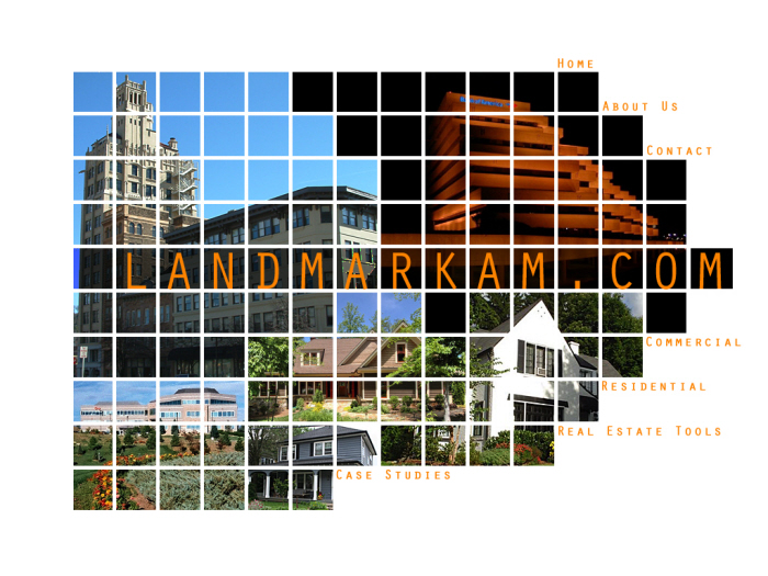
TRUSTWORTHY, EFFECTIVE, ORGANIZED - A minimal, modern interface evokes solidity by using clean, streamlined graphics to induce real estate clients to trust in this company's ability to organize and execute the sale of their homes and commercial spaces.
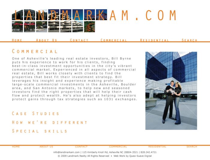
TRUSTWORTHY, EFFECTIVE, ORGANIZED - The site motif of 'architected' photo arrangements opens a window into shots of property and sound customer relations while providing well organized text areas to describe the client's service offerings and optimize with search engine keywords.

HUMOROUS, FRIENDLY, WARM - To contribute a folksy feel to the people-driven industry of home reselling, this site relied on filtered images of actual homes, borrowing wood siding shingles for the navigation's backdrop. Focal graphics with enhanced colors and vector filters flatten photos, giving them a cartoonish aspect in line with the brand.

GREEN, RUSTIC, SOFT - An environmental consultant sought to portray an image of ecological friendliness. The animated wheel displaying the company's services echoes environmental cycles and the concept that all of the elements of our landscape are connected. URL: EquinoxEnvironmental.com

STYLISH, CONTEMPORARY, MINIMAL - Showing the tasteful drama of this interior designer's work involved highlighting photographic resources while hinting at the client's personality. Stenciled logo type integrates with shapes reminscent of a floor plan used to map out a client's home, hinting at a highly technical planning process.

CORPORATE, SLEEK, SUMPTUOUS - Flash slideshows and animated menus add unique touches to an interface meeting Sotheby's International Realty's brand standards. URL: DBSIR.com
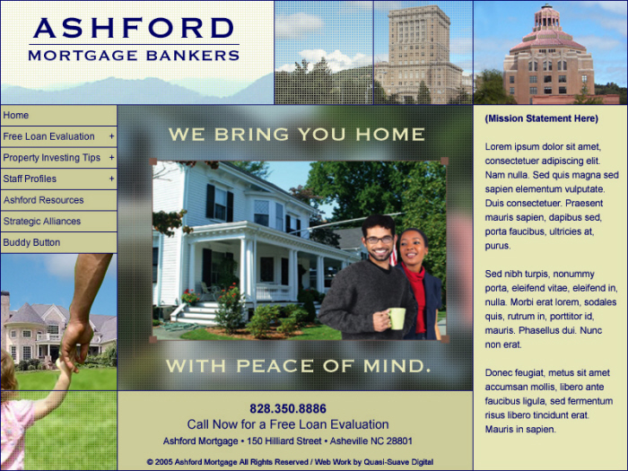
HUMAN, WARM, MODERN - This interface blends a 'soft sell' slideshow, images of local landmarks, and contemporary style. The client was attracted to appealing tag lines, calls to action, and emotionally activating sales tactics. The site provided a clean, open atmosphere to emphasize sales moments.
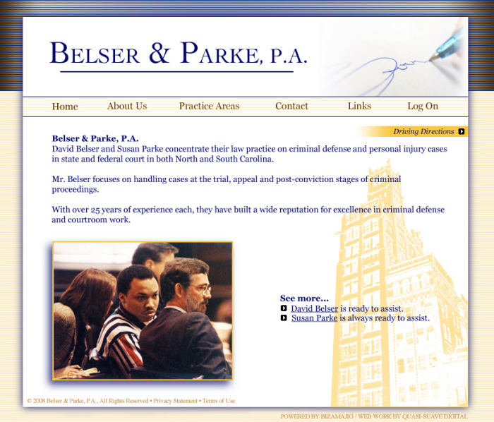
SAFE, LOCAL, STRONG. A fresh approach to normally dull legal industry brands, the interface highlights local imagery while horizontal stripes lend solidity and firmness to reassure criminal defense clients.

SCALABLE, SOLID, TECHNOLOGICAL - A managed network service provider and ISP endeavored to refresh their site look and feel. The buttons of the navigation present the idea of scalability, the ability of the client's digital infrastructure to grow and adapt to their needs. Textured focal graphics in colors complimenting the green of the logo bring emphasis and context to the promotional text, steeping it in the uniform grid of our digital world.

DYNAMIC, SLEEK, AGGRESSIVE - The client's 'take no prisoners' approach to selling network services demanded an assertive interface evoking speed and efficiency which highlights calls to action and service plan features. The interface design phase was preceded by a brand identity project to arrive at a logo and header treatment expressing speed, reliability, and technical acuity.

CHIC, INTUITIVE, BOTANICAL - To convey a strong sense of the now for a trends-oriented landscape designer, simplified interfaces employ x-ray photography and digital fonts. Swift Flash interactions embody brand values.

CHIC, INTUITIVE, BOTANICAL - The portfolio pages of the site delight users with a left/right scrolling filmstrip with flush placement of photography heightening nuances in tone, texture, and color. The left to right scroll effect implies a garden visitor turning head to survey the landscape.

PASSIONATE, ALIVE - For the redesign of Buttercup's site, client objectives included reducing distracting interface elements to arrive at a simplified user experience with an emphasis on spare web code to improve search engine ranking. URL: ButterCupDesignGroup.com

PASSIONATE, ALIVE - The portfolio architecture scales dynamically through the simple act of uploading images. URL: ButterCupDesignGroup.com

NO NONSENSE, GREEN, STRUCTURED
In order to show the value provided by event waste recycling services, a Flash animation cycles through images of an event site getting progressively cleaner. The solidity and tight organization of the site speaks to the efficiency of the cleanup process and environmental sustainability of the result. URL: CleanVibes.com

SCIENTIFIC, MEASURED, PRECISE - To build a setting for the explanation and sale of high tech bioinformatic drug discovery software for sale to corporations like Glaxo Smith Kline, Novartis, and Phizer, a structured laboratory provides the bones of the layout in a sci-fi scenario.

BRANDED, SECURE, EFFICIENT - Thermo Scientific's Kendro subsidiary wanted to fashion a web store to streamline the employee process of getting outfitted in branded attire. Paramount to the interface is the ease of navigating products and viewing photography.

ARCHITECTED, GEOMETRIC, SOLID - The foundation of the home building process itself is echoed in the blueprint patterns and gridded layout of joists and rafters landscaped with descriptive text.

LIGHT, EARNEST, AMIABLE - To earn the trust of stay at home moms shopping for children's apparel, atmospheric colors and inviting fonts surround focal photography and seasonal promotions to drive sales.
gLike
User Interface Design
Visual design of client web sites; concepting, strategic brand positioning, and design of user experience for web site functionality enabling client sites to outperform competitor sites. Logo design and brand identity across various client web properties, portals, and promotional campaigns. Flash design and implementation for sales presentations to win new business and sell client products/services. Researching various market spaces to craft competitive brand identity/marketing strategy, increasing client market share.
View Website