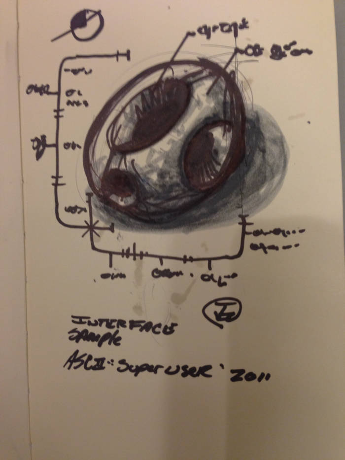
For a time we used a barcode system to check-out some equipment. The problem was that it was just a barcode sticker on the back of our access cards. I recreated my barcode and framed it in a design, printed it out on glossy sticky paper and put it on the back of my access card. This it what it looked like on screen before printing.

A helpful web app for Apple Retail (Apple, Inc.)
This is an asynchronous web application I wrote for Apple Retail in 2007.
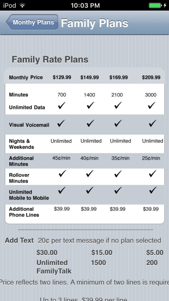
Written with Dashcode, IDK (I Don't Know) as in, "I Don't Know. lets find out," provided a quick reference for Specialists to common questions in a retail environment. It ran on an iPhone with a native look and responsiveness.
Although this iteration was not deployed on a large scale, it’s base code, UI/UX design was the foundation for the Smart Sign in 2011, an iOS app that showed product specs on iPads inside Apple Stores.
The original code can be found on GitHub https://github.com/mematron/IDK-Web-App


gLike

