
gLike
Wine Tasting
AGENCY: BIG Communication
CLIENT: Unknown
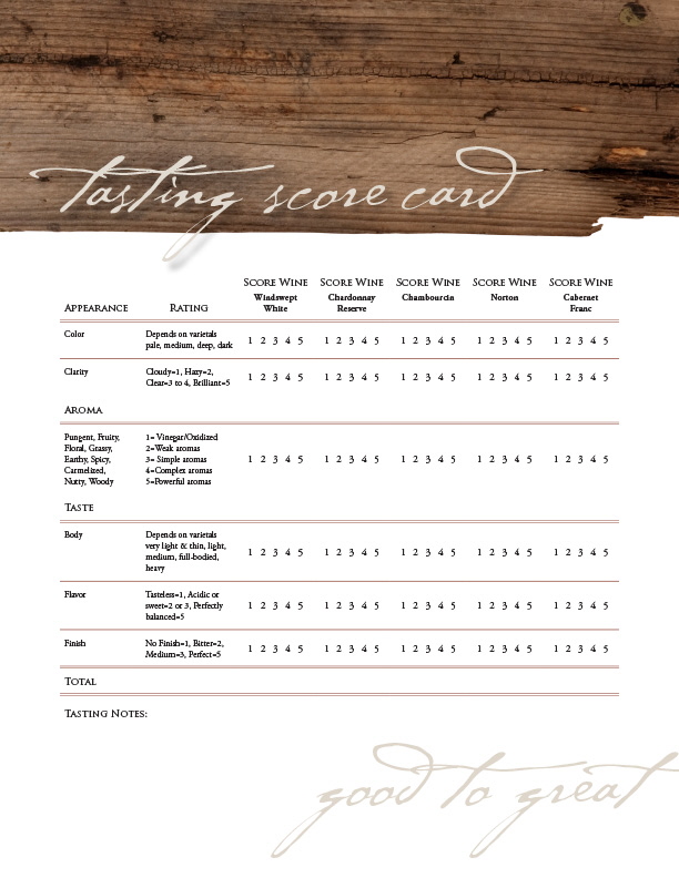
Taking a "less-is-more" approach lends itself to the wide use of white space. Wine tastings are elegant yet simple, and the product itself is "aged." Therefore, font selection was directed toward serif and old fashioned scripts.
Available
Freelance, Full-time, Moonlighting
Matthew Holiday
Creative Consultant | Graphic Designer | Photographer | Retoucher
Novi, MI