
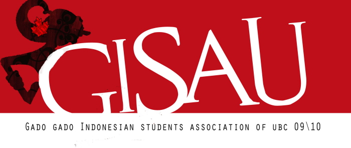
Final version of GISAU Logo-- GISAU stands for Gado-gado Indonesian Student Association of UBC. It comprises of people who are passionate and affiliated with the Indonesian community on campus. The shape of this logo is inspired from a silhouette of 'wayang', a leather shadow puppet, one of Indonesia's cultural heritage. In order to embed GISAU's main characteristics, these 3 details are designed into the logo. 1.) The maple leaf represents Canada, 2.) red&white dot represents the flag of Indonesia, and 3.) blue&gold bracelets represents the campus colors of University of British Columbia.
Logo Design in Letterhead
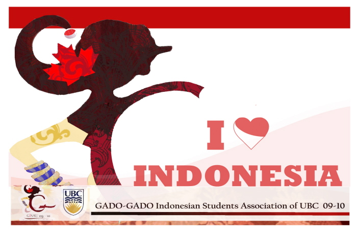
Membership Card design for GISAU members with the logo. Colors of the Indonesian flag is consistently used as the theme in this card design.
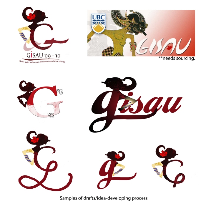
note: Far right image does not belong to me.
Far right image is the previous years' design of GISAU club card. Previously present components in this image are to be consistently carried onto the design of the present logo. These 3 components include: i.) Wayang, ii.) UBC, and iii) GISAU name.
Other images are samples of various trial designs during idea developing stage.
View PDF
View PDF
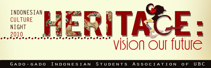
Application of GISAU logo in another promotional event: HERITAGE (Indonesian Cultural Night 2010)
gLike
GISAU Logo Design
GISAU stands for Gado-gado Indonesian Student Association of UBC. It comprises of people who are passionate and affiliated with the Indonesian community on campus. The shape of this logo is inspired from a silhouette of 'wayang', a leather shadow puppet, one of Indonesia's cultural heritage. In order to embed GISAU's main characteristics, these 3 details are designed into the logo. 1.) The maple leaf represents Canada, 2.) red&white dot represents the flag of Indonesia, and 3.) blue&gold bracelets represents the campus colors of University of British Columbia.
Marshiela Giosisca
Corporate Graphic Designer - Communications & Branding Department
West Jakarta, Indonesia