
Emphasis, 2013. This image represents emphasis because of the difference between the red tones in the berries and the changing leaf in comparison to the rest of the green leaves. I applied a higher contrast, levels, gamma correction, and vibrance to this picture.
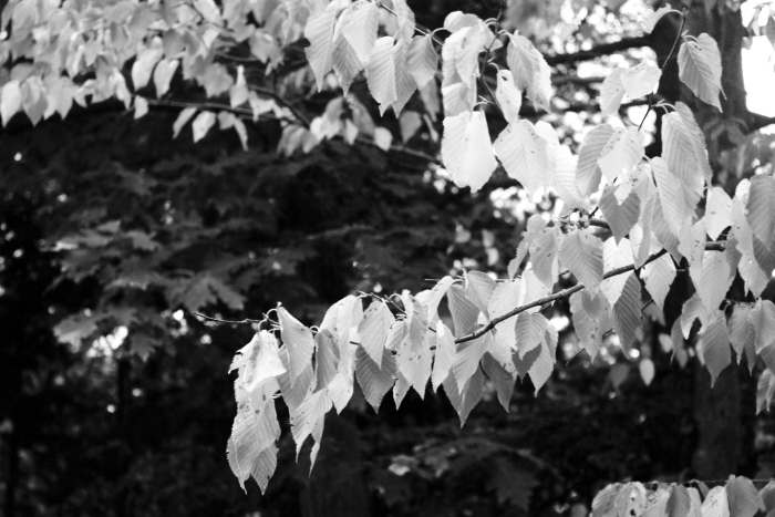
Contrast, 2013. This image represents contrast because of the lighter greys and whites in the leaves in comparison to the darker background. I applied vibrance and gamma correction before using black and white, adjusting the red, cyan, yellow, blue, and magenta levels.
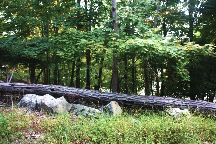
Balance, 2013. This photo represents balance because of the evening out in the tree that divides the rocks and grass on the bottom from the tree canopy at the top portion of the photo. I applied contrast, levels, curves, and vibrance.
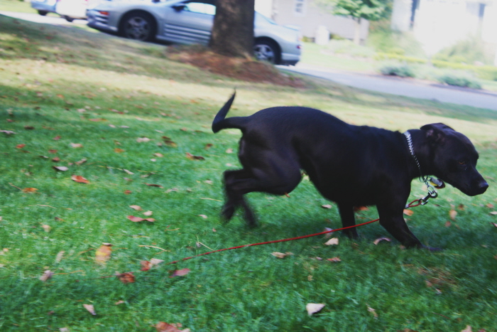
Movement, 2013. This photo represents movement because of how the dog is landing in the grass, showing her landing and making it appear as if she's in mid-motion in the photo. I applied contrast, levels, gamma correction, and vibrance.
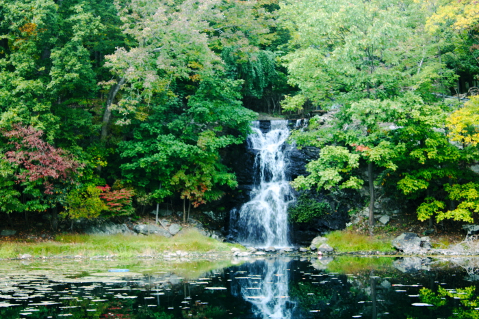
Unity, 2013. This photo represents unity because of the trees and water that all lead to the waterfall in the image, without the waterfall the image would not look the same. I applied contrast, curves, gamma correction, vibrance, and saturation.
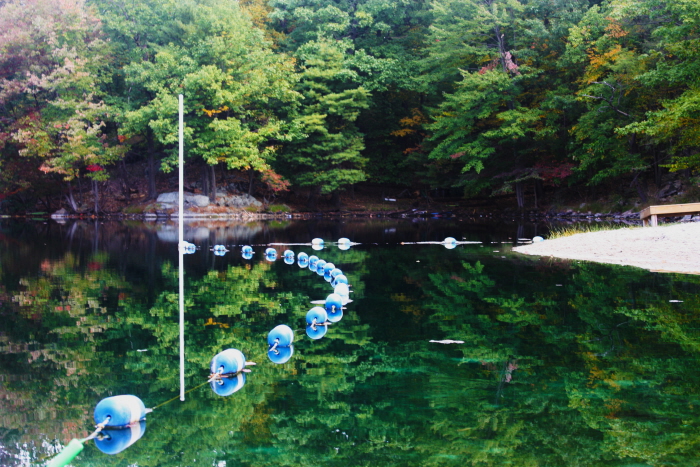
Pattern, 2013. This photo represents pattern/repetition because of the buoys along the water that repeat across in a curve. I applied a higher contrast, levels, exposure, gamma correction, vibrance, and saturation.
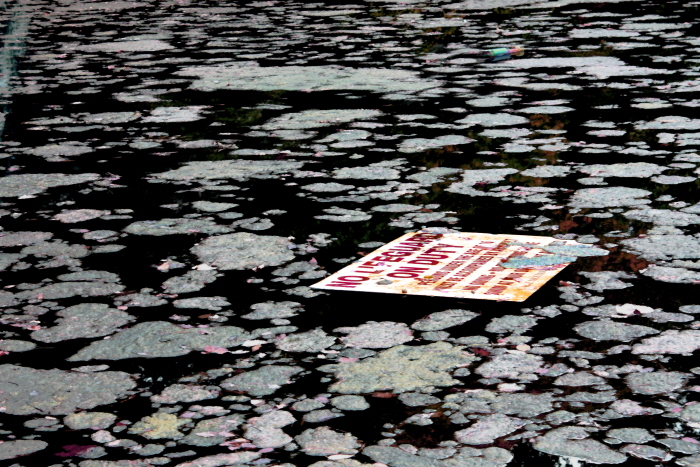
Artist's Choice #1, 2013. I chose to put this photo into this portfolio because it includes emphasis on the sign and contrast between the algae and dark water in comparison to the bright colors in the sign. I used the fresco filter only on the algae in the background and adjustments I used were contrast, vibrance, hue/saturation, levels, and gamma correction.
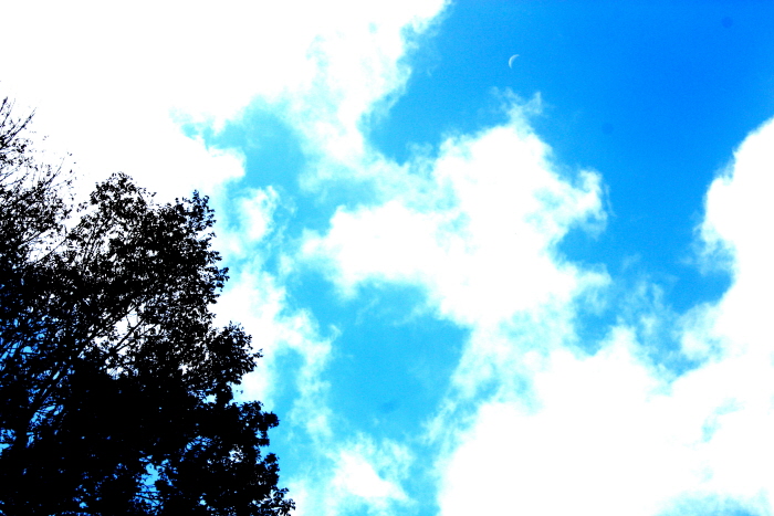
Artist's Choice #2, 2013. I chose this photo because of the vibrant colors and contrast between the white of the clouds to the black of the tree in the corner of the shot, I also like how if you look you even see the moon in the sky. I used contrast. saturation, vibrance, and levels.
gLike
Principles of Design
Principles of Design:
1. Contrast
2. Balance
3. Emphasis
4. Unity
5. Movement
6. Pattern/Repetition