
CMAP APA Display
The Chicago Metropolitan Agency for Planning (CMAP) focuses on planning issues such as housing and land use, community population distribution, climate change, traffic congestion, and water and resource conservation. With a wide breadth of subject matter, the need to communicate and promote each effectively arises.
For the American Planning Association’s 2013 conference in Chicago, CMAP created a 80’ x 200’ display area to more completely explain their GO TO 2040 plan to the attendees. Photography, typography and a wide variety of maps and informational graphics, as well as interactive kiosks, detail the content of CMAP’s four major themes (Livable Communities, Human Capital, Efficient Governance, and Regional Mobility) with four different zones differentiated by color.
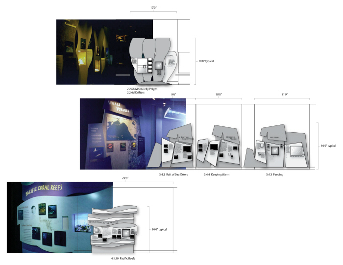
Aquarium of the Pacific
An exhibit project with Amaze Design (formerly Joseph A. Wetzel Associates) involves the development of interpretive exhibits for the Aquarium of the Pacific. Working alongside architects, industrial designers, writers and scientists, a look and feel for each “zone” of the ocean was developed.
The zone pictured at top represents Southern California, where the kelp beds are the lifeblood of the region - the paneling is designed to remind visitors of its importance. The middle area portrays the waters of the Northern Pacific, specifically, the Kamchatka Peninsula in northeastern Russia. Here, the water is cold and the rock cliffs are steep and craggy, with the paneling made to reflect this harsh environment. The bottom image represents the calm waters of the Tropical Pacific surrounding the Indonesian island of Palau. Smooth, wavy, horizontal forms reflect the nature of this exotic region.
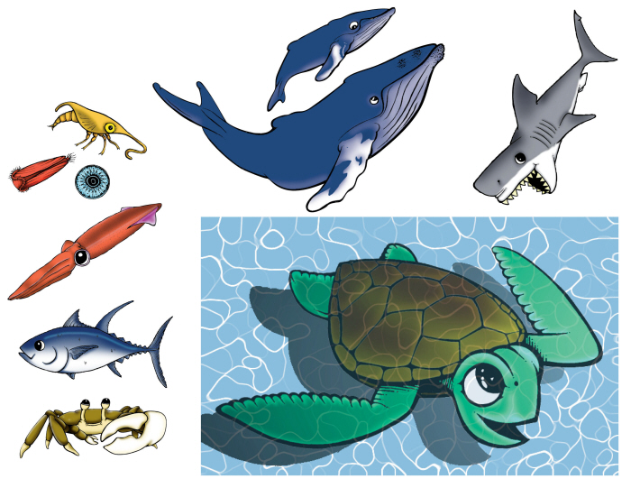
Aquarium of the Pacific
These cartoon-illustrations were created to accent the interpretive playground for the aquarium’s younger visitors, initially hand-drawn and later colored digitally.
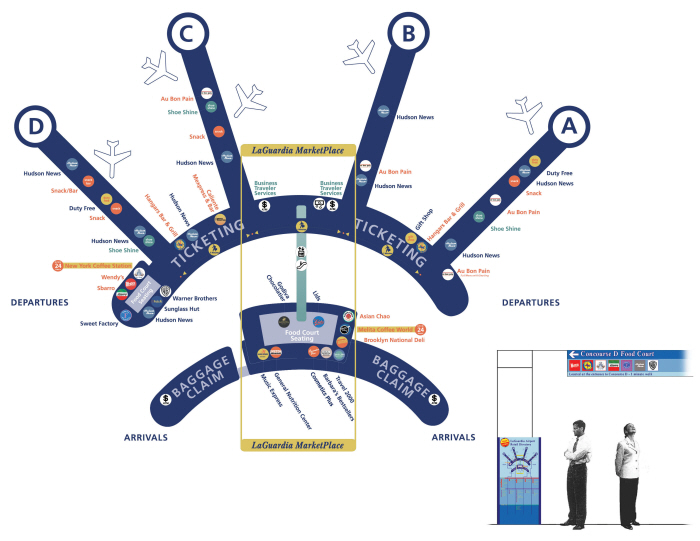
Elkus Manfredi Architects | LaGuardia Aiport
The mapping of the restaurants and shops of LaGuardia Airport’s main terminal presents the challenge of deciphering different services, pinpointing locations and successfully navigating visitors. The solution is rendering a map in an abstract manner, simplifying the floorplan into five simple directions and helping the visitor get a sense of direction. Vendor names are color coded to distinguish between food, shops, or services while the map is split to represent two floors. As a follow-up, a kiosk and signage system were developed serving as the navigation in the wayfinding process.
gLike
Display and Exhibits
When developing a display, the story becomes an environment for the reader. Considerations for how the story is told include area size, traffic, architecture, durability, legibility of content, amount of content, visuals, as well as interactivity and interpretive elements.