
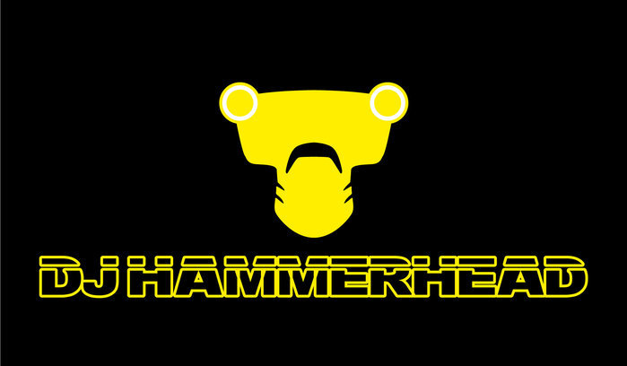
The most notable work of mine used was the main DJ Hammerhead logo, based on a photograph of the actual rubber mask made for the character, with a pastiche of the chrome lettering used often in the Ibiza dance/house scene
This simpler Hammerhead logo also popped up on some t-shirts, again very influenced by a 90s Ibiza aesthetic
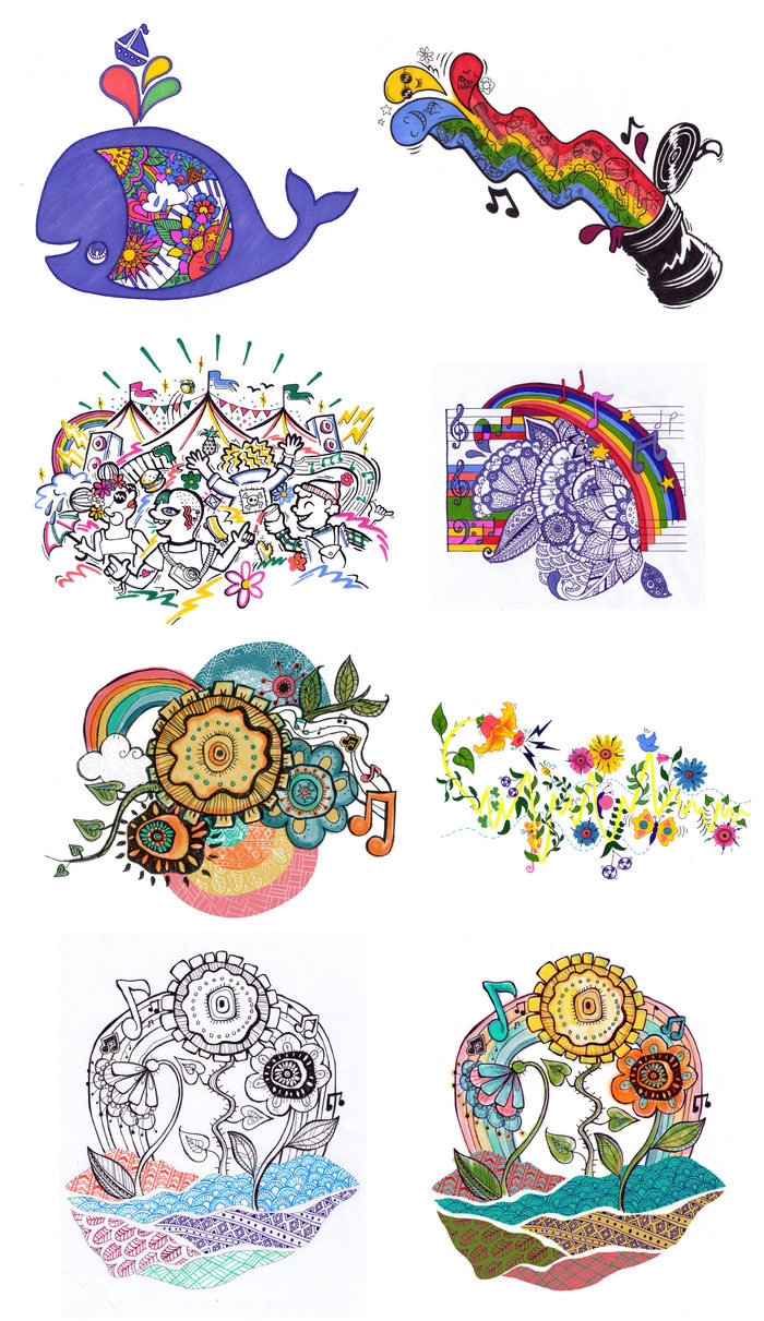
The main graphic design problem in the film was that the festival had no name, it was just referred to as "The Festival." The work-around for this was going to be that on signage, posters, etc, the festival would be represented by an image. The brief was that this image should be hand drawn, rustic, colourful and with loads of imagery and patterns, specifically flowers and musical notes. These were the ideas I came up with, none of which was quite what they were looking for.
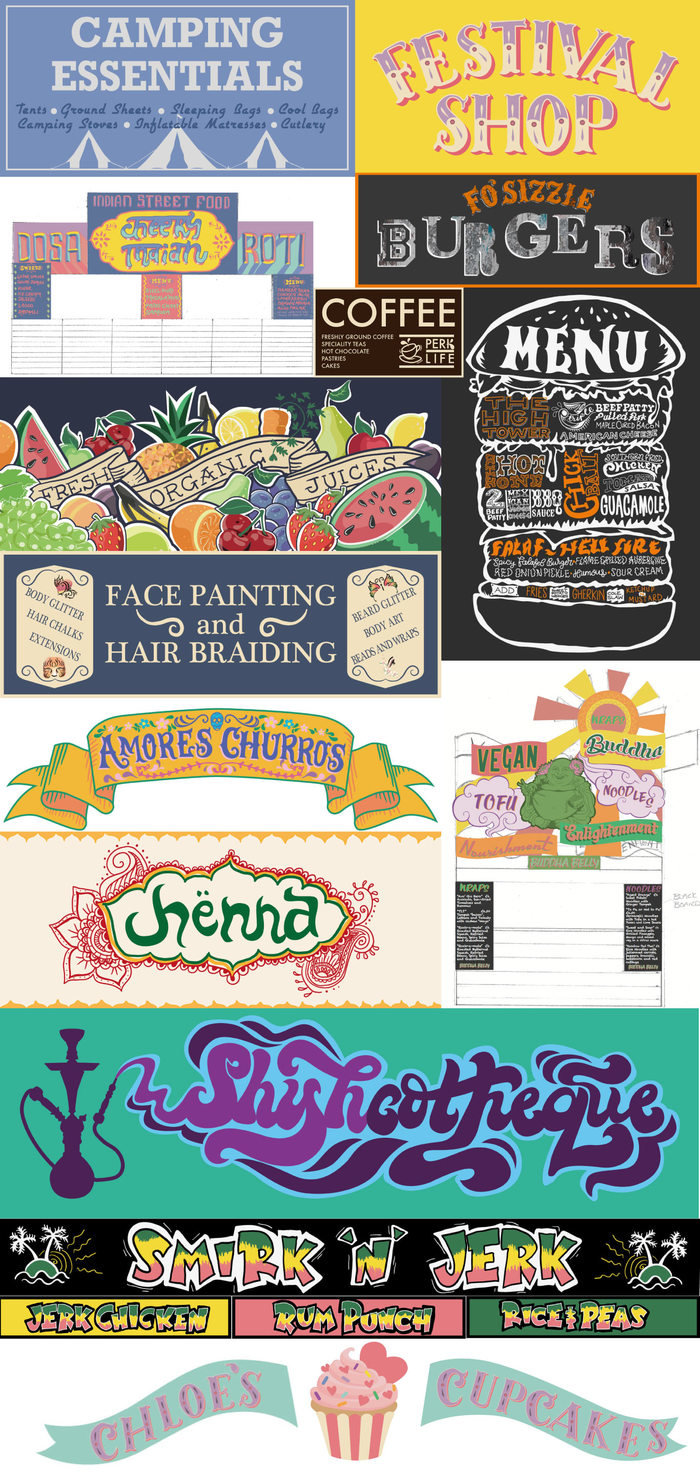
I designed signage for various stalls around the festival. The main brief was that they should be fun and colourful, with some handpainted/homemade. None of these went past the 'initial idea' stage. Had they gone further, I was going to Photoshop them to give a more hand-painted look.
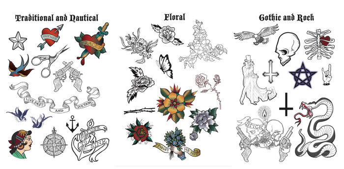
One of my favourite jobs was to design flash boards for the tattooist
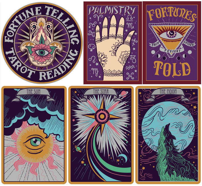
Another favourite was this signage and over-sized tarot cards for the Fortune Teller. Again, these were planned to be over-painted in Photoshop, but were not taken to a 'finished' stage.
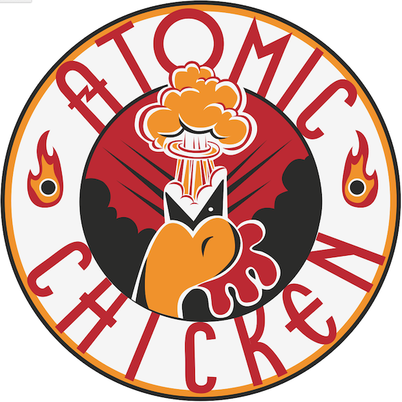
One of the jokes in the film centres around some very spicy chicken, I made this logo design for the boxes (which personally, I loved!) but it wasn't used.
gLike
The Festival (Feature Film, 2017)
I was one of the Graphic Designers on comedy feature film 'The Festival' from the creators of 'The Inbetweeners.' This was a bit of a tricky one, with some "creative differences" between me and Production Designer, Amanda McArthur. Sometimes you have to accept that you're not the right person for the job and bow out gracefully.
View WebsiteAvailable
Freelance, Full-time
Lucy Bullen
Prop Maker, Illustrator and Graphic Designer
Sheffield, United Kingdom