
I think the first thing I designed for the film was the logo for the Swim Club itself. Here are some of the initial ideas. Production Designer, Amanda McArthur, liked the idea of the logo looking like a swimming badge and I was keen to play on the symmetrical patterns of some of the synchro formations.

This is the finished logo we used.
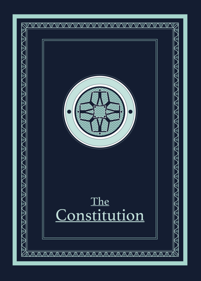
A key graphic prop was the Swim Club's Constitution, given to the main character, Eric, to help him understand what he was signing up for. It was decided that the constitution should be a very smart, official-looking document, reflecting how seriously the men took their swimming obligations. We wanted it to feel like something you might be given upon joining the Freemasons or the Secret Service.
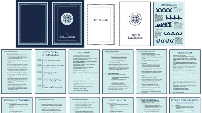
The brief was also that The Constitution should be comically thick and officious. The 5 Rules were scripted, but beyond that I had to come up with a lot of copy to fill the pages. The original Swedish Swimming Club really did have a written constitution, so I based a lot of the rules on that, expanded upon it and added some British jokes and helpful diagrams.
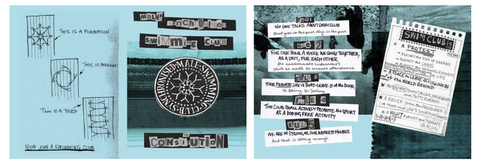
My favourite rejected idea for The Constitution was a DIY zine version. The spirit of the original Swedish club was very Punk - that swimming was a form of rebellion against the stresses and constraints of modern life - so this combined with the age of the founder members made me think a pastiche of 70s zines would be the perfect style. However, as mentioned above, the film ended up going with a very different ethos for the club, so this version was dropped.
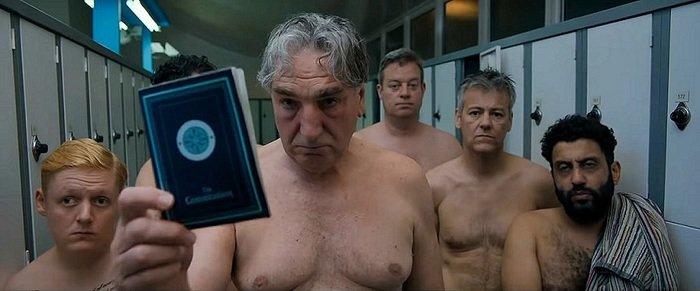
Here's The Constitution getting its starring moment! (Copyright Met Film Production and Shoebox Films)
Our club attend the World Swimming Championships in Milan, so I had to come up with logos and branding surrounding this event. For the AAMSS logo I continued with the symmetrical formation theme, but went for a more abstract style with a slight suggestion of the Olympic rings. With the Championship logo, I tried to replicate the euphoric style of European sporting events. I also decided the Italians would probably have their own Swimming Federation and that the event would have some official sponsors.
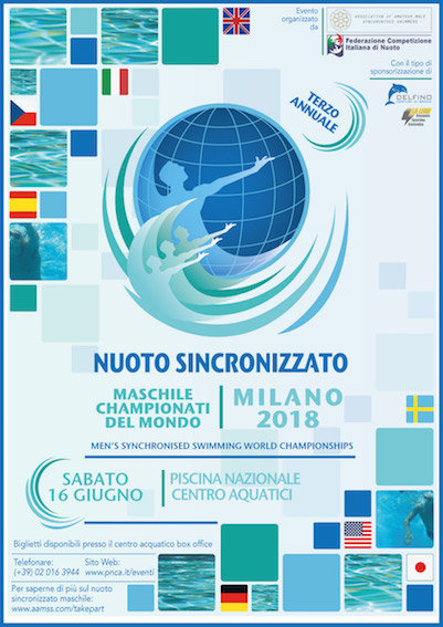
Al the logos were used on this background dressing poster I made for the Championship pool set, with a subtle echo of tiles on the pool floor.
Eric works for an accountancy firm, so I came up with a couple of logo ideas: one modern, one traditional.

Eric's wife, Heather, works for the local council, so we invented the Forest Hill Local Authority and its logo. I liked the idea of the logo being slightly out of date, as if it had been designed in the early 90s and not updated since.

These were the other Council logo ideas
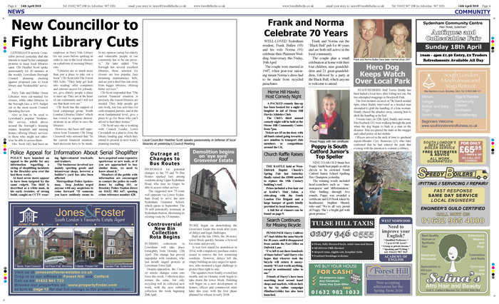
Heather features in an article in the local paper, so I designed this double page spread (the photo had to be inserted in post-production, hence the blank square!) Newspapers are a great place to get some Easter Eggs in. The article below the main one is about a series of shoplifting incidents, which one of the swimmers is arrested for later in the film. In the scene, Eric makes a joke about how mundane all the issues dealt with by the council are ("bin collections and bus routes") so I filled the paper with unimportant, parochial stories to underline this. Plus any excuse to feature my grandparents and dog!
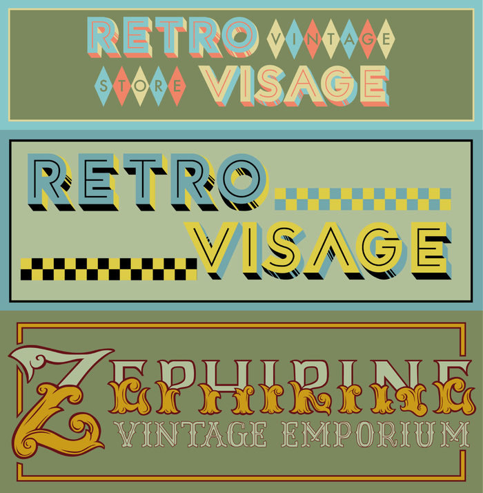
Eric becomes obsessed with a toy in a vintage shop window, these were my ideas for its signage

At work, Eric is stressed dealing with a company called "Peechee" which the script describes as having a "terrible logo." Given the name (and my puerile sense of humour) I was determined to include a peach that looked like a bum, and to emphasise the "pee." This was ruled to be too silly, so my next approach was to try to make a logo that was awkwardly jumping on the brush lettering trend. It was finally decided that the name was bad enough on its own, so all that was needed was a simple no-nonsense logo. At least I got to emphasise the "pee!"
gLike