
The main logo for the dog show. It was supposed to be very prestigious, but with a touch of Vegas showmanship. The columns are a nod to our show venue at Caesar's Palace.
I made a few variations on the logo to be used on different formats and background colours, so we'd always have a usable version whatever the context.
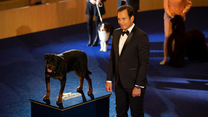
The logo looked great printed up on the winner's podium (copyright Universal Pictures)
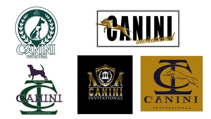
Some of the ideas we went through in the search for the Canini logo
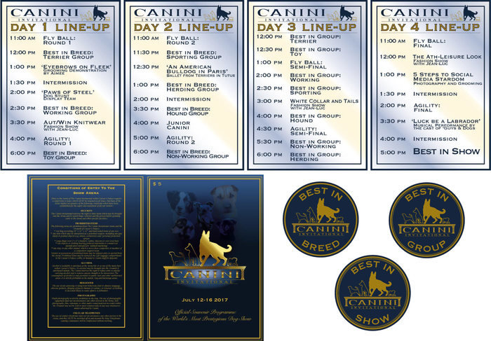
We used the logo on a range of graphics through out the dog show set, including line-up posters, souvenier programmes and rosettes. I had a lot of fun coming up with silly events to complete the line-up. I also had a go at creating animated revolving line-ups and information to be displayed on our venue's Jumbotron. I'd never done any computer animation before, so this was a very steep learning curve against a deadline, but it's always fun to learn a new skill!
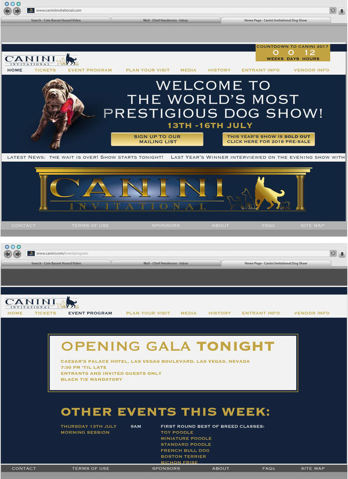
The logo also featured on the first of many websites I needed to design for this film. I made the elements for the webpages and the UI for the web browser and the lovely people at Compuhire turned them into proper working websites for us.
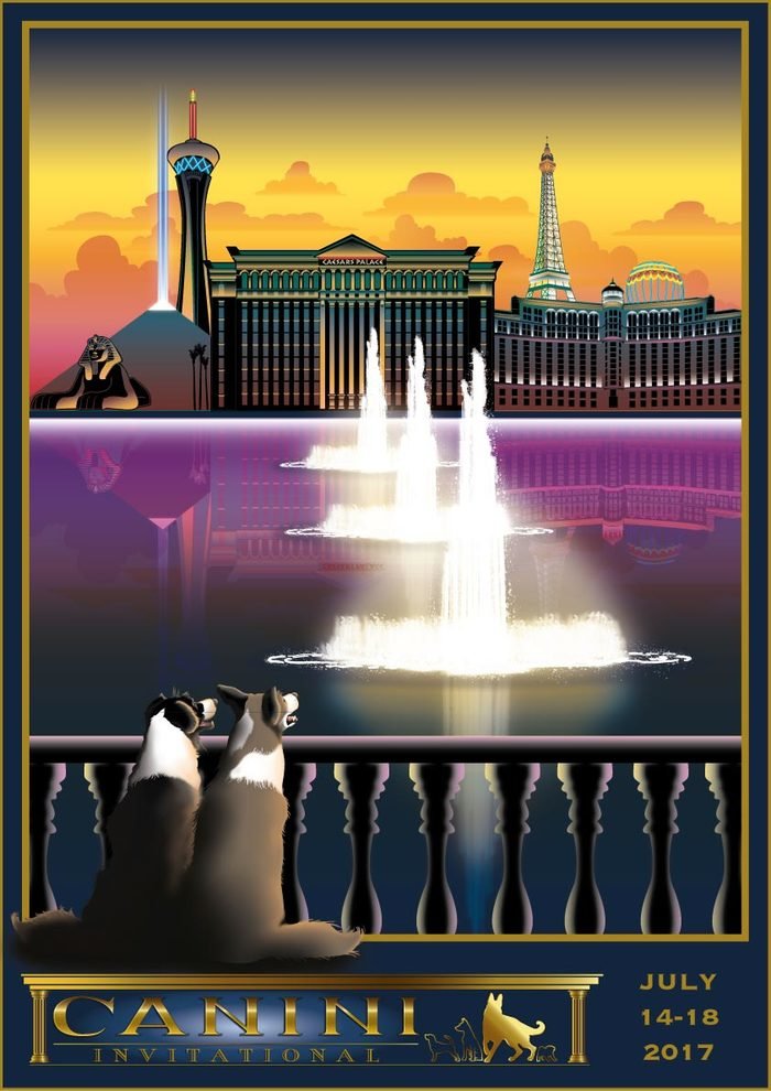
A poster design for the dog show.. We wanted to emphasise the idea of the canine contestants romanticising the event. There's also a key scene in the film involving the Caesar's Palace fountains, so there's a little bit of fore-shadowing in these posters too.
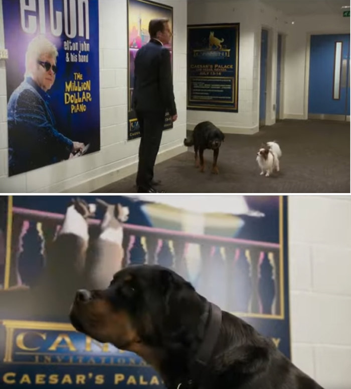
A few shots of our posters backstage. We were also kindly granted permission to use promotional images from some of the performers playing in Vegas at the time. "I'll just have to confirm this with Elton John's people" - not a phrase I ever expected to be using! (copyright Universal Pictures)
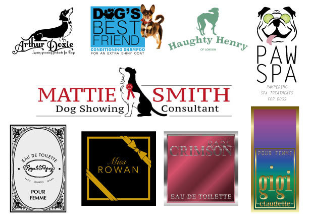
A few logos for dog grooming products and fancy perfumes to be used by Natasha Leone's dog groomer character
The script specified that the Animal Control logo should be something cute and friendly to hide the grim reality of the prison-like conditions in the pound. I added the slogan "taking care of stray dogs..." for its sinister double meaning.
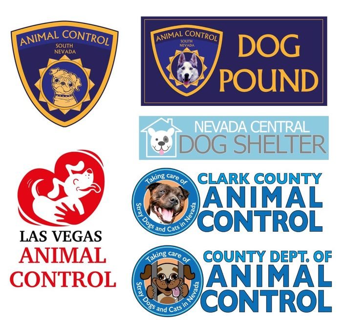
Some of the other ideas floated for the Animal Control logo
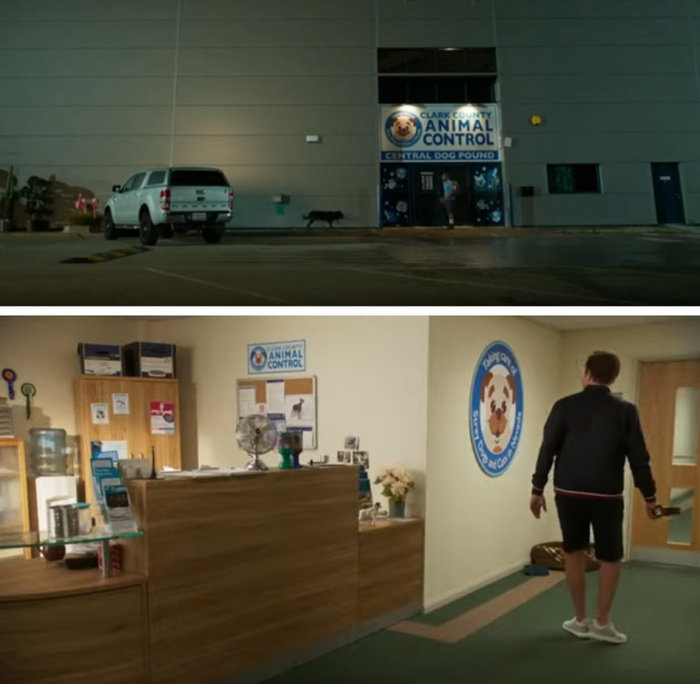
The Animal Control logo probably got the most screen time out of anything! I also designed the dog face decals you can just about make out on the doors here (copyright Universal Pictures)
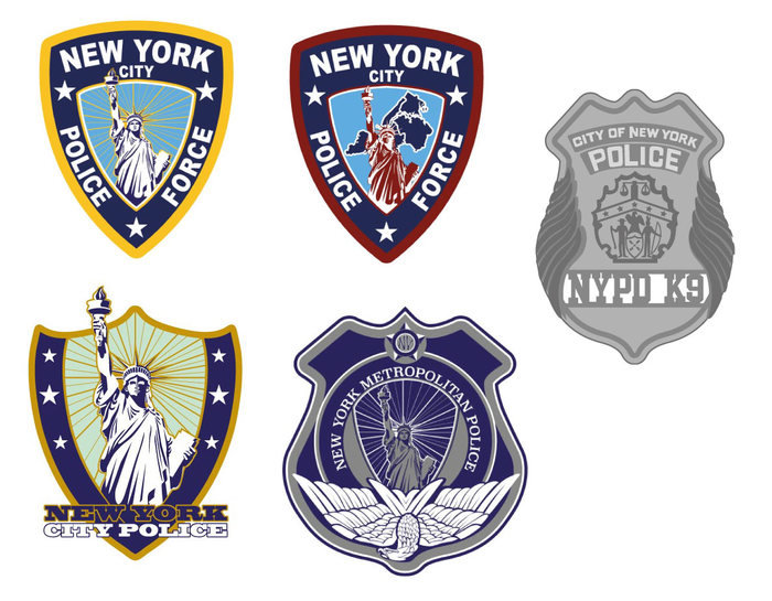
The film's opening scenes take place at an NYPD station, so I started coming up with ideas for a cleared New York police badge, but eventually we got permission to use the real NYPD name and logo, so these weren't used. Although I did get to design a special K9 badge, because apparently, the real NYPD doesn't issue dogs with badges!
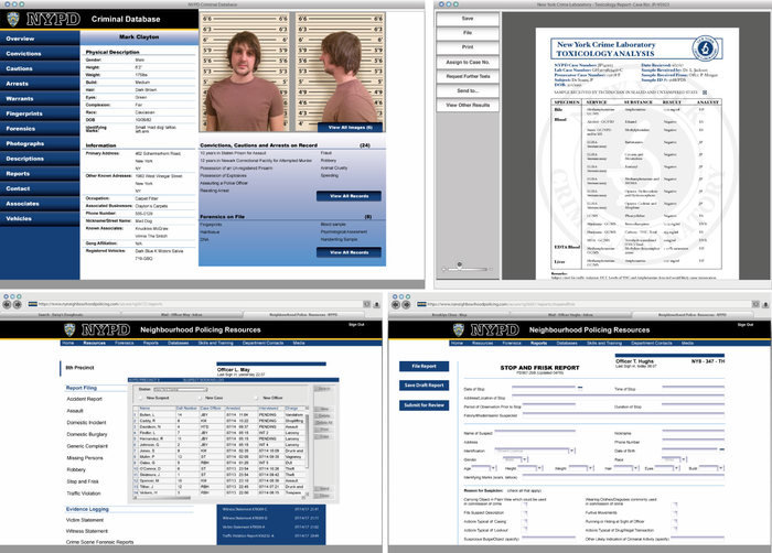
For the NYPD set, we also needed content for the police officers' computer screens, so I imagined a whole NYPD internal system, as well as digitised paperwork and mugshots
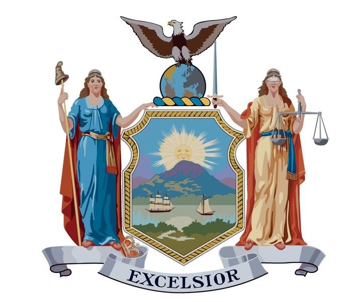
For exterior shots we needed a flag with the New York City crest on it. Although we had permission to use the logo, we couldn't find an image in high enough resolution to be printed on the huge flag, so I made a vector of it. That day, I'd dropped and broken my graphics tablet, so I had to make this whole image with a mouse and keyboard!
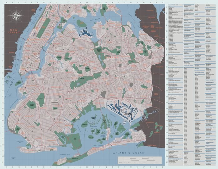
I also made this map of New York for background dressing at the precinct. It's another job that was very time consuming, and probably didn't need to be as accurate as I made it, but the finished map looked great.
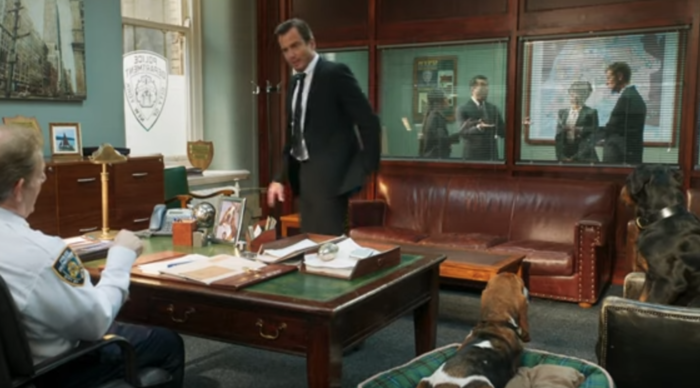
The map in all its glory! I also made the frosted decals for the window (copyright Universal Pictures)
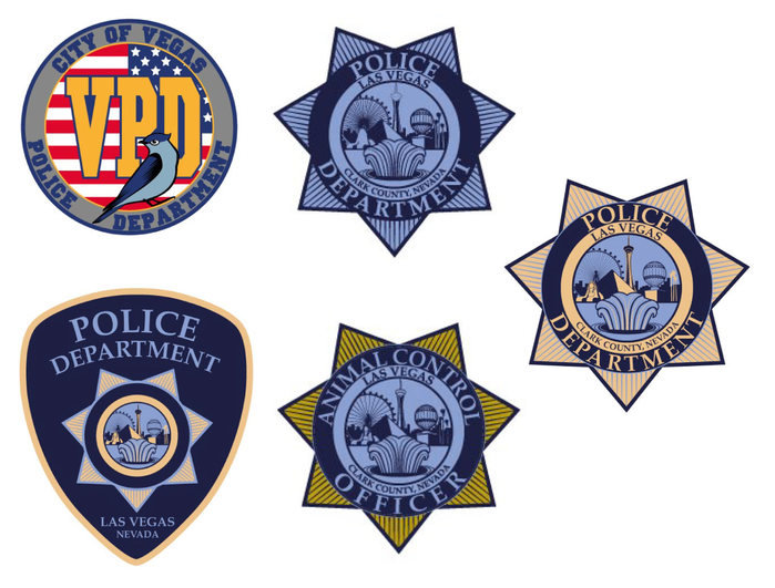
The other US police force we meet, is in Las Vegas. We couldn't use their real logo, so I came up with a couple of ideas, one of which we developed into the star badges used in the film.
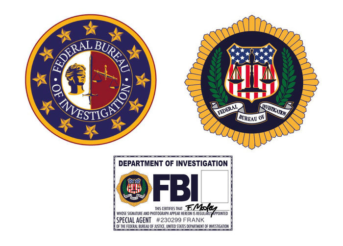
As if two police forces weren't enough, the FBI also get involved, so we needed a logo and badge for them too.
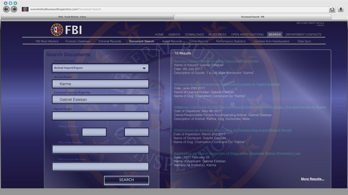
We also delve into the FBI records via their internet search portal.
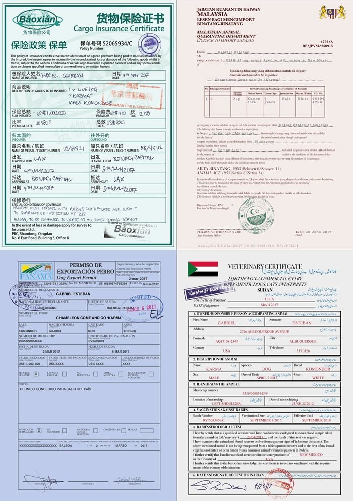
One of the things I was most pleased with, in a very nerdy way, were my forged animal transport documents. They all needed to be distinctly different and mix all kinds of graphic elements - the printed forms, handwritten/typed entries, stamps and signatures. I also designed counterfoils to make our animal transport beaurocracy even more realistic (see below)
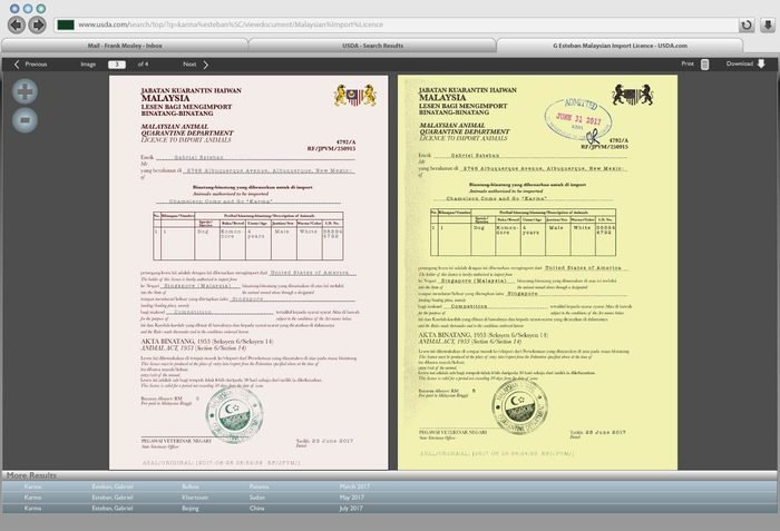
The travel documents were viewed on a computer database, so I also had to design the UI to be programmed by the tech wizards at Compuhire
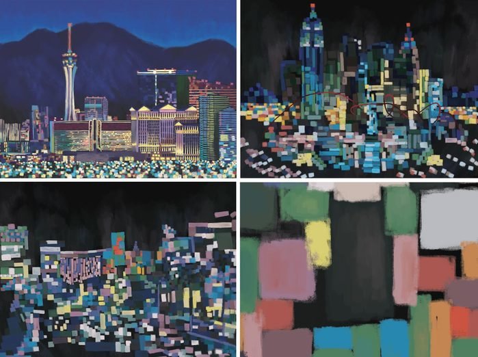
As quite a last minute request I had to produce these huge digital paintings of the Las Vegas skyline (see bottom right image for an actual size snippet of the brushwork to get an idea of the scale.) Super abstract was the only way to go in the time available, I remember staying up all night to get these finished and pressing "send" at like 5am, then immediately going to bed in all my clothes!
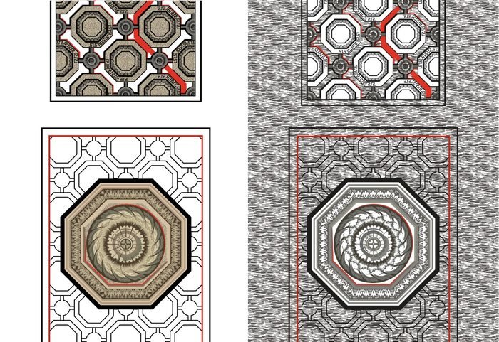
One of the most difficult and time consuming jobs was reproducing the pattern on the carpet at Caesar's Palace, which is a very complicated magic-eye style design. I only had a few photos to work from, most of which just accidentally had the carpet in the corner or the background!
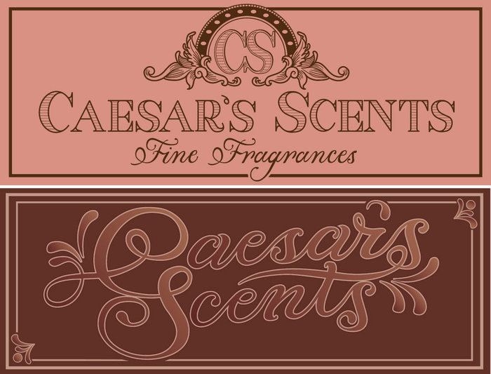
Signage ideas for a perfume shop within Caesar's Palce
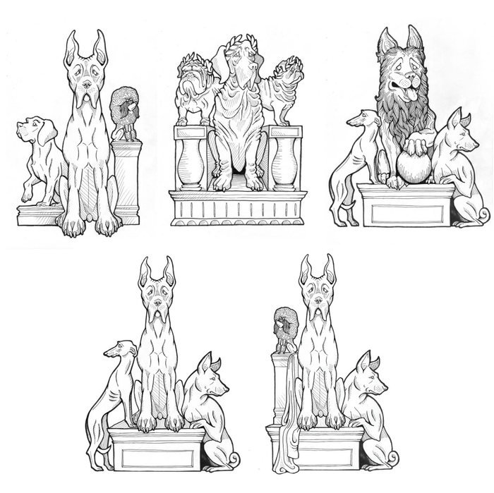
I got to do a bit of (very basic!) concept art too, coming up with ideas for a Roman-style dog statue for Caesar's Palace. I started with three ideas. Amanda liked the central dog from the first one and the side dogs from the third one, but then the feedback from the director was that he liked how funny the little poodle on its own tall plinth was, so we added that one back in for the final design.
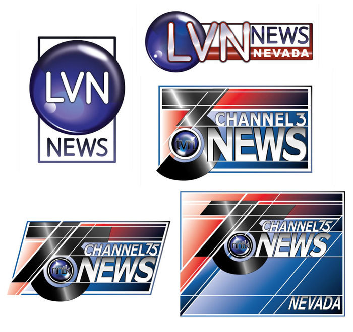
Of course with all this dog glamour and police drama going on, the news networks were going to be there to cover it. We went through quite a few versions of this one, mainly for clearance reasons. My arguement that 'Anchorman' got away with Channel 4 News and 'Dodgeball' Channel 8, didn't cut it, so we had to find a combination of letters which didn't appear in any US network, and a number that didn't feature a news broadcast, so we ended up with the somewhat cumbersome NNTK Channel 75 News, Nevada!
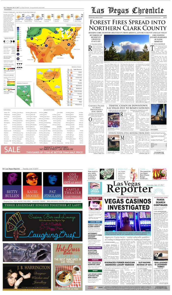
One of my favourite jobs on any project is making newspapers. I love coming up with all the little incidental details, stories and adverts that build the world of the story. For Show Dogs I put a lot of effort and research into two papers - a broadsheet and a tabloid - to be used to line a panda's cage!
gLike